Discussion: A disturbing map legibility trend
in: Orienteering; General
Nov 9, 2012 3:56 PM
#
I've been noticing a disturbing trend developing in map legibility over the last several years. With the trend to try to map more and more features, I've noticed that attention is not being paid to legibility of the map.
Specifically, what I see is that section 3.3 of ISOM is not being followed. Here ISOM says the minimum dimensions at 1:15,000 is "The gap between two fine lines of the same colour, in brown or black: 0.15mm" The great maps at the recent NAOC have lots of examples of overlapping symbols of the same colour (especially look at the "thorn-loop" in the north-east corner of the map on the blue course.) It made the maps much more difficult, if not impossible, to read in some areas.
I worked on a pretty cluttered map this summer for the Yukon champs - an area that had oodles of earth banks - when I spent time clipping contours and adjusting the point symbol locations, it was magic - the map was suddenly usable and clear - not the jumbled mess of brown before. Respecting the rule really works and makes a difference!
The second part of this consideration is legibility discussion in 2.4 of ISOM. Basically it says if you can't draft it all clearly, then you need to drop features. Legibility takes precedence over content. So, if you can't show it all clearly, then the mapping team needs to figure out what is important to show, and what can be dropped.
Anyway, I'd like to raise awareness in the o-community of this problem and perhaps we can start drawing our maps better.
Nov 9, 2012 9:35 PM
#
Oh the answer's easy, you just give in and print the map at a bigger scale. And then when people find that they can put in more detail at the bigger scale and there are grizzles about legibility you just give in and...
Nov 9, 2012 10:11 PM
#
ok, but are we getting anywhere? 'cause we see this problem everywhere on the maps...
Nov 9, 2012 10:38 PM
#
AZ:
Hey ShadowCaster - don't suppose you saved an old version so we could have a before/after example? I think a picture is worth a thousand discussion threads ;-)
Nov 9, 2012 10:55 PM
#
Funny thing is when it comes to AP discussions on NorAm O maps the masters (myself included) argue too much clutter while some of the elites argue that the maps aren't detailed or good enough for them to perform. Time for some retr'O'.
Nov 9, 2012 11:15 PM
#
bigE:
That 0.15mm rule I wasn't aware of... I've been struggling with the readability problem in some extremely detailed areas while working with newly aquired LIDAR data. There are some sections of the Gatineau comparable to the French WOC terrain. I still haven't found the right balance but this rule will serve as a useful guide.

Nov 9, 2012 11:28 PM
#
pi:
Looking nice there bigE! Stick to the ISOM rules for symbol sizes, minimum distances and minimum areas for area symbols and perhaps we'll finally have some maps that can be printed at 1:15000...
Nov 9, 2012 11:37 PM
#
BigE -this brings me to my next beef - tags on cliffs!!!! Rock faces should, by default have legs - they are as important tag lines to show slope direction. I know there are all these cool "Euro" maps showing cliffs without legs, but it still doesn't make it right. Here are the ISOM rules on this:
Impassible cliffs have legs. Period. The only exception is where a passage between two uncrossable rock faces exist (see ISOM 201).
For passable rockfaces (ISOM 203), the legs should, by default, be there. The exception is for minimum size rock faces (1 m high only) or legibility--great, remove those legs if the map is too cluttered, but otherwise leave them in! In the example above, almost ALL of the cliffs shown would benefit from legs without comprising legibility. If there are legibility conflicts, the symbols can be moved slightly to improve clarity, before removing the legs.
Note that in NAOC'12 Long-Blue course we had a control on a small rock face where the slope was not apparent, and the symbol had no legs - there was nothing around preventing the mapper from adding the legs - but it did make the map difficult to interpret for no reason.
The second item is the minimum symbol size, especially for passable rock faces. I actually make minimum size rockface point symbol in OACD to make sure I don't draw a rockface too small. The minimum size is 0.6 mm at 1:15k [Correction made]. Again, if you go smaller than that, it starts to look like a boulder or stony ground. If it is too tight to show, then maybe it, or some surrounding features need to be simplified or removed. This becoming increasingly important as we move away from offset printing - the reduced print quality of the various print-on-demand maps make the need for clear drafting even more important due to the fuzziness of the print quality.
Nov 10, 2012 12:09 AM
#
ShadowCaster, you say: "...draw a rockface too small. The mimimum size is 0.25mm at 1:15k." Actually the minimum length is 0.6mm at 1:15k. The thickness is 0.25mm for a passable rock face.
The ISOM is super detailed for a reason and is generally VERY well thought out so it's important to know the basics and I think mappers should generally carry it with them for a reference.
Anyway... a few additional thoughts which really help but I don't think are in ISOM (I could be wrong on that account):
1. Form lines.. OCAD has a dash point tool which can make a huge difference when used on form lines such as at the top of form line re-entrants. That can be the difference between: two parallel brown lines and a form line re-entrant and can make form lines a gazzillion times more readable.
2. cliffs and contours. Cliffs should either be on contours or completely off contours. They should generally not bridge the gap between two contours or a contour and a form line. Contours should generally enter and leave cliffs at the ends not part way along though there are circumstances where this might be necessary.
Similar things apply to other symbols of course... I'm just picking on these because of the posted map sample.
Nov 10, 2012 12:11 AM
#
AZ - here is my first stab at adding pictures in AP:
The first is the 1:5k drafting of the hoodoo area we used for the Yukon sprint champs this year - before cleanup. This is raw field notes drawn in OCAD. Note all the overlap earth banks etc.:
Second is after I did cleanup - clipped contours, moved point symbols, simplified, etc. Now I'm sure it could be much better yet, but at least is somewhat makes sense now:
The first is the 1:5k drafting of the hoodoo area we used for the Yukon sprint champs this year - before cleanup. This is raw field notes drawn in OCAD. Note all the overlap earth banks etc.:
 |
| From Misc 2012 |
Second is after I did cleanup - clipped contours, moved point symbols, simplified, etc. Now I'm sure it could be much better yet, but at least is somewhat makes sense now:
 |
| From Misc 2012 |
Nov 10, 2012 12:12 AM
#
I suspect many mappers/drafters leave off the tags simply because they look bad artistically. I agree, but I try to put on the tags, because as you say, they are so helpful when you are running with the map.
I think the legs could be shorter though, the standard symbol sets legs can get in the way of other features, and I think that even a very short set of legs is legible and quickly orients the cliff for the competitior.
I think the legs could be shorter though, the standard symbol sets legs can get in the way of other features, and I think that even a very short set of legs is legible and quickly orients the cliff for the competitior.
Nov 10, 2012 12:23 AM
#
Further to the example above, I also made a 1:10,000 version of the same area for our Middle. the first is the 1:5k map re-sized in OCAD - yuck:

Then this is what is looks like once cleaned up for the 1:10k. It is pretty interesting to see what has to get removed when moving from the "over-mapped" version:

Then this is what is looks like once cleaned up for the 1:10k. It is pretty interesting to see what has to get removed when moving from the "over-mapped" version:
Nov 10, 2012 12:26 AM
#
Tag lines are nice to disambiguate up and down, but to be fair, I don't think a literal reading of ISOM 201 dictates that they should always be drawn. The version I found states:
201 Impassable cliff
An impassable cliff, quarry or earth bank (see 106) is shown with a 0.35 mm line and downward tags showing its full extent from the top line to the foot. For vertical rock faces the tags may be omitted if space is short, e.g. narrow passages between cliffs (the passage should be drawn with a width of at least 0.3 mm). The tags may extend over an area symbol representing detail immediately below the rock face. When a rock face drops straight into water making it impossible to pass under the cliff along the water’s edge, the bank line is omitted or the tags should clearly extend over the bank line.
In cases where the full extent of the cliff is contained within the 0.35mm thickness of the main cliff line, drawing tags would seem to depict a cliff with a much larger horizontal extent, no? 0.35mm at 1:15k is already 5.25m.
Nov 10, 2012 12:29 AM
#
ShadowCaster, even on your cleaned up 1:5000 map (way better than the original) there are two spots where it isn't immediately obvious what is going on meaning that those areas should be cleaned up further or exaggerated further to show the features if they're very distinct in the terrain
I've circled the two areas here:

I've circled the two areas here:
Nov 10, 2012 12:35 AM
#
2. cliffs and contours. Cliffs should either be on contours or completely off contours. They should generally not bridge the gap between two contours or a contour and a form line.
Huh?
Huh?
Nov 10, 2012 12:36 AM
#
ya, agreed - my drafting is far from perfect.
What I thought was interesting though was the clipping the contours to allow the required gap made the earth banks really "pop-out" in the mapping - which is in fact how they looked in the terrain.
What I thought was interesting though was the clipping the contours to allow the required gap made the earth banks really "pop-out" in the mapping - which is in fact how they looked in the terrain.
Nov 10, 2012 12:41 AM
#
Hi bshields - ISOM 201 defines the symbol as with legs - that is what the symbol is - unlike ISOM 203, they do not say the legs may be omitted (except in the passage example). And as always, legibility needs to trump.
Also symbology is not meant to represent features "true-scale". Think of the boulder point symbol! Anyway, the same goes for the legs on cliffs. Sure, they look big on the map, and there is no way the cliffs are physically that laterally extensive, but that how the symbols is to be drawn for clarity and distinctness from other symbols.
Also symbology is not meant to represent features "true-scale". Think of the boulder point symbol! Anyway, the same goes for the legs on cliffs. Sure, they look big on the map, and there is no way the cliffs are physically that laterally extensive, but that how the symbols is to be drawn for clarity and distinctness from other symbols.
Nov 10, 2012 12:44 AM
#
ndobbs: 
This is way blown up to show what I'm talking about. See the cliff in the bottom right... you can be guaranteed that that won't print well. Or the two cliffs in the top right where the form line pass into the cliff but then turns away halfway through to skim along the corner of the next cliff. I just think that could probably be represented in a slightly clearer fashion.
This is way blown up to show what I'm talking about. See the cliff in the bottom right... you can be guaranteed that that won't print well. Or the two cliffs in the top right where the form line pass into the cliff but then turns away halfway through to skim along the corner of the next cliff. I just think that could probably be represented in a slightly clearer fashion.
Nov 10, 2012 1:04 AM
#
Canadian - thanks for the line weight catch - you knew what I meant ;-).
On 1. Agreed - knowing about that dash point tool is super important for form lines and where they gap at.
2. In the examples above, you can see, especially on the 1:10k how tight things were, but some of the earth banks were distinct enough they warranted clipping the contours, and given they are the same colour as the contour, you pretty much have to do that to get them to stand out. As for contours entering the earth bank symbol at weird points - that is in fact what was going on here! The earth banks often "climbed" laterally up the hill.
On the topic of leg length, I too agree that they are kind of long in ISOM - but that is the spec and we should stick to it. However, I have sometime "cheated" the length a bit - see the back line of a cliff is 0.18mm, the leg length is 0.5 mm. So, depending on where you "start" the leg, the total symbol height can vary from 0.5 to 0.68 mm. I think the intent is the 0.5 is from the middle of the back line, so the overall symbol height is 0.59 (see the examples is ISOM 201 to get what I mean.)
Nov 10, 2012 1:17 AM
#
AZ:
Canadian - what are these map snippets and where are they stored? They are not showing up in my browser and when I click on them I get this Google-ish error message:
403. That’s an error.
Your client does not have permission to get URL /QHUvq-MLtf264aXSunURVZjxgiNf0Oqun7NkQOLuXk2oSCzyp93TQ0MjD6-AQurClbnUAHUsyGA from this server. (Client IP address: 174.7.243.212)
Forbidden That’s all we know.
403. That’s an error.
Your client does not have permission to get URL /QHUvq-MLtf264aXSunURVZjxgiNf0Oqun7NkQOLuXk2oSCzyp93TQ0MjD6-AQurClbnUAHUsyGA from this server. (Client IP address: 174.7.243.212)
Forbidden That’s all we know.
Nov 10, 2012 1:29 AM
#
bigE:
I have in fact broken the rule on some of my impassible cliffs, some are also too short. Here I agree with you. I'm not so sure however about your interpretation of ISOM 203:
"A small vertical rock face (minimum height 1 m) may be shown without tags. If the direction of fall of the rock face is not apparent from the contours or to improve legibility, short tags should be drawn in the direction of the fall."
It doesn't explicitly say tags are preferred or that the cliff must be a minimal height to omit the tags. I could use tags more, but usually the slope is relatively unambiguous. Personally, since tagless cliffs are thicker and simpler, at high speeds I find they are easier to pick out. Especially on a map with so much rock. If the slope is unambiguous, there should be slope lines nearby to help you out.
Probably subjective but I find tagless cliffs more legible and aesthetic. This I suspect comes after hours of studying many cool Euro maps. They don't tell you the slope, but this simplification is worth the readability you gain.
Nov 10, 2012 1:43 AM
#
bigE:
I don't entirely agree with Canadian's statement: Cliffs should either be on contours or completely off contours.
In steep or complex areas, cliffs and embankments often do climb laterally up hills, like ShadowCaster explained... If you were to simplify these areas, you would arrive at such a location on course, and you may find yourself confused, because the distortions introduced by simplifying the map to a more readable form have reached a point of inaccuracy.
All though confusing to look at, with training you can quickly and accurately visualize these areas without breaking a sweat. I recommend more Catching Features ;-)
You're right about the form lines though. Always a challenge there.
Nov 10, 2012 1:53 AM
#
agreed bigE. Note the part of my statement where I say: "though there are circumstances where this might be necessary."
AZ. How about now? There stored on my google drive and I forgot to change the setting to "visible to anyone on the web".
AZ. How about now? There stored on my google drive and I forgot to change the setting to "visible to anyone on the web".
Nov 10, 2012 1:58 AM
#
Glad to see this discussion - maybe some event organizers reading this will require their mapping teams to pay closer attention to this stuff.
bigE - on ISOM203 the default symbol definition is with legs. It then says they _MAY_ be shown without tags. That wording means that the default is WITH tags.
I don't disagree with the aesthetic comment, however ISOM has nothing to do with how sexy the map looks.
bigE - on ISOM203 the default symbol definition is with legs. It then says they _MAY_ be shown without tags. That wording means that the default is WITH tags.
I don't disagree with the aesthetic comment, however ISOM has nothing to do with how sexy the map looks.
Nov 10, 2012 2:17 AM
#
bigE - on ISOM203 the default symbol definition is with legs. It then says they _MAY_ be shown without tags. That wording means that the default is WITH tags.
No, it doesn't mean that at all.
No, it doesn't mean that at all.
Nov 10, 2012 5:32 AM
#
ShadowCaster- how about a name?
You (and others/) rail against clutter, yet advocate tags on all small cliffs?
Thats probably the quickest way to clutter up intricate contours.
You want to add tags to bigE's example?! You've got to be kidding.
A clear contour picture is the simplest way to show cliff orientation.
You (and others/) rail against clutter, yet advocate tags on all small cliffs?
Thats probably the quickest way to clutter up intricate contours.
You want to add tags to bigE's example?! You've got to be kidding.
A clear contour picture is the simplest way to show cliff orientation.
Nov 10, 2012 6:06 AM
#
Similar principle on the yellow shoreline examples-
Dangerous to fieldcheck on the internet, but I strongly suspect that the knolls and contour shapes should be preserved as you change scales, not all those earthbank tags. Those tags are the biggest visual offenders, yet many off those "free hanging" earthbanks are not even big enough to be caught by a contour? This does not make sense.
First make a clear contour picture, these are the biggest features, then add the most prominent and compact features if there is visual space. Form knolls and dot knolls are compact symbols, taking up very little space relative to their map and in-terrain visual impact. Tagged features (cliffs or earthbanks) take up far more space on the map than they do in the terrain. At the very least, the significant facets of these earthbanks can be captured simply in the carefully drawn shapes of the continuous contours.
Also, "up" features, visable from all sides, should have priority over one sided or "down" features.
Nov 10, 2012 6:26 AM
#
I agree with EricW above. The latter map example with all the earthbank tags would seem to make it harder to interpret than if they were all removed and the contour allowed to live. Again, without having been to that bit of map - but having seen similar examples 'live', perhaps a temptation to leave too many 'potential control sites' on the map rather than a legible simple representation of the terrain?
Nov 10, 2012 9:30 AM
#
I think sometimes there is some kind of confusion about what a cliff really is. The minimum dimensions for these features are about 4 meters in length and 1 meter in height and they should be more or less vertical. If you find something that doesn't meet these requirements then you can leave it off the map with no problem and sometimes you even should. A distinct drop in elevation of more than 1 meter also can and on most occasions should be drawn with at least a formline. So no free-floating cliffs please!
In the map sample above I see some cliffs drawn on dot knolls. For me that is also a big no-no. The dot knoll symbol is used for small features and sometimes for larger features to improve legibility, if the knoll is big enough to accomodate a cliff it's not a dot knoll. So does that mean dot knolls can have vertical rockfaces on them that aren't shown on the map? Yes definitely! Visit some maps south of Stockholm such as this one and you will see tons of them.
I have completely stopped using rounded ends on cliffs now. I have realised that it actually improves legibility when you have straight ends on the passable cliffs despite what it says in ISOM. The risk of confusing a cliff with a pair of boulders is just so much smaller. As for the "legs" on passable cliffs, I generally don't use them, it's just not necessary in ordinary terrain where everything is "up" and nothing "down". In strange sandstone or karst terrain I can see the usefulness though and sometimes when you have a long string of small cliffs on the same contour the legs can make it look less like trail.
When I see a map with lots of earthbanks my first impression is always that there is some bad mapping going on. Either the mapper doesn't understand contours or they want to draw things that doesn't meet minimum requirements. For me an earthbank means something that is as difficult to climb as a cliff but without being rocky. The minimum length should be even longer than for cliffs because the earthbanks are usually less visible and they are mapped mostly for their reduction of runnability. (Note that I have never been to any of those famous goldmining areas in Australia and I really have no idea about how they are and should be mapped. I'm sure there are other people here who can inform us though.)
Tooms: Many people simply doesn't realise that a "potential control site" is only a "potential control site" if you can give a correct and distinct control description for it. Mapping point features that fail this test is just causing problems for the course setter, especially if it's an inexperienced one that doesn't know these things themselves. So if you have too many dot knolls/pits inside an imaginary control circle the mapper should seriously start thinking about using the broken ground symbol instead. Same goes for boulders and boulder fields.
Nov 10, 2012 11:43 AM
#
I am not a big fan of too many tags on (black) cliffs but earth cliffs (brown) are another thing. They need tags to make them stand out from contours. I have done many maps in heavily eroded gold mining terrain in Australia. There are complex formations of earth cliffs and the frequent use of tags really helps the map reader understand what is up and what is down.
The trouble is the ISOM regulation tags are long and thick which makes them clumsy and inevitably causes clutter. This means that other mappers of gold mining tend to leave off the tags whenever space gets a bit tight but I find those maps very confusing.
Also if you simply rely on the OCAD symbols that automatically add the tags the results are often awful - particularly whenever there is any complexity.
My solution is to individually draw the tags (I use a symbol that is just a brown line with no tags for the top line of the symbol-this is how it was done in the days of ink drawing) and a separate symbol for the tags, preset to 'straight line mode'.This way I get to choose exactly where the tag goes and how long it is. And I can ensure there are always sufficient gaps between adjacent brown lines. [I think, as shadowcaster suggested, that minimum gaps are even more important than minimum symbol sizes for good legibility] By taking a fair bit of care with exact placement I can add tags which help make the map easier to understand without decreasing legibility. I only use the default ISOM symbol that adds the tags automatically for nice long straight earth ciffs (eg road cuttings).
But the most important thing is that I use a thinner line for tags than ISOM (and many of the tags I draw would be too short according to ISOM. ISOM mandates 0.14mm tags (same thickness as a contour) I use 0.10 .
(example - a map of mine of typical gold mining terrain.
http://www.bendigo-orienteers.com.au/gadget/cgi-bi...)
Often I think when people complain about cluttered maps - the problem is not necessarily too much detail, rather it just poor drawing - some extra time spent on tweaking the drawing can vastly improve a map and allow you to fit in the detail you want AND maintain good legibility. As far I can see from shadowcaster's sprint example the level of detail is the same on both maps - the second map is just drawn better.
Big E's map looks pretty good - no need for tags there - the blue marshes make it pretty clear what is up and down - if there is any confusion about slope direction in such terrain it can be cleared up by a few (brown) slope lines on the contours. But some of your small cliffs would not get past a vigiliant event advisor with a strict attitude to ISOM.
Nov 10, 2012 12:35 PM
#
I don't have much experience with gold-mining terrain, but I'm in agreement with robplow as far as the 0CAD symbols that automatically put tags on cliffs and earth banks -- it was a nice thought, but in general they don't work, and much better results can be had by drawing the tags individually. Takes a lot of time, but it's worth it.
Unrelated question about the map posted by robplow, though: how come the map is covered by what look like green stone walls, but you didn't put that symbol into the legend. And what are those things?
Unrelated question about the map posted by robplow, though: how come the map is covered by what look like green stone walls, but you didn't put that symbol into the legend. And what are those things?
Nov 10, 2012 2:38 PM
#
AZ:
@EricW - "How about a name" -- check the results at NAOC, Forest is a name ;-)
Nov 10, 2012 2:57 PM
#
There is an easier way to manipulate the tags rather than drawing them individually. Since OCAD 7 there has been an editing tool which is called 'To Graphics' ('Convert to Graphic Object' in OCAD 11).
To use this just draw your earth bank, cliff, etc. as normal and then hit the 'To Graphics' icon (it looks like a little pencil). The earth bank is then split into its component symbols. All you have to do is manipulate the tags using the 'Edit Object ' tool in conjunction with the 'Rotate Object' tool. Using these will maintain the integrity and size of the original tags.
To use this just draw your earth bank, cliff, etc. as normal and then hit the 'To Graphics' icon (it looks like a little pencil). The earth bank is then split into its component symbols. All you have to do is manipulate the tags using the 'Edit Object ' tool in conjunction with the 'Rotate Object' tool. Using these will maintain the integrity and size of the original tags.
Nov 10, 2012 3:26 PM
#
coti:
Isom requires the mapping to be made to 1.5:1 or 1:2 in 15 000. (1: 10 000 or 1:7 500) This would need to already solve the problem of legibility. The problem is that nobody, not working from 1: 10,000 to 1: 15,000 in complex terrains.
At work to1: 7500 to 15,000 in very complex terrains, design can become illegible, especially if they meet the 3D vision.
If YES, the solution would be offset printing to 10 000.
Because, right, we all know that 10 000 according to Isom represent only an increase by 1.5 to 1: 15 000
That if someone does not prefer magnifying glass ...
Nov 10, 2012 4:34 PM
#
To use this just draw your earth bank, cliff, etc. as normal and then hit the 'To Graphics' icon (it looks like a little pencil). The earth bank is then split into its component symbols.
I never realized that this works for cliffs (I use it frequently for text so that, for example, a logo can be scaled). I prefer to have the tags come out as symbols called "cliff tag", rather than as generic lines, but it's not a big problem to convert them after drawing the cliff. However, the resulting lines in the "to graphics" case do not necessarily preserve the length. They're generic lines which can be changed in length by moving one end (and if you edit them, it's likely that will happen). I draw most cliff tags with a point symbol I created that is a fixed-length symbol.
I never realized that this works for cliffs (I use it frequently for text so that, for example, a logo can be scaled). I prefer to have the tags come out as symbols called "cliff tag", rather than as generic lines, but it's not a big problem to convert them after drawing the cliff. However, the resulting lines in the "to graphics" case do not necessarily preserve the length. They're generic lines which can be changed in length by moving one end (and if you edit them, it's likely that will happen). I draw most cliff tags with a point symbol I created that is a fixed-length symbol.
Nov 10, 2012 4:47 PM
#
I regret opening the discussion of the "tags" as it has distracted us from my primary concern, which was about ensuring we leave gaps/spaces between brown-brown or black-black features as per section 3.3 of ISOM. That I find much more disturbing than whether or not a mapper "tags" or not.
ErikW and others, I think the most important consideration is the "golden rule" of legibility - if tags negatively affect legibility, then by all means omit them. Or, as others have suggested, draw them judiciously to ensure the mapping is clear. However, if the tags do not affect legibility, or can be adjusted to make it is readable, then why not show them?
ErikW and others, I think the most important consideration is the "golden rule" of legibility - if tags negatively affect legibility, then by all means omit them. Or, as others have suggested, draw them judiciously to ensure the mapping is clear. However, if the tags do not affect legibility, or can be adjusted to make it is readable, then why not show them?
Nov 10, 2012 4:58 PM
#
FYI - the map examples I posted above are from a very unusual area - it is a old lake bottom that was accidentally drained during the construction of the White Pass & Yukon Route railway during the Klondike Gold Rush. The yellow is all bare earth - actually marl, which is a very soft, erodible white calcareous material. It forms strange, little hoodoos and I imagine it is like those heavily eroded Australian gold mining areas. On the topic of the "cliff-on-the-knoll" scenario, I agree - but in this case the small earth banks were distinctly separate from the knoll (the photo below is not that situation, just a nice picture of the landscape).
P.S. - I wouldn't doubt that the area was "over-mapped" but the features were distinctly mappable and we had a lot of fun orienteering in the area!

P.S. - I wouldn't doubt that the area was "over-mapped" but the features were distinctly mappable and we had a lot of fun orienteering in the area!
Nov 10, 2012 5:04 PM
#
One concept that robplow's example shows very well is integrating earthbanks and contours, not breaking the contour lines for the earthbanks (and gulley- linear ditch symbol) as if they are seperate features as is shown in the other example. These are all part of the same topographic picture. Unfortunately this violates the above-sited principle of seperating features of the same color, so the legalese map critics have something to complain about. If other brown point features were introduced, yes probably break the contours.
robplow's example has many other technical ISOM violations, which I believe are done to good effect, in the hands of a respected veteran mapper. None of this needs explanation to the competitors, well, except those green stone walls :-)
I think this clearly illustates the shortsightedness of mapping or controlling in strict accordance with the written regulations, especially from a remote location (sometimes with software that highlights nonconformities), as has been done lately, at WOC and NAOC.
The ISOM is very good as a guideline, but don't expect it to provide the optimal solutions in unusual situations like downunder gold mining terrain, or gravel mining arenas as at NAOC. It takes experienced on-site, on-paper eyeballs, interacting in good faith, to get good solutions and minimize the aggravation for the map and course people, who certainly don't deserve more crap (right coti?).
And yes Tundra/Desert, that would be about 1% of the reason I was not there. :-)
Nov 10, 2012 5:09 PM
#
You're quite right - the tags can be altered in length hence my saying that you should use the 'Edit Object' tool to move them.
The 'To Graphic' tool can be used for virtually all OCAD symbols though I'm not sure that you'd really want to!
If I want to create a scalable logo I draw it in OCAD and copy it. I then create a new point symbol and paste into the editor. This then creates a point feature for your logo which is then easily scaleable to any factor you like. Note this only works well from OCAD 9 onwards and will not 'back convert' to previous versions. If you then examine the symbol in the editor you will see that it has automatically converted the text to graphics.
Please forgive me if you already know this but I'm sure not everyone does.
Nov 10, 2012 5:10 PM
#
feet:
I think the green stone walls are lines of fallen trees in a logged area. If so, they are difficult to pass (the closest US analogy is the fallen redwood trunks mapped on some BAOC maps), so the green stone wall symbol is not bad.
Nov 10, 2012 5:33 PM
#
PG:
It's a very common complaint among older (and I'm guessing also non-elite) orienteers that the maps are too hard to read, or at least some maps. It's nice to see that some mappers are thinking about legibility, even though my general feeling is that it still isn't being given enough emphasis.
A related problem is that, despite all the best intentions, there are many times when the map printing is not so good, and therefore the legibility is severely impaired. Perhaps the mapper should give this some consideration and therefore err on the side of a more legible rather then less legible product. I would hope so.
I know an easy retort would be that that is not the mapper's problem, that we should just get the printing right, but in the real world that often does not happen.
A proper map for me is one that can be read on the run without a magnifier, if for no other reason than orienteering is a lot more fun that way. It would be nice if all the maps were like that.
Nov 10, 2012 5:34 PM
#
coti:
" The ISOM is very good as a guideline, but don't expect it to provide the optimal solutions in unusual situations like downunder gold mining terrain, or gravel mining arenas as at NAOC. It takes experienced on-site, on-paper eyeballs, interacting in good faith, to get good solutions and minimize the aggravation for the map and course people, who certainly don't deserve more crap (right coti?). "
right, EricW
right, EricW
Nov 10, 2012 5:45 PM
#
Although there is a general rule that symbols of the same color should not touch, there are exceptions. Clearly, boulders bumping into pits is not okay, and if there's a boulder on the edge of a lake, the lake edge should be broken. However, there are other cases where it's clearly okay, such as trail junctions. I'd put earth banks into the latter category, where it's fine for a contour to flow into an earth bank. In some cases it may make sense to break the contour for legibility, but I would not consider there to be a prohibition against the earth bank line having a contour run right throught it. In most cases that I've been involved with, I feel that it should.
But to the general point of legibility, I don't disagree at all. To coti's point, I've long felt that if you can't draw it with 0.5mm pancils at 1:7500, then you shouldn't put it on the map. Of course, these days a lot of people don't fieldcheck with pencils. And drafting isn't a simple mechanical process, it's something that can benefit from skill and experience.
But to the general point of legibility, I don't disagree at all. To coti's point, I've long felt that if you can't draw it with 0.5mm pancils at 1:7500, then you shouldn't put it on the map. Of course, these days a lot of people don't fieldcheck with pencils. And drafting isn't a simple mechanical process, it's something that can benefit from skill and experience.
Nov 10, 2012 6:21 PM
#
coti:
Totally agree with you, but Isom says nothing of other techniques. Still remained at age pencils and paper. And while they say that technology should not influence mapping, we remain in this age
Nov 10, 2012 10:50 PM
#
coti:
Before finding solutions of the problem must be identified. Agree that this disturbing trend in recent years there are increasingly more often.
We must recognize that 20-30 years ago the trend does not exist, or only very isolated cases
Is now 25-30 years old when they were more legible maps, cartographers were more competent, more experienced? Allow me to doubt ..
Personally I think all technical developments make more detailed maps to be more accurate.
What to do? go back to Rotring pens and documents base sketchy?
Another trend is the mapping of extreme land where moving is an adventure in itself.
We can prohibits mapping these lands? I do not think it's a constructive solution, but at least you can limit international competitions.
The problem is complex and will not settle until they are taken into account all factors.
To ignore the technological revolution is not a solution.
Go back to 15 000 for all competitions (long, medium, relay) before trying other solutions, it seems unrealistic and negative consequences.
And yet, it seems that this is the solution that will be adopted by MC.
And maybe it will officially declare magnifying glass is wonderful and indispensable for our sport.
Nov 11, 2012 9:03 AM
#
In Australia last year there was a minor controversy over the mapping of land which required all but elites to be given a 1:7,500 map. The eventual conclusion was that the area was not mappable by ISOM standard as it was too complex. This really emphasises the comment of coti.. that choosing not to use these areas is unconstructive. The area, Rowdy Flat, is popular because of its challenging navigation. What to do?
http://omaps.worldofo.com/index.php?st=rowdy+Flat&...
http://omaps.worldofo.com/index.php?st=rowdy+Flat&...
Nov 11, 2012 1:12 PM
#
Feet is right, the green lines are long piles of logs. It is where natural eucalyptus forest has been bulldozed and the logs left in linear piles, then non-native (monterey) pines planted. I have seen other mappers try to map the same feature as earthwalls (brown line with dots) , thin strips of green stripes, thin strips of dark green or combinations of brown and green, even as a green strip with broken ground dots underneath. All of them look terrible and give a misleading impression about the nature of the feature. It is such a unique feature I felt it deserved a unique symbol that is both simple and elegant. The first time I used it (on another map) I discussed it with the controller and various others first and it was explained in the event info and noted on the map itself. The fact there is no note on this map is simply an oversight.
I haven't been to Rowdy Flat but I am pretty certain that it is no more complex than, say, the NW corner of Cotty Creek (http://www.bendigo-orienteers.com.au/gadget/cgi-bi...)
EDIT i didnt look closely at that map (and the link is incorrect anyway) - it doesnt have the section I meant. I meant the NW part of THIS map: http://www.bendigo-orienteers.com.au/gadget/cgi-bi...
or many other mining areas I have been to in Australia and even NZ. Certainly the amount of detail drawn on the map is no greater than those maps - I can't speak to what is actually on the ground not having been there. The unique thing about Rowdy flat is that there is such a large area of consistently complex terrain. I think the drawing could be tidied up a lot to make it more legible and the addition of more tags would greatly improve the comprehension of the ups and downs. Ie I think the problem is not so much the complexity of the terrain but the way it is drawn.
But what is wrong with 1:7500? I am 50 and now need glasses to read even the simplest of maps. Personally I like the trend to more detailed maps (if it is mapped well) and if that means that some detailed areas become hard to read at 15000 or 10000 then print it at 7500 or 5000. It is easy to do, so why not? ISOM really is still playing by the rules that applied to hand drawing. Then it was expensive and impractical to produce maps at different scales - now it is easy but the rules don't allow it. I do that all the time now at events I organise: as the courses get shorter the scale gets larger. In general the older orienteers tell me they appreciate a map that is both detailed and easy to read.
People can (and do) complain all they want about overdetailed maps but I am certain that is a vocal minority - the silent majority like this trend - if they didnt the mappers that produce such maps would soon be out of work. A few years ago I was at an IOF mapping conference and there were several presentations about 'generalisation' where the presenters spent a lot of time putting up examples of maps they felt had too much detail and heaping criticism on them. During the break I was talking to P. O. Derebrant (one the most respected mappers in Sweden, acclaimed for his work on woc 06 maps in Denmark). He told me that if he made maps like those presenters wanted he would be out of business within a year.
As for all those 'old guard' mappers who criticise other mappers for 'mapping too much detail' - I think that deep down they are just jealous because they know they dont have the skill to do that themselves. It is easier to criticise others than to face up to your own shortcomings.
Recently I saw a presentation that was made to a controllers workshop. It was showing controllers how to use OCAD to check that the map symbols conform to ISOM. Useful information for sure. But a couple of things bothered me.
Firstly there was a fanatical 'zero tolerance' tone to the whole thing. This is the sort of attitude that can lead to really stupid acts - like using the 'select object by symbol' function in OCAD10+ to automatically delete all objects off a map file that dont meet ISOM minimum sizes, without actually checking them out in the terrain.
Secondly - it completely ignored the question of how well the map actually represents the terrain - accuracy and interpretation. I could just imagine all these controllers spending hours obsessing over symbol specifications in OCAD files and having no time or energy left to check the map in the terrain.
It is very easy to get bogged down in the detail of an OCAD file. And it is, conceptually, relatively simple because there are very clear rules: a contour must be exactly 0.14mm, minimum gaps must be 0.15mm, etc, etc. Never mind the fact that those are just numbers in a computer and may not bear much relation to the actual dimensions on the printed paper. It is the printed map that is ultimately important - not the OCAD file. But while it is easy to decide what is 'right' and what is 'wrong' when comparing symbol specifications in OCAD to ISOM it is not nearly so easy when you take a map into the terrain and try to decide if it is accurate and the interpretation is good. But these issues are far more important than a few 100ths of mm's here and there in OCAD. As a controller I rarely check the symbol sizes in OCAD unless there is something that obviously looks wrong on the printed map. I use the time I have to check the map in the terrain and ensure the courses are good. A map that conforms exactly to ISOM (as far symbol dimensions are concerned) is not much use if it is inaccurate or the interpretation is poor or if the courses are banal.
None of my maps would get past a controller determined to strictly enforce ISOM. Nonetheless, despite some small deviations, I think my maps are very much in the spirit of ISOM. Any deviations I make are small and are not made lightly but based on years of experience. I make them to improve interpretation and legibility. My basic 'rule'is that the map user should not notice the deviation from ISOM. For example - no one has ever come and said to me that the tags on my gold mining maps are too thin or do not conform to ISOM. If I had to stick 100% exactly to ISOM my maps would be the poorer for it. The recent zero tolerance trend among mapping committee/controller types depresses me - I will give up mapping before I give in to that sort of stupidity.
Nov 11, 2012 2:08 PM
#
@TheInvisibleLog: What to do?
If the MC or Council is not willing to find a suitable solution for these type of terrains the only way is to bring the issue on General Assembly. The question is relavant for many countries and I think we just need a good proposal so everyone can understand where is the problem.
Now we have two different type of maps: Recreational maps (not ISOM) and Elite maps (ISOM). We have more than 50% of maps on very detailed karst terrains.
What to do?
If you want to compete on karst terrain before you die you should hurry up. Our forestry industry is helping to IOF and in a decade we will have some very suitable terrains for major IOF events. Rocks are melting!
Nov 11, 2012 2:23 PM
#
Agree with EricW and robplow that ISOM (and ISSOM for that matter) cannot and should not be followed to the letter. They are very useful as a guide, but each terrain is unique and every mapper is an individual. I also agree with PG - should be able to read a map on the run without a magnifier.
Nov 11, 2012 7:09 PM
#
coti:
robplow thanks for the courage and sincerity that proves.
I had the same feelings too, same disappointment
I have a few questions for Mr. Havard Tveite or commission maps.
But I fear it will remain a dialogue between deaf
None of the maps the commission has nothing to comment?
I think that the contradiction is born the progress, so please, even if we have no the same views, we can hear each other.
Nov 11, 2012 7:39 PM
#
pi:
Thanks ShadowCaster for starting a useful discussion! Actual real advice and tips on how to make more legible maps. And yes, map printing quality is sadly forgotten in most of these discussions. How does it matter that you stick to the 0.15 mm min distances when there is 0.25 mm blur in the print?
To keep this thread going in a constructive tone, I'm wondering if kofols and coti could actually propose in real numbers what the MC should do with ISOM? What would make you happy? In your opinion, what should the size of a dot knoll be (on the printed map) at 1:15, 1:10, 1:7.5? What about the width of a contour line at the different scales? The size of a boulder? Thickness of a cliff base line? What should the minimum distance be between brown features? Smallest allowed area feature? etc etc.
It's easy to bash the MC, ISOM and the IOF, but harder to contribute with a proposal to make it better...
Nov 11, 2012 8:04 PM
#
coti:
Pi Thanks for the invitation. Many proposals have been sent (and maybe you're already aware)
Nothing revolutionary in my opinion.
Scale of 10 000 for long distance when the ground requires, and only 125% increase symbols and not 150 in this case would already be a big step forward
These things have already occurred in IOF competitions both for long as well as symbols (WOC 2003 Switzerland for middle)
Maybe it would be good to review your language.
It's your problem if you think that if I express my point of view is denigration. I could talk about defamation but I will stop here.
Asking to run the Middle or Relay with 15,000 when you know that no one has done it for decades is unrealistic.
Nov 11, 2012 9:32 PM
#
pi:
1:15 for Long is a Competition Rule. It's not an ISOM issue.
What do you mean about Middle and Relay at 1:15? Did I say that?
125% increase for 1:10 is perhaps a compromise that can make everyone happy? Do you know how the MC has responded to this proposal?
I'm sorry if my language is misunderstood. I apologise. I'm not attacking coti or kofols. I think what happened with the WOC map in France was handled terribly poorly and I'm not supporting that at all.
But I'm very frustrated with all this talk that ISOM is bad, when no one is discussing what would be better. kofols want to map his karst terrain and says ISOM has to change, but how? What do you actually want? If you want smaller symbol sizes to fit more details, then what exactly is the size that would make you happy? If you want smaller symbols sizes, isn't that going to make the map harder to read?
I just don't understand... are you sure that you are not confusing ISOM and the Competition Rules?
Nov 11, 2012 9:56 PM
#
Lots of good discussion here. My early remark about continuously increasing scale was partly serious partly in jest, we are somewhere on a journey from 1:25,000 (?) a century ago to 1:15/10/5 today.
Around here the most common challenge is sand dune terrain. Shaped by wind, the ground shows a directional "grain". Mappers have been helped by the "elongated knoll" 113. There is no elongated equivalent for a small depression - and no ability to align the long dimension of the symbol with the grain. "Does it really need to be shown?" needs to be asked.
The stalemate in the ISOM revision is regrettable.
Nov 11, 2012 10:36 PM
#
coti:
pi
That should really ... be in competition regulations and rules not Isom. But unfortunately specification is in Isom.
From here all interpretations MC. Would have been nice to be told you (I would have smiled only) 1; 15 000 for relay and Midl but unfortunately are ''high'' recommendations.
Honestly, I do not make no illusions regarding the new rules Isom.
Will only defend against holy 15,000 helped too great function of ocad 10 (selects, delete) by sinners mappers
And I think Isom rules are generally pretty good. That does not mean it can not be improved
However, it is extremely annoying when you try to respect them as the bible, when you are accused of blasphemy just because you tried to find the best compromise for athletes
Yes, this tolerance 0 robplow speaking there are, and it will not bring anything good.
Bjorg Persson asked that when something goes wrong, to say. I think it goes both ways
That and we do, but that need a dialogue
Revision Isom rules is very important because it seems that for a long time will dictate future new direction to follow in orientation
Should once and for all that work only on maps,the MC. And for the competition, only competition commission.
Once again, someone from MC, willing to a dialogue?
My posts on AP are not accidental, because I know that some members MC follow your debate
Nov 11, 2012 10:36 PM
#
pi - the systems to a large extent are already in place and are applied sensibly in most areas. The glaring exception is Long Distance competitions in unusual terrain where the IOF competition rules state:
2.1 These rules, together with the Appendices, shall be binding at the World Games, the World Orienteering Championships, the World Cup in Orienteering, the Junior World Orienteering Championships, the World Masters Orienteering Championships and for W21 and M21 elite classes at Regional Orienteering Championships and IOF World Ranking Events.
and in Appendix 6:
3.3 The map
The standard ISOM specification shall be followed. The map scale is 1:15 000.
That makes ISOM part of the IOF Rules, and leaves no room for the type of approach so eloquently described above by Robplow. If instead you changed "shall" in Appendix 6 3.3 to "should" and said "The map scale should be 1:15,000" instead - that would preserve the intent and guideline that ISOM should be for most terrains, but allow the kind of flexibility being asked for by some of our more experienced mappers.
Nov 11, 2012 10:52 PM
#
pi:
Thanks O-ing, but that wording is in the competition rules, like I have said countless times. ISOM by itself does not disallow any scale. Any terrain can be mapped under ISOM. Ultra detailed karst or mining terrain can be mapped under ISOM at 1:5, for example.
Yes, the competition rules disallow such a map for IOF sanctioned events, but it does not stop OOCup for putting on amazing (recreational) races on such maps.
I asked already in that horrible thread in July, are we discussing ISOM or the competition rules? Are we finally getting to the bottom of this?
Nov 11, 2012 10:58 PM
#
It's easy to bash the MC, ISOM and the IOF, but harder to contribute with a proposal to make it better...
in 2005 I gave a presentation at the IOF mapping conference expressing my concerns about the zero tolerance approach. Among other things I suggested:
1. a return of the pre 1SOM 2000 rule that allowed a +/- 20% tolerance on symbol sizes
2. a different conceptual approach to how the specifications are decided. The rules should be written to reflect the 'accepted best practice'. So if the worlds most experienced and respected mappers are adding more detail and tending towards larger scales - the rules should reflect that trend. At the moment it seems to me the attitude is one of dogged resistance to change.
3. I suggested a little more flexibility in the interpretation and enforcement of ISOM
Basically I think ISOM is an excellent document - I just think many of the 'problems' being bandied about here would be greatly reduced if a slightly more flexible approach was taken to its implementation
Nov 11, 2012 11:00 PM
#
coti:
http://orienteering.org/wp-content/uplo ... n-2013.pdf
new rules for 2013 IOF
IOF:
15.2 The map scale for Long distance races shall be 1:15000. The map scale for Middle
distance races and for Relays shall be 1:15000 or 1:10000. The map scale for Sprint
shall be 1:5000 or 1:4000.
WMOC 15.8 The map for age classes 45 and above shall be at a scale of 1:10000, and this scale
may be used for all classes with the approval of the IOF Event Adviser. For the
Sprint, the scale shall be 1:4000 or 1:5000.
SOLV: Pour les championnats LD et nationales LD
Vereinfachung der Begriffe:
„Jugend“-Kategorie als Begriff
entfernen
HD16 sollten, wenn es möglich
ist, 1:15000 laufen
if possible, 1, 15 000 for M16
Nov 11, 2012 11:02 PM
#
Well, pi, ISOM says:
3.1 The scale for an orienteering map is 1:15 000. Terrain that cannot be fieldworked at a scale of 1:7 500 and legibly presented at a scale of 1:15 000, is not suitable for international foot-orienteering.
As you are trying to say, in part at least, (I think) both the IOF Rules and ISOM say essentially the same thing. They both disallow any scale other than 1:15,000 for international foot-orienteering.
It seems that many people on this thread, certainly including me at least, disagree that only one scale is suitable and that unusual terrains mapped by experienced mappers can be represented at other scales sufficiently well for top level competition.
Nov 11, 2012 11:38 PM
#
pi:
coti, yes, those are the competition rules.
Yes, O-ing, I have quoted 3.1 myself on AP. Further down in 3.1 it says "In education there is usually a progression of scales from 1:2 500 to 1:5 000 to 1:10 000", which in essence opens up the use of any scale.
So as I expected from the very beginning, we are (mostly) discussing the (in)famous competition rule about 1:15 for Long. Good to finally confirm that.
I'm passionate about legible maps. I want to be able to read the map without a magnifier. I don't want ISOM to change to allow smaller symbols sizes at 1:15. I could maybe accept a 125% rule, or the old +-20%, for 1:10 ONLY. A dot knoll is already 0.5 mm at 1:15, please don't make that smaller still.
I care less about the rule about 1:15 for Long. If the IOF changes that to 1:10 I'm not particularly upset, as long as that does not further the trend towards illegible maps...
Nov 12, 2012 12:02 AM
#
It's important to keep things in perspective.
The largest threat to orienteering is irrelevance.
Billions of people use far less detailed maps daily.
I'm out of snarky comments for today.
The largest threat to orienteering is irrelevance.
Billions of people use far less detailed maps daily.
I'm out of snarky comments for today.
Nov 12, 2012 3:01 AM
#
ditto robplow above.
I can't say it any better.
"...all this talk that ISOM is bad..."
What? I haven't read or understood every word here, but I don't think this summarizes anybody's comments, and certainly not the thrust of the comments.
I also believe that the ISOM is extremely good as a general guideline intended to cover O mapping of all terrains around the world. I think some small tweaks can be made, but they are minor compared to all the accumulated wisdom embodied in this document.
The core criticism is "the zero tolerance approach" of administrators, most of which I have found to be very respectable people with good intentions, but I believe their oversight has been misguided, contributing far too much friction, with no net added value for participants, organizers, and especially the map workers of the sport.
Nov 12, 2012 4:34 PM
#
coti:
Delete message because many grammatical errors. I apologize but google has its limits.
100% avec EricW
Question: What can we do?
100% avec EricW
Question: What can we do?
Nov 12, 2012 4:50 PM
#
I think some people have got a little obsessed with the role of mapper. You are making maps for people to orienteer on rather than demonstrating your technical expertise and then letting people use the maps to run on almost as a bi-productt.
Planners also fall in to the trap by demanding very detailed maps and then almost hiding the control in the clutter. That is not what orienteering is about - it is the navigation of the legs between features - not a treasure hunt at the end.
And to complete matter and slag off everyone Controllers should not waste time checking the minutae of the symbols specification - all their efforts should be concentrated in assessing the accuracy and intrepretation of the terrain, and the design of the courses.
But before anyone gets too upset I've fulfilled all these rolls and have probably been guilty of all the failings at some time or other
Nov 12, 2012 5:14 PM
#
I'm afraid this discussion lost me on the scale item...I don't quite get the debate. A map made a t 1:10,000 an 1:15,000 are identical from a mapping and drafting perspective because the symbols and everything (including gaps) all expand by 50%, so there is no difference - it is as if the whole thing is magnified. So all the discussion about legibility, gaps, all apply equivalently, making them no different in the amount of detail that can be shown.
All this discussion aside, one thing I can say after spending a lifetime in orienteering, is that our maps now days are WAY better and orienteering is WAY more fun and interesting that it used to be. The amount of detail and map quality is so much better now - go back and look at some of your maps from the '80's - snoresville! I think we are doing a much better job of mapping, more fun detail, and with computers, the drafting is way better. It is just some of us are getting sloppy on the drafting and we need to "up our game" in the cartographic department to keep pace with the quality work being done in the field.
All this discussion aside, one thing I can say after spending a lifetime in orienteering, is that our maps now days are WAY better and orienteering is WAY more fun and interesting that it used to be. The amount of detail and map quality is so much better now - go back and look at some of your maps from the '80's - snoresville! I think we are doing a much better job of mapping, more fun detail, and with computers, the drafting is way better. It is just some of us are getting sloppy on the drafting and we need to "up our game" in the cartographic department to keep pace with the quality work being done in the field.
Nov 12, 2012 5:22 PM
#
@robplow - I looked at both of those maps posted/linked to, I don't know the scale, but I think they both are good examples of care given to legibility - both are quite legible (yes, more tag lines would help) and I can see there has been a good amount of care in the placement of symbols (knolls) and other brown features to ensure readability and no overlap.
Below is a map example that had lots of overlap and was very hard to read (both the black and brown features). Note that I've "edited" the maps a bit to protect the innocent because they came from a really great event that had great maps and awesome orienteering - so I shows these in no way to complain - the organizers did a great job and it was a super fun event. I put these up though as an example of where we can be "up-ing our game" when it comes to map production.
The first is a sample from RouteGadget - it looks a bit fuzzy 'cause of the image quality:

The second is a photo of the actual competition map. It is pretty close to how it actually looks to the naked eye:
The area is complicated by all the green, but if you look close you'll see lots of knolls and broken ground overlapping/touching each other and the contours. Ditto for the black features too.
Below is a map example that had lots of overlap and was very hard to read (both the black and brown features). Note that I've "edited" the maps a bit to protect the innocent because they came from a really great event that had great maps and awesome orienteering - so I shows these in no way to complain - the organizers did a great job and it was a super fun event. I put these up though as an example of where we can be "up-ing our game" when it comes to map production.
The first is a sample from RouteGadget - it looks a bit fuzzy 'cause of the image quality:
The second is a photo of the actual competition map. It is pretty close to how it actually looks to the naked eye:
The area is complicated by all the green, but if you look close you'll see lots of knolls and broken ground overlapping/touching each other and the contours. Ditto for the black features too.
Nov 12, 2012 5:28 PM
#
coti:
From red adder
A good comment.
I would add that the good map makers do what is required.
Sometimes, however, it's not cartography but balancer.
Between personal concept, reality of the land, which request the client, what he want controllers, requirements Isom (without forgetting the demands athletes) result is not obvious
Sometimes the dialogue (even if difficult) remains the only binding agent
Personal admit that I failed.
I hope to succeed in another profession. I want to give up even tomorrow, but currently only maps that I know to do. And not always well
P.S.
we are all adults and have the same purpose.
No need to hide
Nov 12, 2012 8:57 PM
#
@pi
What about first to divide the ISOM and IOF competition rules. ISOM should be only a guideline and use all accumulated best practices from world respected mappers (coti, robplow,....). So ISOM could says in a very simple, techical language what is the best practice to draw maps from 1:4 to 1:15 and what is allowed to draw differently in case of very detailed - complex terrains for each scale. Each mapper would have a clear guideline what can be adjusted, how and to which extent that maps still stay legible.
I think that all strictly wording paragraphes (0 tolerance) about which maps can be used for International competitions must be written ONLY in IOF Competition Rules. So all resposiblity should be on Foot O commission. In case WOC, WorldCup, JWOC,... mappers would suggest to use for Long 1:10 adjusted map (complex terrain) than FOC decision should be based on confirmation from MC that the map respect all ISOM recommendations.
So, who will decide which terrains are complex enough to use 1:10 instead of 1:15? I think this decision should be in hand of mappers not MC. MC should work to provide them standard for complex terrains too and gets approval by Elite runners.
Whole resposibility about which scale and standard must be used for International competition should be in hand of FOC. If FOC says: okay, map is good, map is legible, competition rules are respected, MC says that the map is drawn by standard but we not allow you to use the map because.....so we get a clear responsibilty where and what is the problem. Based on FOC decision MC could have a clear information what to ask world mappers, invites them to contribute their inputs and work to make even better standards.
MC shouldn't dictate the development but should only provide the different "best practice" standards. And WRE issue......event advisor should act on behalf of FOC not like today that MC decides which map is suitable for WRE competition. Is MC also responsible for marketing issues?
MC_minutes_2012-01-Vantaa-FIN
"New Zealand, WRE. Change of scale 1,7500 Not agreed. WRE withdrawn."
Nov 13, 2012 5:16 AM
#
That little portion of recent NAOC long Blue WRE course map should have been avoided by course planner. Not only that it was not readable, overloaded with details, as ShadowCaster seem to suggest (I would totally agree with that—it was not readable, due to imperfect printing, small scale, effect of thick plastic bag covering the map, failed attempt to put too many little details, whatever), but the heavy use of this small area (remnants of old mining, filled with piles of garbage, overgrown with thorny vegetation) was not justified, and, in my opinion, somewhat decreased the quality of otherwise a very good course.
Nov 13, 2012 8:03 AM
#
I enjoyed that portion. It was hard to read on the run due for the reasons mentioned, but also because it was an interesting area. That said, simplification was possible, and I imagine top orienteers wouldn't need to slow down much in there.
Nov 13, 2012 8:46 AM
#
Dr Mr Simon Red Adder
I have non idea of who you are or where you are from but clearly you are someone with a long track record of contribution to orienteering. I apologise if I have in anyway offended you.
I think you are somewhat over interpreting my comments. I didn't think I was saying 'all their efforts should be concentrated in assessing the accuracy and intrepretation of the terrain, and the design of the courses.' I was trying to say I felt the latter are more important than the former and I fear that so much focus on the former in forums like this and other discussions might lead to a trend towards controllers focusing too much on the former to the detriment of the latter.
NAOC map and course: I'm with Neil - a good course should have variation and a section of shorter legs requiring fine navigation and forcing a change in tempo is a text book example of good 'Long' course setting. And the map - it is hard to tell on a computer screen but apart from all those overlapping black crosses i see nothing that could not be fixed by a bit of tweaking. Part of the 'problem' is the green and yellow making the contours hard to read - but that is just something you have to live with - if the whole course was like that it might get a bit tiresome but a short section like that is fun and challenging. Great stuff.
Nov 13, 2012 9:01 AM
#
I wonder how that would look if printed without overprint effect. Overprint effect makes green + brown really dark, makes it hard to see difference between brown and black objects. Also, with overprint effect you get lots of different tones, makes it harder to figure what color given object actually is drawn with. Overprint effect is great if print quality is very good, but if it is not you usually get more legible map without overprint effect and overprint makes map just less legible and dirty.
Nov 13, 2012 10:13 AM
#
Two separate issues here. Map legibility, and map scale. I take responsibility for starting the thread hijack on scale, but in my defence, the two issues are related. If you insist on 1:15,000 mapping, you either forgo some terrain or increase the risk of communicating terrain through the map.. either by legibility issues or over generalisation. If you allow some flexibility in scale, then good mapping and drafting can reduce these risks. So I have no disagreement about map legibility concerns. I have a concern over scale inflexibility as revealed in the issue I referred to at Rowdy Flat. I think it is safe to say that map was drawn at 1:10,000 and would be very difficult (impossible?) to read at 1:15,000. And for Rob, having run on both Coti Creek and Rowdy, I have no doubt the latter is more crowded with detail. But I enjoyed both areas. I'm a technical orienteer by preference, perhaps because i am a slow runner.
Thanks to everyone who has educated me about drafting approaches in this thread.
Thanks to everyone who has educated me about drafting approaches in this thread.
Nov 13, 2012 1:19 PM
#
Agree with Jagge. Prior to NAOC, there was a lot of fixation on the overprint effect, thanks, perhaps partially, to directions from the IOF. It is possible to miss the forest for the trees.
I would trade some of that for increased sharpness, but I think you hit the nail on the head.
I would trade some of that for increased sharpness, but I think you hit the nail on the head.
Nov 13, 2012 1:28 PM
#
We want to use the map and clues to simplify and move as fast as possible between controls, then navigate accurately picking up the details in the circle.
A small amount of joined-up thinking offers the solution: replace the cluesheet with a blown-up section of the map around the control. Then the map becomes fit for both purposes.
When ISOM was written, maps were bulk-printed to cover multiple events, and clues for each event. But now that both are printed together, there's no reason not to move information from one to the other.
It just needs the rulemakers to look at the facts...
Nov 13, 2012 3:22 PM
#
An other issue is getting color tones "right" vs getting best possible contrast and sharpness. I know tones should be about right (for color blind), but often that isn't optimal for sharpness and contrast. If you try to get countour brown tone right, the brown will be made with blobs of all possible ink tones, even black, so it will not look as sharp as it could. It is not easy to find the best balance between sharpness, contrast and color tones without overprint effect, and even more dificult with the over print. With overprint map will for sure look more like offset printed map - at least if you don't look at the details too much, but as far as I can understand the goal should not be trying to make it look like offset printed map, but making best possible printout for the actual orienteering. Here again experince is usefull and 0 tolerance with tones, scales and overprint effect doesn't help much.
Nov 13, 2012 4:34 PM
#
pi:
"I think it is safe to say that map was drawn at 1:10,000 and would be very difficult (impossible?) to read at 1:15,000."
Please explain to me what this means: "drawn at 1:10"?
Please explain to me what this means: "drawn at 1:10"?
Nov 13, 2012 4:50 PM
#
feet:
@graeme: brilliant. Although the time may not be here yet: the e-paper version of that idea would be super-cool.
Nov 13, 2012 5:05 PM
#
coti:
"I think it is safe to say that map was drawn at 1:10,000 and would be very difficult (impossible?) to read at 1:15,000."
Please explain to me what this means: "drawn at 1:10"?
@pi
Means to work in another report than 2:1 or 2:1.5 to 15 000
that is 7500 or 10 000 to 15 000, ie any scale (eg 5000) With this, I NOT agree.
But from personal experience I can say that even if you work from 7500 to 15 000 in very technical areas, it is very hard to read.
So a large scale is required
Nov 13, 2012 6:00 PM
#
Yes, great idea graeme.
Can you able to make a mockup how the whole map with a course would look like at 1:15. If I understand you correctly, details in the circle would not be just 150 % or 125% increase from 1:15 map.
Is this mean that we would need two maps drawn at different standards 1:10 and 1:15 to produce one competition map for Long? Maybe for WOC this would be better use of resources compare to today practice. How many different 1:15 maps organizers produced for WOC 2011 Long to fulfil the MC recommendations and instructions?
Nov 13, 2012 6:40 PM
#
coti:
@kofols
All maps for woc 2011 were made in accordance with Isom and recommendations controllers to scale 15,000 (49 square kilometers)
I mean it in 7500 to 15 000.
Areas for final and qualifications were defined and fully retained after whole surface was mapped, depending on access, arena and complexity (not least)
Of course, there were so deficient as well as inadequate objects Isom rules.
There were two methods were applied:
on the ground object to object (my method and Swedish colleagues come to help remedy deficiencies) and automatic suppression method imposed by the MC.
In short, between 10 000 and 15 000 there is no difference mapping
Instead, automatic suppression method allowed anomalies that:
a rock 1 m diameter that remains on the map and right next, a cliff below 9 m long and 1 m height disappears.
a hole of 1 m which remains a glade of less than 225 square meters disappears (hole was in the glade)
other examples like this, objects versus objects surface point and length.
Both me and Finnish colleagues, we observed both scale mapping controllers as well as recommendations.
MC member please correcting me if I have said do something wrong.
So @pi, revision rules Isom is necessary for such anomalies.
In all honesty, I do not like to make any critic.
but someone has to do it
Nov 13, 2012 7:04 PM
#
pi:
@coti, ok, what revisions do you propose? what would help the situation you describe and still have legible map?
regarding the "drawn to 1:10", you all must think that I'm insane, but this statement is at the core of my decline into madness. I hear this "drawn to 1:10" all the time on online forums and in real life, but we know from ISOM that 1:10 is just a 50% enlargement of 1:15, so they are the same. There is no difference, you cannot "draw to 1:10"... so I just need to understand, when a person say this is it:
a) the person understands ISOM and is deliberately breaking the 50% enlargement rule?
or
b) the person does not understand ISOM and simply means "print at 1:10"?
Nov 13, 2012 7:26 PM
#
When I say drawn to 1:10, what I mean is that it was drafted with the intent of it being printed at 1:10.
I think everyone agrees that 1:10 vs 1:15 is just an enlargement. I assume that there are stylistic differences in how the drafting is done if the mapper knows the intent is to use it at 1:15 for a long, or at 1:10 for a middle. Given the larger symbol sizes at 1:10, smaller areas of vegetation can be mapped (probably breaking the exact ISOM rules) and still be legible and useful for navigation. It that same map is printed at 1:15, it becomes hard to read the pattern of vegetation, and a magnifier is needed. If the intent was to use the map at 1:15, then I would want the mapper to generalize the vegetation more.

Here is an example of a map that I think is very well done for a technical middle printed at 1:10, but that I would not want to use at 1:15.
I think everyone agrees that 1:10 vs 1:15 is just an enlargement. I assume that there are stylistic differences in how the drafting is done if the mapper knows the intent is to use it at 1:15 for a long, or at 1:10 for a middle. Given the larger symbol sizes at 1:10, smaller areas of vegetation can be mapped (probably breaking the exact ISOM rules) and still be legible and useful for navigation. It that same map is printed at 1:15, it becomes hard to read the pattern of vegetation, and a magnifier is needed. If the intent was to use the map at 1:15, then I would want the mapper to generalize the vegetation more.
Here is an example of a map that I think is very well done for a technical middle printed at 1:10, but that I would not want to use at 1:15.
Nov 13, 2012 7:43 PM
#
pi:
Ok, so edwarddes is putting forth a third option:
c) the person understands ISOM and respects the 50% enlargement rule for point and line symbols, but not for area symbols.
Seriously, at 1:10 you can see that little gray dot at control 11 while running without a magnifier? And if you can, what difference does it make to your orienteering?
c) the person understands ISOM and respects the 50% enlargement rule for point and line symbols, but not for area symbols.
Seriously, at 1:10 you can see that little gray dot at control 11 while running without a magnifier? And if you can, what difference does it make to your orienteering?
Nov 13, 2012 7:47 PM
#
coti:
There are some people who work at other scales than those imposed by Isom. (increasingly more often when digital tablet is used). I do not know if you understand, but it will not agree, at least until he Isom will accept.
About concrete proposals look more closely subject vesus 2012 and 1982 maps you will find a link where there is a document sent to the IOF, a small federation, on specific proposals.
Take it and compares it to Isom. I'm not saying that is written there is correct.'s Just a very simplistic view puncture.
As for me, I have something more radical views that can Isom adepts would shocking both current as well as those which require very detailed maps.
But keep it to myself and not try to impose anybody.
Trying to impose is just Isom compliance and interpretation of the benefit athletes.
Isom for me is the bible Orienteering.
But when the Bible, the Qur'an or in our case Isom rules are implemented by fanatics, the results are disastrous.
Isom is why be revised.
If it used in good faith as well as mapping both controllers, could take another 1000 years.
Personally I will not be able to make a document so good puncture.
Isom fan until I was 2 years ago.
Now allow me to say that there are contradictions
Please excuse me "my Google"
Nov 13, 2012 7:53 PM
#
Wow. It's like they put every bush on that map. Many of those rough open land vegetation features are less than 0.4 mm across at 1:15000.
Not only do I wonder how somebody is expected to be physically capable of seeing that little speck of light yellow on the run, I wonder how meaningful that little "clearing" can really be in the middle of a patchy white forest.
Same goes for the tiny patches of light green. My typical thought - if you're putting in a patch green that is smaller in area than symbol 420 (0.5 mm dot), you're probably doing something wrong.
Nov 13, 2012 7:56 PM
#
coti:
@pi
pi understand that you would not mind at all if you have to the map a 1 meter rock , and cliffs and more than -9 meters would not be drawing?
Or if the landforms that are between 2.5-3.75 m height are drawn as those 0.5 m?
etc etc
It amazes me
pi understand that you would not mind at all if you have to the map a 1 meter rock , and cliffs and more than -9 meters would not be drawing?
Or if the landforms that are between 2.5-3.75 m height are drawn as those 0.5 m?
etc etc
It amazes me
Nov 13, 2012 8:06 PM
#
pi:
@coti, I'm very sorry, but I don't understand what you are saying...
Clearly edwarddes' map sample is not "well done for 1:10", because now you need a magnifier to read a 1:10 map! The very reason the 50% rule exist in the first place is to avoid this development in map making. No, those area symbols can be generalized much more and it will still be a great technical map (and perhaps it can even be printed at 1:15?).
Clearly edwarddes' map sample is not "well done for 1:10", because now you need a magnifier to read a 1:10 map! The very reason the 50% rule exist in the first place is to avoid this development in map making. No, those area symbols can be generalized much more and it will still be a great technical map (and perhaps it can even be printed at 1:15?).
Nov 13, 2012 8:06 PM
#
Please explain to me what this means: "drawn at 1:10"?
For complex terrain this mean that 1:10 is the most suitable scale with today methods of generalization and 1:15 is not an option. At 1:15 generalization means that you will probably need to draw boulder fields instead of boulders, etc to have a legible map. in this way you lose very much on accuracy and interpretation of the terrain.
1:10 here is not an enlargement of 1:15 because mapper don't produce of 1:15 maps. So they don't deliberately breaking the rules but they make their own rules. It would be better to have common rules as part of the ISOM because today each mapper has his own rules and these rules vary a lot based on personal experiances.
Organizers know who are top, good and average mappers for karst terrain but monitoring the quality of maps is harder without ISOM rules. And yes, they use more details on 1:10. I don't see a problem here if the maps stay legible. We need ISOM rules to distribute personal experiances from TOP mappers to new younger mappers so the best practice will converge in the best solutions. Now you need to know the mapper style and it is almost imposible to know this for many mappers and each mapper says: This is the best solution. At the end competitors decide which style is the best and organizers know that. MC must just do their homework and leave decision about scale and standards for international competition to FOC and focus on standards for different terrains. It would be great to have one standard for all terrains on the world but after 10-15 years most of the people underastand that this is not possible.
Nov 13, 2012 8:08 PM
#
I wonder how meaningful that little "clearing"
Billions of people use maps daily.
An average mudder attracts 4000 relatively young people. Two years ago there were no mudders. There are no maps at mudders, but many happy customers.
There are no more people orienteering now than 20 years ago, certainly not in North America, and most likely not anywhere, with the exception of China and South America.
Orienteering has been around for over 100 years. The majority of WOCs have been held on far less detailed maps than say WOC 2011 maps. Orienteers were just as fast 20 years ago as the current elites, if not faster.
So why all this talk?
Nov 13, 2012 8:09 PM
#
Did the mapper intend that map to be printed at 1:10 or did he instead lobby for 1:7.5?
Nov 13, 2012 8:09 PM
#
pi:
"1:10 here is not an enlargement of 1:15 because mapper don't produce of 1:15 maps. So they don't deliberately breaking the rules but they make their own rules"
Haha...
Haha...
Nov 13, 2012 8:15 PM
#
Why all this talk? Well, as you acknowledge, orienteering is fundamentally about using maps. Therefore, those are the focus of discussion and a locus of attention for improvement. This is the case with every sport, eventually.
There are other forums where people may be talking about mud, so if the map talk is frustrating...
There are other forums where people may be talking about mud, so if the map talk is frustrating...
Nov 13, 2012 8:37 PM
#
coti:
@ pi
I'm talking about trying to meet Isom maps.
others can do what they want.
When I go on the court always try to respect Isom. can not succeed in all the time.
Sometimes I realize the problem and try to send them, as a man of land are
I assume that after 4000 hours of work in the field, can speak on equal someone who spent only 40 hours. Even if that someone is 100 times more competent.
I was the happiest man if I could have 100% respect Isom
but not always possible!
P.S.
Try to draw a detailed area or specific symbols generalization ...
You will surprise to see that both crowded map as much.
the only differences are that the example of edwarddes :
who want to fuck ants can do, the other not.
otherwise, it's only money spent elsewhere (but that's everyone's choice)
Otherwise, remember that it's orientation and working of others, not only mapping
@ Pi, I amuse you? hahaha
at least use something
Nov 13, 2012 8:49 PM
#
@pi
If somebody tells you to drive into red you would stop and say hey....this is not good for me. Are you deliberately breaking the rules? No, because mappers and organizers are not sheeps. Yes, we don't want to have 1:15 just because ISOM says that this is the STANDARD. I had intention to show you a same terrain at 1:15 and at 1:10 but I know your answer.
We had many WRE events on these kind of maps and MC didn't say hahaha....your map is not drawn by ISOM. Did they deliberately break the rules?
You have challenged me and I challenge you: What you propose, what is your statement? Are you in "club" of 0 tolerance? What we should do to officialy organize WRE Long and I hope experiance mappers can validate your proposal. Option that these terrains are not suitable for international competition is not an option because we have many great Long events on karst terrains. Do you propose that we organize only recreational events? Do we need to be a member of IOF to organize recreational events?
Nov 13, 2012 9:35 PM
#
I'm totally lost now in this thread - when you say "1:10,000 scale map" do mean "a 1:10,000 scale map drawn with 1:15,000 scale symbols"? so you can show more detail?
Because as noted above, currently a 1:10k map is just a 1:15k map blown up 50%, causing everything to scale up the same.
Because as noted above, currently a 1:10k map is just a 1:15k map blown up 50%, causing everything to scale up the same.
Nov 13, 2012 9:56 PM
#
pi:
Here are my statements:
- I don't want to use a magnifier to read a 1:15 000 map.
- I don't want to use a magnifier to read a 1:10 000 map.
- I don't want to use a magnifier to read a 1:7 500 map.
- I prefer to run a 12 to 15 km long course on a 1:15 000 scale map.
- I think ISOM is very good, but not perfect.
- I don't think edwardes' map sample is "well done".
- I am not 0 tolerance.
- I think the whole world should use the same standard.
- I am happy to accept improvements to ISOM, if the above statements remain true.
Nov 13, 2012 10:13 PM
#
Thanks.
- I think the whole world should use the same standard if we make improvements to ISOM for 1:10 maps.
@ShadowCaster: "currently a 1:10k map is just a 1:15k map blown up 50%"
I see this as a 0 tolerance rule. I would love to see improvements so mappers can OFFICIALY draw terrain at 1:10 with more details and not just print at 1:10 with 1:15 scale symbols +50%.
I am not saying that the map should be crowded with details but I am saying that some symbols can vary depend on the terrain and scale (boulders for 1:10 instead of boluder fields for 1:15). Generalization rules should be clear for 1:10 and 1:15 map.
Nov 13, 2012 10:13 PM
#
coti:
@pi
To understand the that you have accepted to run on a 10 000 without a magnifying glass than 15 000, with a magnifying glass??
please make me happy and say yes!
To understand the that you have accepted to run on a 10 000 without a magnifying glass than 15 000, with a magnifying glass??
please make me happy and say yes!
Nov 13, 2012 10:27 PM
#
pi:
[Edit].Good point coti! You are implying that symbols are already too small in ISOM... I was thinking to bring this up earlier, but then kofols would probably get a heart attack ;)
Nov 13, 2012 11:05 PM
#
I challenged you.... I am not a mapper so you can shoot. Don't be shy...... :-). What I am missing here is a survey among mappers to see wishes, trends and 0 tolerance statements. We can produce heart attack questions, neutral and 0 tolerance statements. Can we do it or we will just talking?
337. You know you are an orienteer when... you care about ISOM.
Can APointers do it?
337. You know you are an orienteer when... you care about ISOM.
Can APointers do it?
Nov 13, 2012 11:30 PM
#
The map talk isn't frustrating... it's frustrating to see the sport sail off to irrelevance as people are arguing minute details about maps. This irrelevance that's knocking on the door is the disturbing trend, not how well the brown dots are reproduced.
Note that I'm all for high-legibility maps that make sense. However... please also note that mapping expenses are the number one item in most orienteering clubs' budgets.
If maps didn't take so long and cost so much to make perfectly, what could be done with all this money?
Or, perhaps even better: If we paid as much attention to other aspects of our events as we do to map legibility, spending as much on promotion as we do on maps (without decreasing the map budgets and raising entry fees instead), what great heights could be achieved?
And: If any sane person outside of the sport were to witness so much energy expended on mapping disagreements, and at the same time witness zero visibility of these perfectly mapped events, what would they conclude?
I would personally much prefer if most events around me were well-promoted rogaines on Pullautin maps set in scenic surroundings close to major urban centers, with mass starts, aid on the course, and a party with barbecue and beer at the finish. Just sayin'.
Nov 13, 2012 11:32 PM
#
You really don't want a survey of mappers. If you want to know whether maps are fit for purpose, you need to survey users. The only problem with this is that many orienteers dont understand that an unreadable map can be made readable with simplification, better cartography or better printing. Certainly in the UK the invariable reaction is "Cant read map - need bigger scale".
Nov 13, 2012 11:48 PM
#
As someone who dabbles in mapping, I find that simplifying the terrain is the most challenging thing. It's always tempting to just put everything on the map and avoid the hard decisions about what to include and omit.
My belief is that the best map is one that makes navigation easiest. I think it's silly to make navigation more difficult by hiding important information behind superfluous details. That strange thing is, a mapper will generally get more compliments for the more detailed map. Novice orienteers mistake extra detail for higher quality, and confuse difficult maps with technical terrain.
It takes special dedication to put in the hard work of simplification, when you know that your effort will often go unrecognized. Anyone who has seen one of Pi's maps knows that he is meticulous about making his maps legible and his maps are quite elegant. But I'm sure he has felt the pressure to add detail, and experienced the frustration of using maps made with less care.
For that matter - I don't think the problem of map legibility will be relieved by allowing smaller map scales. I've made psuedo-ISOM maps at scales of 1:7,500, but the pressure to add extra detail still remains. Heck, I have made an ISSOM maps at 1:4000, that had to be printed at 1:3750 to improve legibility. The detail obsessed mapper will always find more detail to add.
As an orienteer with mild astigmatism, I greatly appreciate the work of mappers like Pi. I commonly encounter maps that are hard to read, even with a magnifier at 1:10,000. Intricately mapped boulder fields become a black clump to my eye. Finely mapped vegetation becomes a smear of green. The last thing I want is a relaxation of mapping standards, to allow even smaller symbols and tighter gaps between features.
Anyway, I am very glad to see some discussion of the techniques and guidelines that can be used to ensure high legibility when field checking and drafting. There are some hidden gems in this thread.
Nov 14, 2012 12:02 AM
#
What is annoying me with this thread is that pi is very reasonable, and thinks along more or less the same lines as coti, but they don't understand each other, so there's a lot of argument without cause.
Everyone seems to be saying,
- ISOM is good, and should be respected where possible.
- some mappers don't draft properly, and some overmap.
- some terrain is too detailed to be legible at 1:15.
Some disagree whether extremely detailed terrain is suitable for international long distances, as it would need to be mapped to a different standard.
Anything else?
Nov 14, 2012 12:02 AM
#
One of the challenges, as a competitive orienteer, is to figure out what is shown on the map, and what is "below" the mapping scale. This is often the case in relatively flat, subtle topography (think Manitoba) - some of those features are just too small to show, so you have to factor that into your navigation. That is part of the orienteering race - what is a mappable feature, and what is not.
Sticking to the standards help level the playing field as it give everyone the same expectation of what should and should not be on the map. Of course it isn't black and white - lots of grey, and that is why we have model maps before the events to get a feel for how the mapper is "making the call" on what to show and what not to show.
Sticking to the standards help level the playing field as it give everyone the same expectation of what should and should not be on the map. Of course it isn't black and white - lots of grey, and that is why we have model maps before the events to get a feel for how the mapper is "making the call" on what to show and what not to show.
Nov 14, 2012 12:36 AM
#
I must admit to not having read every single word of every single post here, but it seems that another solution (rather than changing ISOM, or anything else) is simply for mappers to be thinking more about legibility of the end product when they are in the terrain doing the fieldwork and making their decisions about what to include and how to map it. One of the best things to do is simply be cognizant of how little time the competitive orienteer will be spending in the area. A mapper may have the luxury of spending a whole afternoon in a very small area, in which time he/she will see (and be tempted to map) all kinds of detail that an orienteering will race past, literally in seconds. Now I am not suggesting cutting corners, not paying attention to standards, or doing sloppy mapping; but that legibility might improve if mappers simply tried to think like, and imagine the terrain like, a moving orienteer, rather than a walker spending time in the area. I attended a mapping clinic years ago with Robin Harvey and he put it this way: Map based on your "first impression" of the area, as that replicates an orienteer coming into an area quickly. What features are most obvious, what things aren't? then by all means spend teh time necessary to get it right. But don't just automatically start putting on everything you as a walker can see.
Nov 14, 2012 3:42 AM
#
I'm all for advertising, but I'd rather not advertise a sh*tty product. If it is going to be sh*tty, let's keep it to ourselves, lest the world figure out the emperor has no clothes.
Otherwise, I agree with you, more or less, T/D.
You do realize, that you are best placed (in that you recognize the need for this revised strategy and are geographically well situated) to do this. So, why haven't you? Actually, this is a rhetorical question, and definitely don't mean to pick on you. I mean, why hasn't {someone} done what you clamor for?
You believe it would work, I imagine?
Nov 14, 2012 7:22 AM
#
coti:
Thanks for the translation ndobbs
I'd like to also add.
As a personal impression about generalization, the rule that applies: What I see and select walking, is visible in running sports. It's not needed and is a waste of time and money to sit dozens of hours to go around each bush. Focus should be on relief and penetrability. There almost never use specific symbols generalization. Dirty map as much, perhaps more, without being able to use anything in the area.
What signaled robplow is very true. Tolerance 0 can wreak havoc.
In addition, in large part, is put into practice by theorists who do not have enough practice maps.
Lack of dialogue is a big gap, so the MC as well as the IOF.
red adder right. But we assure you of not much importance if I did what I did. I just care about what happens to the others. I took my dose
Me will excuse me, I started to get tired.
However, if any member MC wants a public dialogue will return with pleasure. But I do not think they want a dialogue.
Nov 14, 2012 7:23 AM
#
At this point in the game sh*tty maps are a fairly minor problem, at least in most places in North America. This wasn't the case 20 years ago, but is now. The drop in attendance relative to 20 years ago can hardly be attributed to a few overlapping knolls, don't you think so?
We put our moneys where our mouths is. We'd put more if we had more moneys. Whatever moneys {someone} makes that has moneys, them spend on pretty maps far, far away, and we can't just Pullautin over the areas the {someone} already has, because that'd be bad-neighborly and resource-wasteful and wouldn't earn us no brownie points.
We put our moneys where our mouths is. We'd put more if we had more moneys. Whatever moneys {someone} makes that has moneys, them spend on pretty maps far, far away, and we can't just Pullautin over the areas the {someone} already has, because that'd be bad-neighborly and resource-wasteful and wouldn't earn us no brownie points.
Nov 14, 2012 8:31 AM
#
coti:
last post.
of thinking for mc.
If 20-30 years ago was much rarer phenomenon that has changed in the meantime?
Died, all good mapping? Born, only bad cartographers?
Did all of technological developments have no contribution?
Paradoxically I think still technology is the solution to the problem
of thinking for mc.
If 20-30 years ago was much rarer phenomenon that has changed in the meantime?
Died, all good mapping? Born, only bad cartographers?
Did all of technological developments have no contribution?
Paradoxically I think still technology is the solution to the problem
Nov 14, 2012 9:20 AM
#
T/D and Hammer, I respect your efforts and opinions on promotion. But it doesn't mean that you should criticise any other topic on the basis that it is less important. I'm a mapper and I'm getting good value out of this thread. Requires sifting the wheat from the chaff, as usual.
Nov 14, 2012 11:44 AM
#
Similar to upnorthguy I was once told at a mapping workshop conducted by mapping guru robplow that a great way to get sense of what to map, how to simplify etc was to go for a run through the area to get a general feel of how an orienteer will perceive the terrain.
I think it's likely that both mappers and speedy orienteers need to simplify the terrain - the latter to match the map, and the former to make a map legible for on the move.
I think it's likely that both mappers and speedy orienteers need to simplify the terrain - the latter to match the map, and the former to make a map legible for on the move.
Nov 14, 2012 12:04 PM
#
Sorry for the confusion. When I talk of a (potentiallly) sh*tty product, the map is just a part of that, and most likely not the big deficiency. But, given the context, I can understand why I might be misunderstood.
Nov 14, 2012 3:36 PM
#
I lament the fundamental misunderstanding of priorities in the sport, which, if unchecked, will lead to its demise... is all.
I think the arguments in the thread would be served well if they were understood in this context. My hopefully relevant input is that the community would be best served if mappers who spend hundreds of hours depicting 0.1 mm2 grey things on top of 0.2 mm2 green things would receive some pushback. Zero tolerance is awful (and that's why I quit as IOF Adviser, sending a letter to the Foot-O Commission in which zero tolerance was listed as one of the problems). However, the reason these mappers feel justified in doing what they do is because of the community's misplaced value on navigating on superdetailed maps; the ensuing allocation of resources cannot support the survival of the sport.
I think the arguments in the thread would be served well if they were understood in this context. My hopefully relevant input is that the community would be best served if mappers who spend hundreds of hours depicting 0.1 mm2 grey things on top of 0.2 mm2 green things would receive some pushback. Zero tolerance is awful (and that's why I quit as IOF Adviser, sending a letter to the Foot-O Commission in which zero tolerance was listed as one of the problems). However, the reason these mappers feel justified in doing what they do is because of the community's misplaced value on navigating on superdetailed maps; the ensuing allocation of resources cannot support the survival of the sport.
Nov 14, 2012 5:09 PM
#
I will disagree strongly. Is orienteering spending more $s on R&D (maps) in proportional terms than in the past? It has never spent $s on marketing, so your yearning for the counterfactual has merit. But, what is this magic product you want to sell?
These so-called priorities seem well placed to me (but are they really priorities in the US?) Who's priortizing that here, and what are they spending?
I'd really like you to put your money where your mouth is if you think that marketing orienteering is more prudent than making good maps?
Or will you say there is no money. And I say, why not?
You are always lamenting this, and seem to have a handle on it, so why let someone stand in your way?
Nov 14, 2012 11:38 PM
#
And I say, why not?
Well, there's a handful of us who don't have tens of thousands of dollars of personal capital to invest in the product we desire marketed; on the other side, there are clubs with tens or hundreds of thousands sitting in the bank. There is Orienteering USA's map loan/grant fund with tens of thousands of mostly idle dollars, but there is no Orienteering USA promotion loan/grant fund. Are you saying I'm full of *t because I don't cash out all my savings and put them into promoting the product? That's slightly below the belt.
Well, there's a handful of us who don't have tens of thousands of dollars of personal capital to invest in the product we desire marketed; on the other side, there are clubs with tens or hundreds of thousands sitting in the bank. There is Orienteering USA's map loan/grant fund with tens of thousands of mostly idle dollars, but there is no Orienteering USA promotion loan/grant fund. Are you saying I'm full of *t because I don't cash out all my savings and put them into promoting the product? That's slightly below the belt.
Nov 15, 2012 12:48 AM
#
GuyO:
There seems to be an underlying premise in T/D's thinking that volunteer effort -- like money -- is fungible. For instance, that the energy spent on mapping minutiae would not just be better spent on marketing, but that it could be spent on marketing.
However, people who work on orienteering mapping enjoy mapping. They would probably not enjoy (or feel they are qualified) working on orienteering marketing. So, unless they got compensated to do it (or learn it), they simply won't do it; and they can best serve the orienteering community by sticking with mapping.
However, another point of T/D's is valid: If the orienteering community needs something in which its members lack either ability or interest -- like marketing -- then there is little choice but to pay for it -- and find the money to do so.
Nov 15, 2012 1:10 AM
#
Off-topic sure, but if we are going to talk marketing, it is worth bearing in mind that it it is not just the sport you are selling, but also (or principally?) the people.
Nov 15, 2012 1:43 AM
#
It would be great if we could sell some of the people in this thread.
Nov 15, 2012 3:54 AM
#
I'm not saying anyone is full of *t, just that 1) I don't believe an increasing percentage of $s in orienteering is going to maps and/or that is why we are getting these hyper-detailed maps. I don't think that it is a misplaced priority in the community. It is merely the state of the art advancing. But, I maybe completely wrong--maybe people really are doing just that, and there is a bubble in orienteering mapping. However, the particular map being criticized as a failure or exhibit A in this trial is nothing more or less than the outcome of a poorly constructed contract, poor communication, and misaligned incentives. It is not the exception that proves the rule, but close.
Anyway, I certainly wouldn't want anyone to spend their own $s, existing or not, to advertise orienteering, because I wouldn't, or at least not if I wanted a financial return on those $s. (And I was being figurative with the expression "money where the mouth is.")
In any case, T/D clearly understands something about marketing, and many others probably do, too. It certainly seems easy, and self-intuitive. Probably not a legitimate academic discipline. And, yet firms like BCG, McKinsey etc., have been paid millions of dollars to devise or advance things like the BCG Matrix, the 4Ps, etc., which to me, and maybe you, seem as obvious as the color yellow on an orienteering map. Still, as useless as MBAs might be, I can't help but think that orienteering would benefit from the sort of analysis that would get you hired by one of those firms out of college.
Or maybe we just enjoy what we have. Some people like black licorice, but not matter what you spend on advertising, how you package it, or how much you charge for it, it is not going to outsell Snickers.
Nov 15, 2012 4:51 AM
#
This is why no-one does orienteering. It is too complex a sport to understand.
Nov 15, 2012 4:55 AM
#
Well, yes. I'd agree with that. And all the rest of this is hyperventilating.
Nov 15, 2012 5:39 AM
#
Yes, trash that knows no better than Snickers is now dominating.
After every decent meet (and not) overwhelming screams "This one was the best ever, epic success". Criteria: widest and glossiest displays, juiciest hamburgers , lots of popcorn. Finding a small patch of old garbage pile , or pavement among buildings, to run on, over and over, and enjoy it, being surrounded by finest forest.
After every decent meet (and not) overwhelming screams "This one was the best ever, epic success". Criteria: widest and glossiest displays, juiciest hamburgers , lots of popcorn. Finding a small patch of old garbage pile , or pavement among buildings, to run on, over and over, and enjoy it, being surrounded by finest forest.
Nov 15, 2012 7:50 AM
#
factors affect legibility
- print quality
- amount of details (generalization & character of the terrain)
- how details are drawn
- scale
* Print quality, well, you can fine tune settings and tones, but when scale is fixed and map is what it is one canät do miracles.
* amount of details/ generalization/character of the terrain
The biggest issue here is business logics. Doing generalized maps is bad business at the moment. Customers expect ot get details mapped, you try luck with generalization by always drawing very generalized and legible map at 1:15000 you may soon end up out of business.
ome say this and that terrain is so detailed it can't be generalized, but IMHO quite often it's not entirely true. Maps are often just drawn to look "techical" and "challeging" by pushing the legibility limits for business reasons. But for some terrains that argument is valid. Those terrains are the ones with just small details on large land forms, with no "medium size" details land forms. So if you map the tiny details the map isn't legible unless it is printed to something like 1:7500. If you dont map them, you end up with just big land forms and quite dull map. Examples:
http://omaps.worldofo.com/index.php?id=72845
http://maps.worldofo.com/webroute/img/cap_de_aljub...
Then, there is these maps with plenty of intermediate sized land forms and details, on can map this with any scale and any generalization level and you can always get nice and usable map. Example: http://orienteeringmaps.net/doma/show_map.php?user...
Of course, one can argue what is the most fun generalization level.
* The way details are drawn. This is something mappers could do better. There is plenty one could do to improve in NAOC and BigE's map examples to improve legibility, without actually loosing much or any details.
* scale. Well, that's just scale. I believe no matter that the official scale has been or will be - 1:20, 1:15 1:10, 1:7500 - orienteers expectations, wow factors and business logics loop over again few raound in couple of years and steer the detail level to the point where we again play with legibility limits. And maps end up being more expensive / km2.
---
How to straighten this tailspin? I'd suggest something like this (again):
- Split ISOm in half. ISOM for generalized maps and ISOM for detailed maps. generalized versions are used or long races or relay. detailed ones for middle or relay.
- Detailed maps are about like today's "1:7500 "maps or slightly more detailed, emphasis on getting details mapped.
- generalized maps are 1:15 - 1:20 maps, slightly more generalized than todays ISOM. Legible if printed with laser printer at 1:15 000.
The business logics. When there is these two versions of ISOM out there and you order mapper to make detailed version you expect to get details, right? So mapper will map those details. If you order the generalized version, you expect to get generalized map (right?) and you also expect mapper to leave room for the detailed version of the same area (you may already have one), so mapper would have no reason to do nothing else than the generalized legible version, and no one would blame him for doing so. And customers wuuld judge mappers not by the way how map is drawn, not by what and how many details mapper has drawn. So business logics wuold steer mappers do better, more legible maps.
Scale would not be fixed any longer either, mappers would do map "offset printing at 1:7500" or "offset printing at 1:20 000" in mind, but if maps end up printed with less perfect technology and result doesn't look legible it it would bee ok to change scale last minute (it is quite stupid we now print map at same scale no matter what printing technology we use). So, scale would be one parameter to ensure legibility at last minute. If map isn't legible when printed with the printer you need to use for the event there will be no time to draw the map again, but there is time to change the scale.
Mapping would also become less expensive, you don't need to make large detailed maps any more. Smaller detailed maps would do and big more generalized aren't as expensive to make per km2.
- print quality
- amount of details (generalization & character of the terrain)
- how details are drawn
- scale
* Print quality, well, you can fine tune settings and tones, but when scale is fixed and map is what it is one canät do miracles.
* amount of details/ generalization/character of the terrain
The biggest issue here is business logics. Doing generalized maps is bad business at the moment. Customers expect ot get details mapped, you try luck with generalization by always drawing very generalized and legible map at 1:15000 you may soon end up out of business.
ome say this and that terrain is so detailed it can't be generalized, but IMHO quite often it's not entirely true. Maps are often just drawn to look "techical" and "challeging" by pushing the legibility limits for business reasons. But for some terrains that argument is valid. Those terrains are the ones with just small details on large land forms, with no "medium size" details land forms. So if you map the tiny details the map isn't legible unless it is printed to something like 1:7500. If you dont map them, you end up with just big land forms and quite dull map. Examples:
http://omaps.worldofo.com/index.php?id=72845
http://maps.worldofo.com/webroute/img/cap_de_aljub...
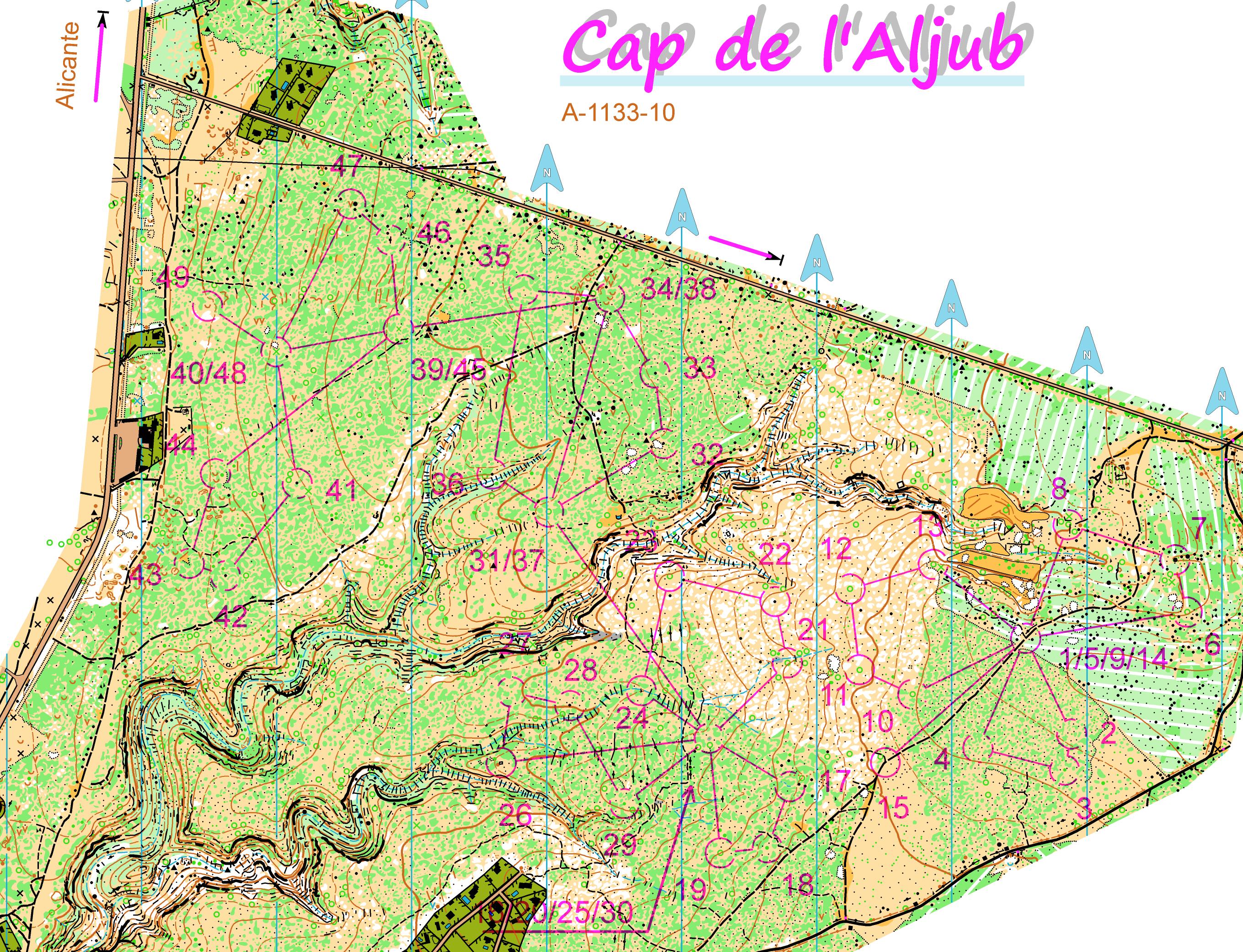
Then, there is these maps with plenty of intermediate sized land forms and details, on can map this with any scale and any generalization level and you can always get nice and usable map. Example: http://orienteeringmaps.net/doma/show_map.php?user...
Of course, one can argue what is the most fun generalization level.
* The way details are drawn. This is something mappers could do better. There is plenty one could do to improve in NAOC and BigE's map examples to improve legibility, without actually loosing much or any details.
* scale. Well, that's just scale. I believe no matter that the official scale has been or will be - 1:20, 1:15 1:10, 1:7500 - orienteers expectations, wow factors and business logics loop over again few raound in couple of years and steer the detail level to the point where we again play with legibility limits. And maps end up being more expensive / km2.
---
How to straighten this tailspin? I'd suggest something like this (again):
- Split ISOm in half. ISOM for generalized maps and ISOM for detailed maps. generalized versions are used or long races or relay. detailed ones for middle or relay.
- Detailed maps are about like today's "1:7500 "maps or slightly more detailed, emphasis on getting details mapped.
- generalized maps are 1:15 - 1:20 maps, slightly more generalized than todays ISOM. Legible if printed with laser printer at 1:15 000.
The business logics. When there is these two versions of ISOM out there and you order mapper to make detailed version you expect to get details, right? So mapper will map those details. If you order the generalized version, you expect to get generalized map (right?) and you also expect mapper to leave room for the detailed version of the same area (you may already have one), so mapper would have no reason to do nothing else than the generalized legible version, and no one would blame him for doing so. And customers wuuld judge mappers not by the way how map is drawn, not by what and how many details mapper has drawn. So business logics wuold steer mappers do better, more legible maps.
Scale would not be fixed any longer either, mappers would do map "offset printing at 1:7500" or "offset printing at 1:20 000" in mind, but if maps end up printed with less perfect technology and result doesn't look legible it it would bee ok to change scale last minute (it is quite stupid we now print map at same scale no matter what printing technology we use). So, scale would be one parameter to ensure legibility at last minute. If map isn't legible when printed with the printer you need to use for the event there will be no time to draw the map again, but there is time to change the scale.
Mapping would also become less expensive, you don't need to make large detailed maps any more. Smaller detailed maps would do and big more generalized aren't as expensive to make per km2.
Nov 15, 2012 8:14 AM
#
We all like stats and microdetail - perhaps Ken could come up with a ranking system for the quality of drivel on AP, perhaps with some reductions for quantity of verbosity and bonus points for insightfulness (or in tRicky's case incitefulness?). Or, even better, a fantasy league for technical blatherings. We could have a salary cap and form a league of Great Textulators!
Nov 15, 2012 12:17 PM
#
I have certainly used maps where the level of detail was done for reasons that I can't understand. I'm not talking about gold-mining terrain (though I have been on some poorly mapped gold-mining terrain), I mean like the map that edwarddes posted above. There's stuff on there that is of no use to the orienteer, no matter what scale it's printed at, that serves only to make the map more complicated and hard to read, and maybe to give the course setter an opportunity to put a control on a feature that doesn't really exist. Who is driving this? I can't believe that it's something that competitors are clamoring for. Are the mappers doing it just to show off? Are organizers demanding it out of a misplaced sense of what is good, or just to make sure that they have more detail than the previous meet? It's not all recent, either -- I've redrafted into 0CAD a map from 20 years ago that had many details (such as tiny blobs of gray) that I could barely make out with a powerful magnifier under bright light, that had no business on a map. Not to mention the numerous dot knolls that don't really exist that just make everything more crowded.
Nov 15, 2012 1:54 PM
#
Guys--why do you persist on harping on the edwarddes example? What is this an example of? It is not typical of mapping in the US, nor is it typical of the work of that particular mapper.
It would be much more constructive to attempt to understand the unique set of complex circumstances that led to that outcome, rather than armchair quarterback an isolated piece of paper, while using it as a cudgel in a much broader attack.
Let's cite other examples of hyper-mapping in the US and excessive $s/K here that illustrate a trend, rather than a one-off.
Nov 15, 2012 5:34 PM
#
coti:
Here I am back. Excuse me but it's too exciting
Excellent review of Jagge. I would ask you to read it carefully and attempt to deepen this
And I'd had something bring to your attention.
1. complex terrain maps, detailed cost much and because of this orientation can not develop.
2. 15,000 scale is the best orientation.
3. technology can not and should not affect the quality of a map.
4. On detailed maps, orientation turns into a game to find treasures.
Truths or just myths?
Things proven by advanced studies or personal opinions?
I will wait for comments
Nov 15, 2012 6:07 PM
#
pi:
@jagge, why two different ISOM? Just say that symbol sizes don't change with scale, e.g. a dot knoll is 0.75mm at 1:15, 1:10 and 1:7.5.
Nov 15, 2012 7:48 PM
#
Somewhere I read that there are three criteria for drawing something on the map:
1. would you hang a control flag on it?
2. would you use it to navigate?
3. would it impede your travel?
Any other detail is not useful to the orienteer.
1. would you hang a control flag on it?
2. would you use it to navigate?
3. would it impede your travel?
Any other detail is not useful to the orienteer.
Nov 16, 2012 12:37 AM
#
Those purple circles on edwarddes' map are of no use to anyone. I mean, they probably don't even exist on the ground.
Nov 16, 2012 1:13 AM
#
1. would you hang a control flag on it?
That is exactly the sort of thinking that can lead to over detailed maps. Read ISOM. There is vitually no mention of courses or control sites in the whole document (a couple of lines in section 2.1). Certainly not in section 2.2 which tells you what should go on the map.
I always laugh at mapping workshops (in the field) when someone says 'oh that's a great control site - gotta get that on the map'. If you map with that attitude the danger is you end up focusing on the smallest features and over exaggerating them and the big picture gets lost.
The mapper should not be thinking about courses or control sites. If it is good terrain and a good map, a good course setter will have no problem.
Nov 16, 2012 4:31 AM
#
why do you persist on harping on the edwarddes example?
Because it's the most recently posted map clip in the thread, and it's easier than scanning something else?
Let's cite other examples of hyper-mapping in the US and excessive $s/K here that illustrate a trend, rather than a one-off.
Surebridge Mountain.
Because it's the most recently posted map clip in the thread, and it's easier than scanning something else?
Let's cite other examples of hyper-mapping in the US and excessive $s/K here that illustrate a trend, rather than a one-off.
Surebridge Mountain.
Nov 16, 2012 4:50 AM
#
I would like to see other examples in the US if people would be willing to take the time to scan them.
Do you prefer Baileytown to Surebridge?
Also, does it constitute a trend if the trendline is not monotonic? 1993 to 2011 is 18 years, and I'd like to understand how we got from there to here. Presumably, there are other somewhat collinear data points?
In any case, I didn't realize that Surebridge would constitute such an example of hyper-mapping; efforts which some fear are are dooming the sport.
I know people have different tastes. Epunching may not be worth the hassle to some. Advertising is unnecessary to others. But, I am pretty sure--for better or worse--that Surebridge is within the range of expectations for a WOC map over the past 20 years. I guess our doom as been a long time coming.
Nov 16, 2012 10:28 AM
#
j-man, bits of Surebridge are terrible, at any scale. There's a bit where formline and cliff with dotknoll on top have a combined height in the terrain of maybe 1.5m. And that kind of mistake isn't unique (I'm not saying it can be found throughout the map either), I've seen it done with re-entrants there too.
Nov 16, 2012 11:47 AM
#
Baileytown and Surebridge are maps of differrnt areas. I do not find Baileytown to be deficient in terms of its utlity as a navigation tool (although I haven't been on that map in may years). Surebridge is difficult to read, due to the unnecessary clutter. Sebago has more comparable terrain to Surebridge, but it has different mapping problems.
Nov 16, 2012 2:33 PM
#
I'd say the real problem with all of them is they are underused! for a 20M metro area, there are fewer events by just about any metric than even in our neck of the woods. And it's not like, you know, there aren't large enough parking lots, or like there are $2–3k permits, or like the weather is awful most of the year... or like either of the three maps is so *ty that its use would stain the product so badly that anyone would get forever disgusted and never come back again.
Nov 16, 2012 5:06 PM
#
AZ:
Here's a theory - probably not very accurate, but maybe it helps to make a point.
Model of Mapper Development
Stage 1: Dabbling stage. Mapper starts to use OCAD and learn a little about ISOM. Makes some corrections to existing map. Most mappers remain at this stage
Stage 2: Novice stage. Mapper starts to take on larger projects, perhaps even making entire school maps
Stage 3: Intermediate stage. Mapper takes on bigger forest maps. Understanding of OCAD / ISOM increasing.
Stage 4: Expert stage. Mapper becomes full time and takes on important mapping projects. Expert at OCAD, thinks about ISOM a lot
Stage 5: Fading stage. Mapper loses motivation, or ...
The point is that IMHO everyone should use "Zero Tolerance" (or very, very close to it) unless they are in Stage 4. My experience with non-ISOM symbols has been overwhelmingly from mappers in the Stages 1-3 and according to my theory this is because they don't know enough about ISOM, they don't have enough experience mapping to know how to use ISOM, or they don't "think" about ISOM that much.
Nov 16, 2012 5:08 PM
#
AZ:
(It occurs to me that this leads to a Double O designation for mappers - license to kill (or at least mutate) - for Stage 4 mappers)
Nov 16, 2012 5:29 PM
#
@AZ
Stage 1 - add stuff to existing maps
Stage 2 - make maps with every little detail shown
Stage 3 - bring experience from 1 & 2 to real maps
Consequence = too much detail
(Guilty as charged)
Stage 1 - add stuff to existing maps
Stage 2 - make maps with every little detail shown
Stage 3 - bring experience from 1 & 2 to real maps
Consequence = too much detail
(Guilty as charged)
Nov 16, 2012 6:31 PM
#
Do you know in which stage is mapper when you decide to hire one?
How many clubs have its own mappers or even better, mappers in stage 4?
Many clubs here don't have their own club's mapper so in most cases they hire mappers from Czech. I think that scale and generalization is decided by organizer and mapper together. If mapper is in stage 4 than most of clubs must be in stage 3 and clubs decision prevail over mapper proposal.
Or....veterans who run clubs want detail maps on scale 7500 and 10.000 because they don't want to run with magnifier on 15K maps...who knows.
I think (guessing) that in the past mappers (stage 4) use approximately same amount of time to produce 15K as today 7.500 detail map so if they want to earn same amount of money they need to do something. Clubs are just not interested to produce 2 maps if they don't need it.
If number of orienteers is decreasing it would be logical that number of events and mappers would decrease and only the best have chance to stay on the market. In this way we should have more mapper in stage 4 than mappers (stage 1-3) but this is not true, at least in our case where less volunteers do more work to make same amount of events than in the past and we even have more (+MTBO, +TrailO, +SKIO).
Orienteers want to run on new terrains/maps and clubs constanlty invest in new maps, maps, maps, maps..... organizers must be full of cash or orienteers are spoiled babies who don't want to run more than 2-3x times on same map. So mappers just do their job to make what clubs want to attract enough orienteers to make money and produce new maps.
Marathon runners would not want to run on macadam road but I doubt that recreational orienteer can says: I will not go on the event if I can't run on ISOM map.
Nov 16, 2012 6:57 PM
#
Do we really have ISOM standard maps and orienteers understand the standard correctly?
I mean can organizer says in bulletin.... new map, ISOM 1:7.500 .... ISOM Branding is poorly comunicated because MC wants ISOM standard (0 tolerance) but they can't promote the ISOM label and they haven't been able to do marketing properly. They just want to have "ISOM standard" that nobody understand.
I mean can organizer says in bulletin.... new map, ISOM 1:7.500 .... ISOM Branding is poorly comunicated because MC wants ISOM standard (0 tolerance) but they can't promote the ISOM label and they haven't been able to do marketing properly. They just want to have "ISOM standard" that nobody understand.
Nov 16, 2012 8:23 PM
#
"Makes some corrections to existing map."
How about moving this from stage 1 to 2 or even 3 for high quality maps?
Nothing like having a good map where susequent changes are made at a lower standard (geometry or general understanding), which happens far too often.
This is valuable for the beginner mapper, but not the map.
"...everyone should use "Zero Tolerance" (or very, very close to it) unless they are in Stage 4."
Agreed.
Nov 16, 2012 11:14 PM
#
I am not sure you can map at ISOM zero tolerance standard without thinking about ISOM a lot and understanding it, which may come at the later stages of your development model.
I'll tell you if I ever get there.
I'll tell you if I ever get there.
Nov 16, 2012 11:44 PM
#
coti:
few WOC maps chosen randomly, but the list can continue indefinitely
WOC 2003 2004 2005 2001 2011
201 70% 23% 53% 6% 1%
203 11% 61% 5% 47% 40%
212 not used 75% 91%
401 1% 22% 4% 23% 14%
402 100% 100% 94% not used 89,6%
403 65% 38% 37% 56% 76%
404 99% 41% 96% 85% 99%
406 61% 19% 33% 61% 23%
407 no regularization………
408 72% 0% 34% 71% 50%
409 no regularization……………
410 69% not used 24% 9% 74%
Symbols ( percentage not according to IOF standard)
This percentage should have dissapeared from the maps
This is tolerance 0
and I guess it's level 4, right?
Nov 17, 2012 1:47 AM
#
I quite like AZ's model of mapper development. It is only a model though not a set of qualifications. In my experience club committees are at level one and can't recognise what level of mapper they are employing, let alone lay down criteria they want a map to meet. They don't know what they don't know. They get what the mapper thinks is best.
There's an additional problem where a (semi, or) professional mapper is a member of a club. Personal relations, not rocking the boat, etc prevent criticism or specifying standards of work for the club, even if there is the knowledge to do so.
As Graeme has suggested, the level of detail of a mapper initially increases, but somewhere in stages 3-4 the mapper starts to discriminate better, and/or develop ways of showing things more effectively. Compare with a painter using fewer brush strokes. This comes from awareness of the importance of legibility, onsite study of maps from all round the world, and thoughtfulness.
It follows that training (well IS there any?) of mappers through stages 1-3 should boost this discrimination ability. One thing that is fairly objective is the minimum sizes of things in the terrain for showing on the map. Many of these thresholds are 1m. I can't begin to estimate how many ankle-deep depressions I have seen mapped, and knolls and boulders that only have height on one side. Are you only supposed to approach from below??
Another thing, perhaps more debateable, is an over-emphasis on height consistency. In our desire for greater navigational challenge (perhaps fuelled by older orienteers who travel past features at a slower rate) we have deliberately sought out terrain types with many point features. You know what I mean: rocks, cliffs with many gaps, sand-dune and moraine humps and hollows. The DETAIL of the terrain is used as a selling point for events.
So of course in these very feature-dense areas its hard to fit everything in. The best guidance I have heard was from an Australian rock mapper, who said: I come into an area and ask, whick rocks put their hands up and say "pick me!" I put those on, and then around those any others that will fit, and then no more. In other words, above those size thresholds, he is mapping what is significant in context, not everything over a certain size.
A single tree in a field is a feature. We don't map every tree in the forest.
Nov 17, 2012 5:59 PM
#
Hello, I have tried to read and understand the whole discussion. As an elite orienteer I feel ambivalent about adjusting map scale to improve legibility. On one hand I was one of those who signed the petition for changing the scale for WOC2011 long distance but on the other hand I do not want orienteering to transform into "treasure hunt" which I believe could happen when bigger scales are allowed more and more often.
I struggle to see all important details on some 1:15000 and also some sprint maps and can feel how my orienteering is affected by it. Some of my mistakes are consequences of not seeing what is on the map. I really hope that it is not raining during the most important competitions so that I can use magnifier.
My problem is probably partly caused by worsening eyesight but I can see that I am not the only one. The use of magnifier is getting more and more common among elite orienteers. That is why I think that the symbol dimensions in ISOM (and even more importantly in ISSOM) should be followed strictly.
There are some terrains which can be more enjoyable to orienteer in when the scale is bigger (for example Le Caylar or some places in Portugal where I am now). I like to train on those detailed maps with scale 1:7500 and sometimes even 1:5000. BUT, I can see how my speed is decreasing. Do I want to have important competitions on such maps? Do I want the physical part of orienteering to become less important in future? No, I think it is good as it is now (even if there are of course differences between various terrain types).
I believe even "detailed" terrains can be mapped for 1:15000 but I guess the challenge to select what objects should be on the map is pretty tough. I think mappers should sometimes try to run through the terrain to get similar perspective as we who compete in it.
I know that for the Czech champs long distance 2012 the map was remade to work in 1:15000 scale.
Here is the new map: http://www.bestik.cz/mapy/show_map.php?user=vicko&...
and here part of the old map (southern part of the new map, sorry for the quality): http://evajurenikova.com/maps/05_t_kost.jpg
I have big respect for people making maps and I try to be careful with criticism. I just wanted to give my opinion. I am sure some other elite orienteers see it in different way.
I struggle to see all important details on some 1:15000 and also some sprint maps and can feel how my orienteering is affected by it. Some of my mistakes are consequences of not seeing what is on the map. I really hope that it is not raining during the most important competitions so that I can use magnifier.
My problem is probably partly caused by worsening eyesight but I can see that I am not the only one. The use of magnifier is getting more and more common among elite orienteers. That is why I think that the symbol dimensions in ISOM (and even more importantly in ISSOM) should be followed strictly.
There are some terrains which can be more enjoyable to orienteer in when the scale is bigger (for example Le Caylar or some places in Portugal where I am now). I like to train on those detailed maps with scale 1:7500 and sometimes even 1:5000. BUT, I can see how my speed is decreasing. Do I want to have important competitions on such maps? Do I want the physical part of orienteering to become less important in future? No, I think it is good as it is now (even if there are of course differences between various terrain types).
I believe even "detailed" terrains can be mapped for 1:15000 but I guess the challenge to select what objects should be on the map is pretty tough. I think mappers should sometimes try to run through the terrain to get similar perspective as we who compete in it.
I know that for the Czech champs long distance 2012 the map was remade to work in 1:15000 scale.
Here is the new map: http://www.bestik.cz/mapy/show_map.php?user=vicko&...
and here part of the old map (southern part of the new map, sorry for the quality): http://evajurenikova.com/maps/05_t_kost.jpg
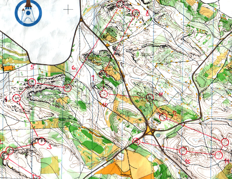
I have big respect for people making maps and I try to be careful with criticism. I just wanted to give my opinion. I am sure some other elite orienteers see it in different way.
Nov 17, 2012 8:56 PM
#
coti:
Hello Eva.
I am guilty because you used a magnifying glass in the final woc 2011. Regrets and I'm sorry that I could not do more legible map.
But I'm not the only guilty, I think ... Can not explained enough for 10,000 organizers asked twice, was not only an increase of 1.5 of the same map 15 000. So 1.5 more visible. With no object more or less. Same map, only 1.5 times more visible
Shit happens .... Map Maker badly or too complex terrain, or other reasons ....
But I think Isom and IOF must take into account all aspects.
WOC 2011 was made for 15 000. Mapping and Any extra were made in the spirit of 15 000. But it seems that was not enough
Being forced to run with a magnifying glass just to defend the holy 15 000, can understand.
What I do not understand is why no one asked if you used a magnifying glass or not.
I do not understand, how IOF could say it was a success after over 50% of you use a magnifying glass.
But I think we are talking too much for you. Maybe you should, because someone will ask what expectations and what you desire. Maybe your voice should be listened more often.
Nov 17, 2012 10:39 PM
#
Something people overlook ... Some mappers actually aren't very good. And some good mappers make poor maps (usually because they aren't paid to do a proper job)
It's very odd that we don't admit that. If I put on a meet, I can label it A B or C to say whether its going to be good or not. If I run, I get a time to say if I'm good or not. If I rush out a map for a training session - I can't. And before I know it someone puts on an big race on the map, and folk are on my case for crap mapping.
For many events we get away with a slightly iffy map. There's a limited amount of EricW time, and so the practical choice is between a graeme map and no map at all, especially if its an area only graeme thinks is any good*.
What to do?
* and if he's right, for sure the map gets used for a more important competition.
Nov 19, 2012 2:49 AM
#
bmay:
In general, what is the point of using a 1:10,000 scale instead of 1:15,000?
i) If the idea is, as ISOM states, to simply blow up a 1:15,000 map by making everything 50% larger, so that the mapping of 1:15 and 1:10 maps is supposed to be identical. Then, it would seem the basic advantage of using a 1:10 scale is to make it easier on the eyes. If this is the case, give me the 1:10 every time - why make the sport harder than it needs to be!
ii) If, alternatively, the idea of a 1:10,000 scale is that it should allow more detail to be mapped, then this is a different idea for sure than is suggested by ISOM. It is this idea that I think needs to be flushed out, particularly if it is actually common practice by experienced mappers.
It seems to me that we have three distinct disciplines of orienteering (Sprint, Middle, Long) and it's not unreasonable to think we might want 3 different types of maps made to match each of these disciplines.
A solution to the issue might revolve around:
1) Map 1:10 and 1:15 scale maps differently as suggested by Jagge. Maps that are intended to be used at 1:15 would need to be more generalized than those intended to be made at 1:10. Put extra details on 1:10 maps, to match the technical challenge that is supposed to go along with Middle distance orienteering.
2) Do not simply scale 1:15 to 1:10 by increasing everything by 50%. The simplest would be to use exactly the same size symbols (on paper) on 1:10 and 1:15 maps (as suggested by pi). This would immediately allow more detail to be placed on 1:10 maps than 1:15. Given that 1:15 maps are pretty tough to read, I think symbol sizes somewhere between current ISOM and the 50% blow-up of ISOM on current 1:10 maps would be appropriate. Use the same size symbols on 1:10 and 1:15 maps ... maybe 25% blow-up of current ISOM.
Nov 19, 2012 4:00 AM
#
When we have sorted out the long and middle, maybe we can address the sprint.
The scale for sprint orienteering is 1:5000 or 1:4000. The speci suggests that 1:5000 is suitable for most terrains, but allows 1:4000 without, interestingly, enlargement of symbols. Guess what. The last World Champs sprint was at 1:4000. The next World Cup sprint is at 1:4000. Interesting, there seems to be lots of "special" terrain around.
So elite orienteers in the prime of their life need 1:4000 to be able to read all the kerbs and pavement changes, and the little building ins and outs 2m deep. Well according to the maps served up anyway.
Well I'm of an age where I'm allowed a 50% bigger scale for the long. Can I have 1:6666 for my middles and 1:2666 for my sprints please?
Nov 19, 2012 8:29 AM
#
The suggestion by bmay and others that 1:15000 size symbols should be used on 1:10000 maps is wrong! wrong! wrong! Veterans (at least this one and many others with age-related visual problems) cannot read 1:15000 symbols while running. IOF introduced 1:10000 primarily for the World Masters in recognition of this.
Nov 19, 2012 9:49 PM
#
bmay:
The suggestion by bmay and others that 1:15000 size symbols should be used on 1:10000 maps is wrong! wrong! wrong!
Note that I didn't suggest that 1:15 size symbols be used on 1:10 maps ... I suggest that symbols bigger than 1:15 symbols be used on both 1:10 and 1:15 maps. In my opinion, 1:15 symbols (ISOM as currently written) are too small in many situations, so we should be using bigger symbols (for middle-aged as well as older orienteers).
Note that I didn't suggest that 1:15 size symbols be used on 1:10 maps ... I suggest that symbols bigger than 1:15 symbols be used on both 1:10 and 1:15 maps. In my opinion, 1:15 symbols (ISOM as currently written) are too small in many situations, so we should be using bigger symbols (for middle-aged as well as older orienteers).
This discussion thread is closed.