Discussion: Mapping multi-level sprint venues
in: Orienteering; Training & Technique
Apr 25, 2013 3:56 AM
#
Splitting off from this thread, where there was a bit of a detour into mapping underpasses versus canopies. I wrote:
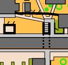
Just to illustrate the above a bit further, here's two examples from a map I made recently:

The right-hand example has a set of stairs that leads to a tunnel under the canopy on the north side of the building, under the building itself and out the south side. If you marked this as a canopy a runner heading east along the north side of the building could reasonably expect to turn right, rather than have to go left and down the stairs.
The left example is nastier - the upper level (at ground level on the north side) is actually a canopy in itself, but there is a solid wall on the south face. The stairs go down, and exit through the south face on the lower level.
I would be interested in anyone's opinion of a better way to map either of these, if there is one.
The problem arises when you have buildings built into the side of a hill, and the running level is different depending on which side of the building you're on. If you draw a canopy connecting to the uphill side then the runner could reasonably expect to see a passage at the main running level on that side, and then get horribly confused.
Just to illustrate the above a bit further, here's two examples from a map I made recently:
The right-hand example has a set of stairs that leads to a tunnel under the canopy on the north side of the building, under the building itself and out the south side. If you marked this as a canopy a runner heading east along the north side of the building could reasonably expect to turn right, rather than have to go left and down the stairs.
The left example is nastier - the upper level (at ground level on the north side) is actually a canopy in itself, but there is a solid wall on the south face. The stairs go down, and exit through the south face on the lower level.
I would be interested in anyone's opinion of a better way to map either of these, if there is one.
Apr 25, 2013 4:11 AM
#
I think there was a similar situation on the World Cup/Oceania sprint map in Wellington, maybe most similar to your left hand example - I don't think I visisted that part of the map so this was just my interpretation of the bulletin mapping notes - if I understand correctly it was avoided by only mapping one of the two conflicting levels and access into the other (lower) was taped off. If anyone more closely involved can provide clearer explanation, jump in.
While in a way that may feel like a bit of a wimp solution, it was probably the fairest way around the limitations of a 2Dsurface in representing a 3Denvironment.
With regards to your map I think the RH example clearly represents what you describe, I'm puzzled enough by both the map and your descrition of the LH example that I'd advise any course setters to just not go there, and I also wonder, to the north of your RH example if there should be breaks in the uncrossable black line where the zig zag path goes through it - I think you are trying to show the path goes under an elevated wall but looks to me like the path is walled off and unusable - that the wall that blocks access across the yellow continues above the sunken paths seems irrelevent to me. But these are the thoughts of someone with only passing familiarity with ISSOM
Apr 25, 2013 4:38 AM
#
This completely confused me at first. For starters I think I would separate the contour line from the wall - move it inside the building just a little. That lets you know that opposite sides of the building are on different levels which is otherwise not immediately apparent at least from this clip.
The left pass thru, I initially thought the passage was to the right of the dotted lines until it was described as being reached from the stairs. What are you trying to show other the two dots going horizontally at the bottom end of the left pass-thru?
No criticism if you - It just shows how hard it is to make multi-level immediately understandable to someone who has never seen the actual building.
Apr 25, 2013 6:10 AM
#
Nic, the paths on the right are blocked by a high fence. The gates are shown (crossing point) but because the black line goes through them, they are locked. The paths are not sunken.
Yes I have some experience of how this mapper draws things!
Yes I have some experience of how this mapper draws things!
Apr 25, 2013 6:30 AM
#
1. Those gates would probably be unnecessary, even if open, since they have paths going to them. A slightly wider opening (perhaps) in the thick black would be enough.
2. The LH example, firstly, thin black line plus contour = hard to read. Thin black line = crossable, so I would expect to get through there. Is the only way through via the stairs?
Then... how about a solid wall going from east to west, almost the whole way across, then turning north to force you into the stairwell and stopping at the stairs? Or maybe I'm misinterpreting.
Either way, for major race you may have to avoid it.
3. RH example. Is there a consensus on stairs and uncrossable walls? I would consider putting an uncrossable wall certainly on the west, probably on the east , and maybe just maybe on the south side of the stairs (the tunnel symbol showing one can get through).
4. Glad I'm not the mapper.
Apr 25, 2013 7:53 AM
#
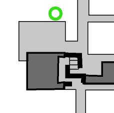
Thanks for your comments so far. Just to clarify the LH situation, here's how I might map it if I tried to map only one level:
Upper only:

Lower only:

The shape of the building walls is significantly different between the two levels, hence my attempt to show the lower level shape using the underpass symbol. Successful? Sounds like a "no" from most people. :)
@Nic - that wall is actually a fence, with locked gates - I tend to drop the tags off fences if they'll get in the way. (someone will probably take me up on my previous comments about walls-vs-fences now... :) )
@Mike - I'm trying to show the shape of the wall in the lower level...it's significantly different from the upper level. There's actually another bit of wall on the lower level making quite a narrow doorway, but there's no way I could fit that in as well.
@Neil - point taken about the gates - especially since I left off two more gates just to the west of these ones (on the tiny paths) since there was no room for them. Why did they need four gates within 20m? Who the #*&$ knows?
Upper only:
Lower only:
The shape of the building walls is significantly different between the two levels, hence my attempt to show the lower level shape using the underpass symbol. Successful? Sounds like a "no" from most people. :)
@Nic - that wall is actually a fence, with locked gates - I tend to drop the tags off fences if they'll get in the way. (someone will probably take me up on my previous comments about walls-vs-fences now... :) )
@Mike - I'm trying to show the shape of the wall in the lower level...it's significantly different from the upper level. There's actually another bit of wall on the lower level making quite a narrow doorway, but there's no way I could fit that in as well.
@Neil - point taken about the gates - especially since I left off two more gates just to the west of these ones (on the tiny paths) since there was no room for them. Why did they need four gates within 20m? Who the #*&$ knows?
Apr 25, 2013 7:58 AM
#
Also @Neil - I don't know if there's a consensus or not, but I tend to leave uncrossable walls off staircases wherever necessary. The alternative is this:
which seems like overkill to me. (and, IMO, also reduces the legibility of the lower passage)
Hey look, that fence is more readable if I take the gates out and put the tags in. :D
which seems like overkill to me. (and, IMO, also reduces the legibility of the lower passage)
Hey look, that fence is more readable if I take the gates out and put the tags in. :D
Apr 25, 2013 8:50 AM
#
Not this section, no - the high school wouldn't let us have access unless we hired a security guard. *rolls eyes*
Apr 25, 2013 8:51 AM
#
The LH example is really difficult to understand. I also had problems with "two dots going horizontally at the bottom end of the left pass-thru" Contour would definitely help.
It is hard to understand the restrictions of the movement on ground and lower level under the canopy symbol. In RH example the tunnel under the building is clear. Anyone can understand that the only moving area on lower level is inside the tunnel which goes thru the building. In LH example the tunnel under the canopy it is not clear. Is it possible to move around the passage on a lower level (under the canopy) or you can go down the stairs to the lower level and then only to the tunnel? How about...
1) In case you can't move on a lower level under the canopy symbol
Maybe a different color for passage symbol (red dots). So anyone can understand that different color for passage is signalizing that the only moving area is tunnel itself.
2) In case you can move on a ground&lower level under the canopy symbol
Maybe a different color or pattern for canopy symbol. The runners should immediate understand that there is the difference in levels and that you can move on all levels under the canopy. Canopy symbols - cyan (1 level) and other color/pattern (2 levels). Black dots for the passage.
Apr 25, 2013 9:58 AM
#
I'm trying to show the shape of the wall in the lower level
From these two additional pictures I can see that moving area in upper and lower level is not the same and that was my main problem with the interpretation of the first image. The dots in this case are misleading. Also the wall is misleading because it is not possible to see where is the entrance which leads to the staircases and on which level the wall is crossable or uncrossable. Maybe red line for wall (that spans over several levels) with dotted line to show the entrance?
And what Neil said: Thin black line = crossable
From the first picture it looks like the wall is crossable (but not clear on which level) and from the second picture it is clear that the wall is uncrossable at both levels.
Apr 25, 2013 10:25 AM
#
I think the RH map is way clearer with the uncrossable walls, for me.
LH: What about gross distortion? You don't want to put controls in this spot, so what you want is to show orienteers what they have to do to run through... so:
Shift the lower wall south a bit.
Then the upper level wall, move it north a bit, and the west end of it, turn it up so it goes north between the flights of stairs. Now, if you come from the south, you are forced by the map to turn left, then right, to the bottom of the stairs.
In your upper level map, you have a wall to the N and E of the stairs, keep it.
So, if you come from the North, the map forces you into the top of the stairs...
Could that work? Nothing will allow you to reconstruct reality; this way might, maybe, guide you through?
Apr 25, 2013 10:36 AM
#
for the LH example - the important things to show is that there is a staircase from upper to lower, and that the lower end of the staircase is offset from the doorway. As the lower level is the more complicated layout I would attempt to show it more accurately, with a connecting staircase to a simplified & distorted upper level.
Depicting the detail at the top of the stairs is not significant, as it won't be used for a control site anyway (I hope), and the stairs are the important and obvious feature. The area to the left of the top of the stairs can probably be ignored as it doesn't lead anywhere, and if it confuses a competitor then they have passed the stairs anyway
Depicting the detail at the top of the stairs is not significant, as it won't be used for a control site anyway (I hope), and the stairs are the important and obvious feature. The area to the left of the top of the stairs can probably be ignored as it doesn't lead anywhere, and if it confuses a competitor then they have passed the stairs anyway
Apr 25, 2013 11:01 AM
#
I think this works as long as the southern wall at the upper level is solid, & not windows or partially open
 |
| From things |
Apr 25, 2013 1:31 PM
#
Wow, this looks great. The life-affirming power of Attackpoint! (cf. "adversarial").
Apr 25, 2013 2:49 PM
#
Interesting discussion. But it makes you wonder - if we (as knowledgeable people all looking at this in the comfort of our homes, with unlimited time) are having such difficulty with this (and I still don't think I can picture what that LH example really looks like) - how can we expect people to be able to sort it out on the run, in the heat of competition (especially beginners)? This is not meant to be a criticism of the mapper in the least, but at some point we may be at the limit of what we can reasonably do and show; and at what point are we 'harming' orienteering by using such kinds of maps and areas? We may be attracting a progressively smaller and smaller audience. (Links to ideas in another current discussion thread I think).
Apr 25, 2013 2:58 PM
#
The worked-out example by rockman and ndobbs seems pretty evident and attractive to me!
Apr 25, 2013 4:03 PM
#
I really like how rockman and ndobbs show the left passageway. For the right passageway I prefer the stairs with the impassable wall around it - it shows more clearly which side you enter the stairwell from.
I would add that tunnels are almost always more legible when used in conjunction with the bridge symbol. For the right I would do that as follows:

I would add that tunnels are almost always more legible when used in conjunction with the bridge symbol. For the right I would do that as follows:
Apr 25, 2013 4:14 PM
#
@upnorthguy, yes, it is close to the limit, the goal was to make it as easy as possible for the runner given the terrain... one has similar problems in really detailed natural terrain too, where some areas are too detailed to show all conspicuous features...
@T/D, I thought you were being sarcastic, the previous post...
@T/D, I thought you were being sarcastic, the previous post...
Apr 25, 2013 5:34 PM
#
Why? seems clear... you can try to figure out a maze, or just go around the building on the west. Wouldn't be as clear in the original revision.
Apr 25, 2013 8:16 PM
#
Really excellent re mapping suggestions by Ndobbs and rock man, as I was thinking along the same lines, just map it so the competitor can see his way through.
The uncross able walls define where the top and bottom of stairs are, really important.
Mapping reality of 3 dimensions is impossible at times, so showing a path is what the competitor really needs.
The uncross able walls define where the top and bottom of stairs are, really important.
Mapping reality of 3 dimensions is impossible at times, so showing a path is what the competitor really needs.
Apr 25, 2013 9:29 PM
#
Nice point, Canadian, about combining the bridge and tunnel symbols. Aesthetically, I really like the way it highlights the start and end of the tunnel. Although in this case the gap between the bridge symbol and the impassible wall is a little annoying.
It's a little bulkier, but I also think the use of the Impassible wall in Juffy's revised RHS is excellent, and clean to read. If it takes up too much space, you must be willing to spatially shift some of the features around by a couple meters to make room. I think the walls around the stairway are essential for communicating that there is an elevation discontinuity there. (This usage is also supported by ISSOM: see 529.1, and the example that is given in conjunction with symbol 708.1). I'm just not sure of the best way to highlight the south facing exit for symmetry.
The removal of the gates on the fence in Juffy's second example was also a HUGE improvement. There is no need to use the "gate" symbol (technically a crossing point) like that unless there is actually a gap the runner can pass through. Even then, 525 is a kindof awkward symbol for use in urban areas. Even if those gates were freely passable, I would not highlight them with 525 in this case, because the area is too crowded. Just put a gap in the fence, and let the paths running through the gap highlight the passability.
Apr 25, 2013 9:44 PM
#
Thinking about this: one place where ISSOM can stand to be improved is its definitions of bridges and tunnels... The bridge symbol, in particular is defined with respect to letting people pass over something. But it says nothing about the passability underneath. Which I think leads to ambiguous mapping.
In practice, I only use the bridge symbol for tall bridges if there is passability underneath the bridge. If you cannot pass under the bridge, I simply use the impassable wall symbol.
Thus, I tend to think that instead of a bridge symbol, it might be better to have an "underpass entry and exit" symbol.
The other issue is the low bridges: bridges which aid you in crossing a small creek or ditch, but which can easily be hurdled from any direction. In this case, I usually find it unnecessary to include the bridge symbol at all.
(And, while one could argue that 708.1 can be used to highlight passability in one direction or another when it's important, the problem with 708.1 is that it looks identical to 707, which forbids crossing in the other direction.. I think there is a need for 'permeable' magenta line that can highlight without forbidding).
Apr 25, 2013 11:43 PM
#
But it makes you wonder - if we (as knowledgeable people all looking at this in the comfort of our homes, with unlimited time) are having such difficulty with this - how can we expect people to be able to sort it out on the run, in the heat of competition?
This was exactly why I started the thread - I wasn't happy with how I mapped the LH staircase, but couldn't sort out a better way without distorting the map excessively.
Having said that, I really like ndobbs' and rockman's suggestion...while it does distort reality a bit, it's a far better solution than my original one. Thanks guys. :D
Consensus does seem to be that the impassable wall around the RH example is also better...I think this feeds into the previous discussion about impassable walls being visible from the top, and I think I've actually been a bit inconsistent between my arguments on AP and my actual mapping - from above all you see of the U-shaped wall is a waist-high railing, but obviously it's surrounding a significant drop into the staircase and should be shown as impassable. Huh.
@Canadian - that's an interesting use of the bridge symbol, I hadn't considered using it in that context. *ponders*
Next week we'll talk about multi-level buildings where you have a covered walkway on two levels, both of which could be considered "the main running level", but the two walkways end at different points....
Dammit, I hate it when I learn things on the internet...:)
Apr 26, 2013 6:09 PM
#
I like what rockman and canadian drew, especially using the bridge to avoid any need to run through the uncrossable wall symbol.
There's a cute negative inference in rockman's example, whenever you run through a uncrossable wall on the map which isn't actually there, it means you're not on the "main running level".
I notice you both left off the contour - what would you do with it? More trouble than it's worth I'd say.
There's a cute negative inference in rockman's example, whenever you run through a uncrossable wall on the map which isn't actually there, it means you're not on the "main running level".
I notice you both left off the contour - what would you do with it? More trouble than it's worth I'd say.
Apr 29, 2013 7:19 AM
#
My head is sore.
I note that in comparatively simple rural situations we recommend the use of slope tags on contours, rockfaces and cliffs to show the down direction. If we broke free from the ISSOM stair symbol to one that could show what was the down direction, the brain could possibly click onto what is meant.
I note that in comparatively simple rural situations we recommend the use of slope tags on contours, rockfaces and cliffs to show the down direction. If we broke free from the ISSOM stair symbol to one that could show what was the down direction, the brain could possibly click onto what is meant.
Sep 1, 2018 11:07 PM
#
Bringing back this discussion, but with a new question. I'm mapping a riverfront area that has several overhead freeways, and a pedestrian bridge. At this point, I've mapped only the bridge pillars and all of the features on ground level (the main running level), and steps going up to the pedestrian bridge. The question is, is there an ISSOM compliant way to show these freeway "flyovers", perhaps with some sort of shading or indistinct border. In places they are only 3 or 4 meters above the ground, and 4 or more lanes wide, so they are pretty obvious to the runner and somewhat dark underneath. But they can't just be mapped as pass-thrus because there is a huge amount of mapped detail underneath (vegetation, paths, even a playground, a building with restrooms, ...)
Sep 2, 2018 12:11 AM
#
I haven't seen the area in question, but I've come across the same issue before. In that instance, the bridge span was 30m above the ground, so I just mapped the ground level, including bridge supports, and completely ignored the span above.
In your case, I might try a few things, such as a thin black line for pavement edge (or even a thin gray line) for each edge of the bridge span above. It would show the correct passability, and depending on what the freeways look like elsewhere, it might be pretty easy for runners to "connect the dots" so to speak, and figure out that the thin lines are the shadow of the bridge.
Another alternative would be to create a set of area symbols slightly darker than spec and use those underneath the bridge only. For example, if there's some lawn down there, create a yellow that's 5% darker and use it for that area. I've done something similar before with the out-of-bounds cross-hatching with a pass-through underneath.
Sep 2, 2018 12:16 AM
#
It's not a sprint map, but here is the exact same situation using the thin black line method to connect the two ground level parts of the freeway.
.jpg)
Sep 2, 2018 3:03 AM
#
Thanks, PinkSocks. I'll see how it looks. On your forest map, it looks great. For this sprint map, I had dismissed the idea of a black line because there are a number of pavement edges, fences, etc under the bridges, some portions of which are nearly parallel to the edges of the overpasses, so I'm a little afraid of causing confusion with more black. the 5% darker shading sounds like an interesting idea...
Sep 2, 2018 3:20 AM
#
Here's a similar situation from Rochester sprint in 2014, but only a few major features are shown along with the canopy symbol and the pillars. Perhaps the dotted line edges like this map rather than a thin solid line, and then the darker shading for everything underneath.
http://www.vmeyer.net/gadget/cgi-bin/reitti.cgi?ac...
http://www.vmeyer.net/gadget/cgi-bin/reitti.cgi?ac...
Sep 2, 2018 5:49 AM
#
Dotted/dashed lines showing the extent and shape of the overpass would make intuitive sense to me as a map user ...whether the mapping specs allow the map maker to do that is another question.
Sep 2, 2018 1:38 PM
#
GuyO:
The venue for SLOC's 2011 US Relay Champs had a tall, 10-lane freeway viaduct crossing it. IIRC, the map only showed the footprint of the supports.
Sep 2, 2018 2:45 PM
#
DVOA (and EMPO, following their example) mapped an overpass (I-78 over Saucon Creek on the Star Village map) with navigable features underneath using just the dotted or dashed line for road edge, and support pillars mapped. Roadway wasn't accessible by orienteers. If your overpass is, I'm not sure how that could be handled. Note: this was for an ISOM map, not ISSOM.
Sep 2, 2018 3:49 PM
#
I'd be reluctant to modify ISSOM symbols. My inclination, if there is a lot of interesting detail under the overpass, would be to ignore the overpass and map the ground level detail (including support pillars). That's what the orienteer will see and will use to navigate.
Sep 2, 2018 8:19 PM
#
One solution would be to use symbol #518.1 (Underpass or Tunnel) to show the edges of the upper level. While not technically to specification either, it does only use unmodified ISSOM symbols.
Example on the left hand edge of this map: https://orienteeringcalgary.ca/maps/rendering/227
Example on the left hand edge of this map: https://orienteeringcalgary.ca/maps/rendering/227
This discussion thread is closed.