Discussion: ISSOM20XX
in: Orienteering; General
Feb 7, 2018 11:42 PM
#
My federation has received a draft of a new ISSOM. Can't find it on the IOF website yet. Maybe I should ask for the website to have a larger scale:-))
Feb 8, 2018 5:30 AM
#
I'm not sure I'm a fan of the 519 Passable Wall symbol replacing the gray wall symbol because it won't work very well with short (in length) walls. I like the current gray vs black of passable vs not. The color difference is easier for me to read at speed than a difference in thickness of black (using 521 vs 203).
Feb 8, 2018 8:19 AM
#
ISSOM 201x final draft:
http://orientering.no/media/filer_public/13/25/132...
What has changed from ISSOM 2007:
http://orientering.no/media/filer_public/e3/82/e38...
ISOM 2017 Appendix 1- CMYK printing and colour definitions:
http://orientering.no/media/filer_public/60/6a/606...
and
https://www.facebook.com/groups/485564718218028/?m...
Feb 8, 2018 9:17 AM
#
Who wrote this pish...
So impassable walls, fences, pipelines, and marshes are explicitly not to be crossed, but impassable crags, vegetation, and water are fine?
So impassable walls, fences, pipelines, and marshes are explicitly not to be crossed, but impassable crags, vegetation, and water are fine?
Feb 8, 2018 12:41 PM
#
There are lots of good changes here to aid clarity, and they learned from things people started doing out-of-spec (e.g. different browns for busy roads, 1:4000 as base scale, 519 in place of the grey wall). I'm glad the very dark green "forbidden to pass" veg has gone. I like the emphasis on size of gaps. I like that mapmakers don't have to decide is an area is "urban" of not when choosing symbols.
They copied green=60-80% normal running speed from ISOM. Since sprint is mainly on pavement, pretty much any woods will be green (which is good).
I like that they ditched the very dark "impassible" green which was too often used for weak forbidden features like flowerbeds. Impassible hedge was a useful symbol, but extending the definition of "Wall" to cover "Wall of living vegetation" should cover it.
Making maps as straight enlargements rather than preserving feature dimensions is going to save me soooo much time: Hurrah :)
Downsides, as Nixon said, the "you will be DQ'ed if you cross this" has got a big vague. e.g. they carefully define "shall not", "may not" "should not" in 1.1 - then use "can not" in the text 8).
Similarly "An impassable fence or railing shall not be crossed, due to danger to the competitor or because of its height.". How to read this in the real world when people go through open gates?
Another typical IOF failing is not to consider urban races (Edinburgh, London etc) which, certainly in the UK, are the most common events using ISSOM maps. Most of these are legible at 1:5000 while the map becomes unmanagable at 1:4000. They also ducked the "two levels" issue, where we really need a symbol that means "you can get straight through at higher or lower level, but you can't go from one to another". Using the purple overprint gets very messy here.
Feb 8, 2018 1:25 PM
#
Note that it isn’t ISSOM202X or ISSOM201X but rather is ISSOM20XX allowing for up to 81 years of AP mega threads.
Feb 8, 2018 1:31 PM
#
they carefully define "shall not", "may not" "should not" in 1.1 - then use "can not" in the text 8).
I think you can put that down as just a mistake - It is a first draft.
We really need a symbol that means "you can get straight through at higher or lower level, but you can't go from one to another
that would be nice but if there was easy solution to that problem someone would have come up with it already. Any suggestions Graeme?
Feb 8, 2018 1:37 PM
#
Another typical IOF failing is not to consider urban races (Edinburgh, London etc) which, certainly in the UK, are the most common events using ISSOM maps. Most of these are legible at 1:5000 while the map becomes unmanageable at 1:4000
But those events aren't IOF level events (WRE +) and aren't going to be unless the IOF creates a new event format. So you can do what you like. Keep making those maps at 1:5000 using the symbols/dimensions from ISSOM20xx - no one is going to be confused by that. If you start expecting ISSOM (or ISOM) to cover every event format that anyone has ever come up with it will take 81 years to finish.
But those events aren't IOF level events (WRE +) and aren't going to be unless the IOF creates a new event format. So you can do what you like. Keep making those maps at 1:5000 using the symbols/dimensions from ISSOM20xx - no one is going to be confused by that. If you start expecting ISSOM (or ISOM) to cover every event format that anyone has ever come up with it will take 81 years to finish.
Feb 8, 2018 2:36 PM
#
rm:
519 Passable wall
I'm with Pink Socks on this. A lot of the passable walls that I see on sprint maps are short, bent sections in busy areas, rather than the passable walls one sees in the forest, with long straight-ish sections and sparser surrounding detail. In forest, this symbol works fine in my experience. The dots, I suspect, will become a problem in urban areas. Maybe a test map or two would be useful...convert a few existing maps to ISSOM 20XX, if someone has ISSOM map files with lots of passable walls.
518.1 Underpass or tunnel
Isn't this what you're asking for graeme? (i.e., the "two levels" issue, where we really need a symbol that means "you can get straight through at higher or lower level, but you can't go from one to another") Or is there something else you're wanting?
Feb 8, 2018 2:58 PM
#
rm:
BTW, I wonder if changing passable wall from grey to black is an artefact of limiting oneself to six or seven spot colors. Now that the Map Committee seems to be largely accepting that CMYK is the reigning technology, perhaps one should consider further map colors. Keeping it fair for color impaired people would be a challenge, as it already is, given the variety of color impairments. But it might yield an option for, say, passable wall, without the printing problem mentioned for grey. It needn't be representative, as most current colors are (green for bushy vegetation, blue for water, brown for ground, yellow for fields of wheat, black/grey for rock/artifice). Purple doesn't represent anything, but is a fine color, as perhaps is olive.

Feb 8, 2018 3:06 PM
#
I have also thought about a combination brown/grey symbol for split levels: 
But probably the symbol is too 'complicated' to be workable in practice. And maybe it would create even more confusion than it would solve.
The map sample is a car park at Dalhousie university:
https://www.google.co.jp/maps/@44.6367322,-63.5955...
But probably the symbol is too 'complicated' to be workable in practice. And maybe it would create even more confusion than it would solve.
The map sample is a car park at Dalhousie university:
https://www.google.co.jp/maps/@44.6367322,-63.5955...
Feb 8, 2018 3:12 PM
#
Keep making those maps at 1:5000 using the symbols/dimensions from ISSOM20xx - no one is going to be confused by that.
I'm not talking about every format, I'm talking about the format for which ISSOM maps are most widely used.
Not confusing? Suppose I come from above to a stone-faced vertical drop. Is the map showing...
a) 0.4mm black line (521.1) using dimensions from ISSOM20xx?
b) 0.375mm black line (203) using a rescaled from 4000 ISSOM20xx
Misreading it will get me disqualified! A standard should be a standard, and it wouldn't exactly be hard to say in the spec.
Feb 8, 2018 3:36 PM
#
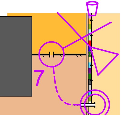
Overpasses. The problem is when there isn't enough room for two lines of dots, e.g. under a bridge or where one edge of the tunnel is a wall which continues far upwards. New spec requires 1.25 mm (=6m) for the minimum 2 dots.
An area symbol in the way rob used brown/grey is the better solution.
In the early days, I (ab)used the canopy symbol.
http://omaps.worldofo.com/?id=16291
Here's what BOK did, (ab)using different paved colours for places where there are two levels
http://www.go78.org/doma/show_map.php?user=Jane.Ca...
gg's maps of the entrance to Stirling castle used the crossing point braces (control 7)
https://ol-shop.at/erik/maps/show_map.php?user=eri...
many were confused.
I believe that in current ISSOM it is allowed to go under a bridge, but the new spec requiring a crossing symbol suggests otherwise
Feb 8, 2018 4:30 PM
#
With the removal of the gray wall, they suggest two options:
519 Passable Wall. This requires a minimum wall length of 20.6 meters, because since the linear symbol has dots, it's required to have two dots (spaced 3.75mm), plus the width of the dots (add 0.6mm), and space on either side of each dot (add another 0.8mm). That's a minimum 5.15mm on paper, so 20.6 meters in terrain. That can be a long wall!
203 Passable Rock Face, which is 0.3mm thick.
So an uncrossable wall of any length, it's 0.4mm thick. If it's a passable wall over 20m in length, it's 0.21mm thick (with dots). If it's passable and short in length, it's 0.3mm thick (which I feel is not enough different than the 0.4mm variety).
---
Impassable linear hedge? If I'm reading this correctly, the previous color (green-black) was removed and it'll be just green. 100% green is illegal now?
Feb 8, 2018 4:53 PM
#
519, Yes 20m is a long wall. They'll need to clarify the two-dots rule : it does say "It should be dotted if possible" so a 0.21mm line around, say, a walled flowerbed may be the best option.
I don't think 100% green is illegal to pass, but nobody runs at almost 0% speed through bushes. Hedges on the other hand are a problem. It looks like to make a hedge illegal to cross, you have to use purple (which covers 100% green, so you can't see what it is you're not to cross)
I don't think 100% green is illegal to pass, but nobody runs at almost 0% speed through bushes. Hedges on the other hand are a problem. It looks like to make a hedge illegal to cross, you have to use purple (which covers 100% green, so you can't see what it is you're not to cross)
Feb 8, 2018 6:19 PM
#
Yeah, if gray is off the table, I think I'd just use the .21 black and make it dotless. I'm seriously going to miss the gray. I just mapped an area with several low and wide bench-wall things. I mapped them plan shape as passable wall gray. If I bounded them with 0.21mm black, I think the area would be too small and it would look more like a fatter strip of uncrossable black. With ISSOM 201X, I'd probably bound them with pavement edge instead. Better legibility than the alternative, but I'd lose the ability to define it as a low wall.
I don't use the green-black often, but there's a rose garden on a map extension I'd like to make, and there are rows of roses and other flowers (illegal) within an otherwise yellow area. Thin strips of olive don't contrast well against yellow, so I was planning on using green-black. I suppose I should use OOB purple?
I don't use the green-black often, but there's a rose garden on a map extension I'd like to make, and there are rows of roses and other flowers (illegal) within an otherwise yellow area. Thin strips of olive don't contrast well against yellow, so I was planning on using green-black. I suppose I should use OOB purple?
Feb 8, 2018 8:19 PM
#
I'm okay with not using 5m contour interval at sprint scales for almost all terrain. Some very steep terrains might be an exception.
But I can't see limiting the minimum interval to 2m. For areas that are almost dead flat, it probably doesn't matter. But for some areas with interesting but small features, you can greatly improve the number of control locations by mapping at 1m (which I'm sure about) or 1m with formlines (which I'm not sure about). I set some sprints last summer with controls in fields that you couldn't see until you were 10-15m away from them. You could see the U-depression as you approached, but not the flag. A 2m interval means it's harder to use these nice, small terrain features. And I'm talking more about fields and mown lawn areas. In the woods, and on complicated flood plains, it's a completely different story, and a smaller interval would probably be a mistake. (For example, lidar in open areas is often very good, but in the woods it's often not at these very small contour intervals.)
There is a case to be made for intervals that are related to "normal" intervals. If 2.5m is normal, then 1.25m (with or without 0.625m formlines) might make maps that are used as ISOM and ISSOM easier to maintain.
Feb 8, 2018 8:21 PM
#
And I'll again complain about the "IOF major event" nature of this standard. I'd rather see an option for 1:5000 or 1:4000 and the map commission assurance that the standard is okay to print at 1:5000, even if the competition rules might require 1:4000 for major competitions.
Feb 8, 2018 9:43 PM
#
I'm a little annoyed that they have decided to remove the very dark green. It was often used to mark flower beds which made it much easier to distinguish than the typical olive green (I am colour blind). And I am also very against the new symbol for a crossable wall... why change it?!
Feb 8, 2018 10:03 PM
#
Recalling a conversation I had with Spike some time ago---and this is his idea---There needs to be more print experimentation.
Wouldn't it make sense to have printable files that show pieces of maps rendered with different symbols?
Without maps in hand, it's really hard to argue some of these topics.
Wouldn't it make sense to have printable files that show pieces of maps rendered with different symbols?
Without maps in hand, it's really hard to argue some of these topics.
Feb 8, 2018 10:56 PM
#
MCrone, the dark green was definitely way better than olive green. I think all gardens should be done in dark green. Olive green can be kept for private/residential out of bounds areas but I've never liked the fact that olive green means both gardens and the like which you can see in the terrain and navigate around and some invisible feature (private out of bounds feature of any sort) that you only know is out of bounds because of the map symbol.
Feb 8, 2018 11:00 PM
#
Now, I haven't actually read the document in depth, but it seems they've done nothing about the 1.6 or 2m wide (now just 1.6m) impassable wall and fence symbols. I've always seen this as one of the key flaws of the ISSOM. The number of times I've had to find a solution to drawing one or more impassable walls or fences in a narrow area is too high to count. Distortions work to an extant but they can be a pain and in some cases just aren't entirely feasible. It is very common that mappers use a thick edge of pavement symbol or passable fence symbol on wheel chair ramps and other such details. It works fine in terms of legibility and understanding of the feature but I wish the spec would have a proper solution to such a common issue.
Feb 9, 2018 12:15 AM
#
rm:
Mm, I'm not a fan of dark green for "mustn't go there". My forest orienteering mind thinks "hedge", and then I go running up confusedly looking for dense bushes, until I realize that the wood chips and teensy flowers in front of me are the dark green on the map. I'd rather a purple screen for out of bounds...fairly highly visible, and not a color used to depict actual features generally. I.e., a distinct depiction of "must/mustn't" from the depictions of "is".
Feb 9, 2018 7:39 AM
#
Some things I've wanted, and some things I still want to change. But keep the discussion flowing. We want more time, surely? My federation has been given until 1 May for comments. There wasn't even a call for submissions on this one.
Something we need to solve outside the spec, is that organisers need to tell participants what the rules are. We have urban maps used for sprints and urban maps used for non-sprints. We have middles and longs and other lengths using ISOM2017 and ISOM2000 (and will have for some time). We have small forested reserves using 1:5000 versions of ISOM. It is rare to get a statement up-front of the spec being used, and what is not allowed to be passed or crossed.
I have the feeling that the spec under discussion would be better termed ISUOM (Urban).
Feb 9, 2018 5:48 PM
#
rm:
"519 Passable wall...
It should be dotted if possible"
Presumably this is to allow the wall to be depicted not just in short sections but also in complex areas that don't afford the space for both dots and legibility/intelligibility.
Maybe there could be an optional or mandatory thinning of the line when omitting dots to enhance both readability and distinction from impassible wall.
(Aside on 1.5m maximum: Even at 188cm, it rarely crosses my mind to vault when a wall's over a meter high. But this may again be the difference between elite and non-elite use of urban (and non-urban) maps. Certainly, depending on footholds and ability to haul oneself up, 1.5m is probably plausibly crossable for most fit people?)
Feb 12, 2018 1:52 AM
#
Michael C - I don't know much about colorblindness - is the biggest problem seeing the difference between light green, light yellow and olive green?
I have sometimes wondered if giving the olive green some 'texture' might help? For example:

You could play around with the color, size and spacing of the dots. As is often the case very small areas would be problematic.
I have sometimes wondered if giving the olive green some 'texture' might help? For example:
You could play around with the color, size and spacing of the dots. As is often the case very small areas would be problematic.
Feb 12, 2018 2:30 AM
#
I think there are lots of variations in colorblindness. I will say that I didn't notice that there were two colors in the middle circle until I read the words. I can see that there is a difference but it's fairly subtle. That's in context, though -- if I just had an area of one of those two colors in isolation, I might not be able to tell which it was.
Texture may be a good idea. One thing I'll note is that there was less of a problem in the says of spot color printing. A dot screen of full green or full yellow dots is easier to identify than a lighter color, though I don't think it's the texture that helps.
Texture may be a good idea. One thing I'll note is that there was less of a problem in the says of spot color printing. A dot screen of full green or full yellow dots is easier to identify than a lighter color, though I don't think it's the texture that helps.
Feb 12, 2018 6:15 AM
#
A good thing about this - recognition that most sprint events are using 1:4000. Does it mean this MC has a less hard-line view on ISOM scales? OTOH this document is called "Final Draft". That looks fairly hard-line:-))

Feb 12, 2018 11:52 AM
#
"Does it mean this MC has a less hard-line view on ISOM scales?"
No.
No.
Feb 12, 2018 3:19 PM
#
@rob, sometimes the texture will help, but it is tricky and you need to test lots of different combinations while running at speed. For me the most noticeable improvement was using the darkest green for flower beds. Otherwise I could tell that there was olive green, but I was unable to see the boundary of the olive green and the orange. As someone also mentioned, this is very printer dependent. Offset printing is much better than laser printing and I almost had a heart attack last year when they reprinted the WOC maps using laser printing at the last minute.
As someone mentioned earlier I also have a big problem with 30% green and yellow 50%. On a forest map I can tell them apart when they are side by side, however, if there is a small clearing with yellow I can't tell by looking at the map if it is light green or yellow.
As someone mentioned earlier I also have a big problem with 30% green and yellow 50%. On a forest map I can tell them apart when they are side by side, however, if there is a small clearing with yellow I can't tell by looking at the map if it is light green or yellow.
Feb 12, 2018 6:26 PM
#
I definitely prefer the halftone green above, but that's just me.
I've had cases of running down a trail intending to turn into the rough open area, only to find when I got there that it was vegetation difficult to run. Never happened with spot color printing.
I've had cases of running down a trail intending to turn into the rough open area, only to find when I got there that it was vegetation difficult to run. Never happened with spot color printing.
Feb 12, 2018 8:35 PM
#
rm:
I wonder what it is about spot color that makes it more readable for you JJ? Given the dot screen used in the bottom half of the green in the second image, perhaps you're seeing differences in the dot screens for yellow and green, which perhaps were printed somehow differently? And more importantly, is there a way to get the same in CMYK? Maybe we're drifting slightly off topic here...perhaps worth another thread.
Feb 12, 2018 10:01 PM
#
Holding my phone far enough from my eyes (with my glasses off) that the dots in the lower left quadrant all blur together, the difference is still significant. The upper quadrant is much more of a yellowish spring green, while the lower one is bluer.
Feb 12, 2018 11:32 PM
#
rm:
I see what you're saying JJ. So is it a matter of color choice with CMYK, rather than printing technology per se? Did the colors change a tad to make them work better with CMYK, and deviate from the ISOM/ISSOM Pantone colors? (OCAD and OOM seem to differ on CMYK percents for each map color.)
Feb 12, 2018 11:47 PM
#
rm:
On the question of better showing overpasses and underpasses, would it be feasible to show them by making the fill color of pavement a function of altitude? This is similar to the BOK strategy linked in graeme's post, but generalized to change the fill color from near-white at the highest altitude on the map to near-solid brown at the lowest, in a continuous gradient by altitude. Unusual idea perhaps, but what was the reaction to BOK's use of the similar strategy in their map?
(This assumes that multilevel areas are all paved without canopies above the top level, which may not 100% be the case. Perhaps this could be remedied by changing some additional colors by elevation. It also assumes that the difference between two levels will be a significant percentage of the overall elevation range of the map, which might possibly not be the case in some hill cities, but I'm not sure. 5m difference between levels versus...what's the biggest elevation range of an ISSOM (not ISOM) map?)
(This assumes that multilevel areas are all paved without canopies above the top level, which may not 100% be the case. Perhaps this could be remedied by changing some additional colors by elevation. It also assumes that the difference between two levels will be a significant percentage of the overall elevation range of the map, which might possibly not be the case in some hill cities, but I'm not sure. 5m difference between levels versus...what's the biggest elevation range of an ISSOM (not ISOM) map?)
Feb 13, 2018 1:39 AM
#
Some CMYK maps are fine, but the colors are anything but consistent from map to map. People tweak the color table until it looks right to them. And what works for RGB on the screen may look very different when translated to CMYK. With spot color printing, there was much more consistency, with some notable exceptions like the fact that in Norway the green was very yellow and in Sweden it was very blue. But US maps mostly came from Newell and looked the same. I recently fixed the color table on a map in NH, and there was widespread agreement that is was a big improvement from prior years.
Feb 13, 2018 2:02 AM
#
Sure I get that not all cb people are alike - but presumably there are some things that can be done that will help the majority. I have heard from several cb people that they find the olive green problematic. Obviously any suggestion would need to be tested and refined but I just wondered if the general idea of textured area symbols is worth pursuing. Also I would guess there is a big difference between how things look on a screen and how they look on a printed map (as well the difference due to printing processes).
I can see that the very dark green would be a godsend for anyone who has trouble distinguishing the olive green. But for me it is too dark - too like black - easily mistaken for a boulder say. Or mistaking a hedge for a stone wall. But maybe that could be solved by making the very dark green a little less dark rather than just abandoning it altogether. Also I would only use the very dark green for areas with high vegetation - a normal flower bed with stuff under 1m say, I would use olive green, but that doesn't help the cb. the new ISSOM now requires a 0.1mm border for all olive green areas - would that help you? At least you would see where the boundary is, even if you can't tell which side is which, though in most cases the context would help I guess.
I agree with Canadian - I don't like the use of olive green for flower beds AND general OOB - the two are very different things and should have a different symbol. Easy to say - harder to do - that was originally why I was playing around with 'textured' olive greens - to try to distinguish the two.
FWIW: the bottom half of the green in my second example is just 100% green dots of 0.1mm diameter spaced at 0.22mm (by my maths that 30% green) - that's for a 10000 map - so 0.7/0.15mm at 15000. There are a couple of problems working with a symbol like that in OCAD: if you have large areas it can slow down the redraw, and when you zoom out the color disappears - it looks white. But you could just do all the drawing with the normal green 30% and change it at the last minute before printing.
BTW I remember hearing a story of how cb people make good military aerial spotters - they are good at detecting camouflage that normal sighted people can't see. Is that true?
Feb 13, 2018 2:15 AM
#
We had a severely CB person suggest the textured thing for olive green for our street-O maps (for which we use olive green for built-up areas, and of course there's a lot of that in suburbia. We switched to a heavy cross-hatch symbol, effectively a white dot screen on olive green - he was a lot happier, and I don't think anyone else really noticed the change.

Feb 13, 2018 2:42 AM
#
We also put distinct cultivation boundary (.07 black line) around olive green gardens on sprint maps, and I much prefer gardens drawn that way than drawn with very dark green.
The boundary line was used around gardens at WOC Sprint in Trondheim in 2010. Can't imagine why MC didn't catch on and mandate it.
Maybe Rob you could draw your original diagram above with the boundary to see if it improves the situation for jj and others.
The boundary line was used around gardens at WOC Sprint in Trondheim in 2010. Can't imagine why MC didn't catch on and mandate it.
Maybe Rob you could draw your original diagram above with the boundary to see if it improves the situation for jj and others.
Feb 13, 2018 7:00 PM
#
I never liked the use of "dark green for gardens". For me, a strong symbol like that on the map should indicate a strong/obvious feature on the ground. purple is the colour for important things which aren't really there. Also, if keeping out of it really matters, you should tape the feature.
Feb 13, 2018 9:42 PM
#
I agree 100% with not using the very dark green symbol for gardens. Also, I don't like there now being FIVE different types of green. (When including olive green.)
Feb 14, 2018 10:13 AM
#
I highly prefer the very very dark green over olive green. Much better route choice wise to have something dark enough to immediately see it as OOB barrier. But it must be so dark it is not look like ISOM dark green at all. In my opinion Olive green should be used only if for larger areas, not for anything tiny or narrow. Reason: for small areas it is difficult to see the actual color tone, but it is easy to see the contrast.
Feb 14, 2018 11:58 AM
#
Much better route choice wise
Yes, that's the key point. For route choice like uncrossable hedges very dark green is ideal (though actually using the thick black line works just as well). But for tiny patches of "keep off the flowerbeds" which are easy but illegal to cross its confusing. Especially in parkland where there are many other paler shades of green showing things which are harder but legal to cross.
Yes, that's the key point. For route choice like uncrossable hedges very dark green is ideal (though actually using the thick black line works just as well). But for tiny patches of "keep off the flowerbeds" which are easy but illegal to cross its confusing. Especially in parkland where there are many other paler shades of green showing things which are harder but legal to cross.
Feb 14, 2018 1:28 PM
#
rm:
Why not purple for "must not cross"? It's distinctive, fairly visible in small patches, and not used to depict features, avoiding confusion. Conflating "looks like" with "must/mustn't/may" is a mistake, guaranteed to periodic confusion.
Feb 14, 2018 4:45 PM
#
I find dark green great for tiny patches too. Example, Finnish champs 2017.
http://kartat.iknv.fi/show_map.php?user=teemu&map=...
Very dark green, almost black but not quite.
http://kartat.iknv.fi/show_map.php?user=teemu&map=...
Very dark green, almost black but not quite.
Feb 14, 2018 5:26 PM
#
@Jagge That's OK when the feature is some thick and distinctive bushes forming an obstacle like at the start of 5-6 : Its basically a hedge. The problem is when dark green is used for easily-passible flowerbeds like this.
Dark green just feels wrong here. ISSOM421: "An area of dense vegetation (trees or undergrowth)..."
Dark green just feels wrong here. ISSOM421: "An area of dense vegetation (trees or undergrowth)..."
Feb 14, 2018 8:35 PM
#
That looks typical dark green "hedge" to me. Hedges here are often cut all the way down to ground, so there is sometimes pretty much just black dirt, like that photo but without flowers. So I can't see much difference really. I can't see how making it more difficult to identify as OOB on map helps at all here. I'd say it is only question of getting used to it, when you are on top of it darker color is far better.
Feb 14, 2018 10:51 PM
#
rm:
What feels wrong is using similar symbols for two completely different-looking things. If the organizers want to keep people off certain gardens (sometimes wood chips are shown as OK to run on, sometimes not), then it's worthwhile not to have the orienteers thinking thick bush as they trample across the meter and a half of garden in a step or two, with question marks coming out of their head. Purple. Its distinct, unlike various shades of avocado, lime, jade, etc.
Feb 15, 2018 6:30 AM
#
I can see your point, the problem has been is purple course drawings especially purple parts of cut control circle. How about drawing course with blue?
Feb 15, 2018 7:41 AM
#
rm:
Blue seems a bit sparse on sprint maps, so potentially a usefully distinct color. Maybe use light blue for water.
Feb 15, 2018 1:39 PM
#
rm:
I'll try to make a map snippet with various shades of purple, or blue mixed with purple, as out of bounds indicators, with cut purple lines and circles, and numbers, in the area, to see how it looks. I'll show similar size olive and dark green as well, with other shades of green present. I may also try jagge's idea of blueish course markings, or blue mixed with purple. It might not get done today due to some other things happening.
Feb 16, 2018 4:06 AM
#
Its a challenge making improvements, we tend to miss some of the many different situations that might be encountered. For example not much blue? I'm thinking about the kids park called "Splash Planet" with ponds everywhere, some passable and some not. Fabulous sprint venue.
Feb 16, 2018 4:27 AM
#
rm:
Sure, a limited number of distinguishable colors are available, all used for something. But green seems particularly overloaded.
Feb 16, 2018 3:09 PM
#
Course markings and out-of bounds have appeared in various shades of purple and magenta. Yet it seems to me that the darker purple and brighter magenta are two very distinct and easily distinguishable shades. Neither is used for any actual map symbols. What about using one shade of purple/magenta for course symbols, and a distinctly different shade for out-of-bounds? Neither can be confused with map symbols, and it eases Jagge's concern about purple out-of-bounds obscuring or confusing course symbols such as control circle or connection lines.
Feb 16, 2018 3:54 PM
#
Red.
What is it about orienteers and red?
In the UK we have a colour-coded system using 8 different colours, and still no red.
Even if its hard for colour-blind people, you could just replace the olive green with "whatever shade of red looks the same".
What is it about orienteers and red?
In the UK we have a colour-coded system using 8 different colours, and still no red.
Even if its hard for colour-blind people, you could just replace the olive green with "whatever shade of red looks the same".
Feb 16, 2018 4:37 PM
#
rm:
I like Mike's idea. I'll give it a try, maybe Sunday. I'll try the red too, though I know that my red-green color blind father had massive troubles with it. It was just indistinguishable from certain shades of ISOM green. I'd worry that OOB adjacent to some green might not be visible, at all, to some.
Feb 17, 2018 12:33 AM
#
Except for the detail that I might be expecting to see a building or something that isn't there.
It's mostly a problem with thin lines or dots. More likely that I'd confuse red with brown, actually. Red lines crossing contours would be a disaster. Depends on the particulars of the red color, and on the lighting. I'd probably be able to see a decent-sized red area as red. Also bear in mind that I don't have the most common form of colorblindness.
I recall being at Jim's father's house, seeing him looking at a map under good lighting, unable to see the start triangle (in an area of green stripes) even when it was pointed out to him. I had no trouble seeing it. I have protanopia, and I assume he had deuteranopia.

Feb 21, 2018 3:56 AM
#
rm:
Above is a quick drafting of some of the various symbols mooted or discussed above, or in the standard, for out of bounds, plus some bits of water, open land, building or canopy of the same size for comparison, and the requested course markings to see how they affect reading.
Feb 21, 2018 7:28 AM
#
In my opinion olive green would do for tiny flowerbeds only if it is very dark olive green with enough % black in it. Convert map to greyscale and if there is still clear contrast between dark forbidden to pass stuff and pale passable stuff then it it fine. Darkening worked very well with green so it would do for olive too. I'd say it is not big deal if some colour blind can't see is it building or flowerbed or hedge, there would be tape anyway in any international major races. And for lesser races there is time to figure out what it is. It much much more important everyone can actually see there is something forbidden than differentiating various forbidden color tones much to make it easier to describe the type of it, differentiate so much some see them as passable as it will happen with any pale colours.
Feb 21, 2018 3:39 PM
#
rm:
One reason for wanting to know in advance what's passable is that it can affect route choice. If an orienteer arrives at a flower bed to realize that it's OOB instead of, say, a tiny patch of medium green that's not forbidden, it could change one's results by one position quite easily.
I agree that only one OOB symbol is needed. Shown in my example are a few current ones, olive green, dark green and vertical purple lines. (The latter, of course, shows up as only a single line in a small patch, and is not very useful for that.) A pattern of black dots might make the olive more distinct; I'll try that and post. I'll also make a patch of olive green that's simply darkened. And, having given the above sample another look after a night's sleep, and taking into account Jagge's idea for olive, I'll try a patch of magenta darkened with black dots. To be honest, not much in my sample appears distinct to me except red, and I know that my father would have found it almost, or completely, indistinguishable from some shades of green. And I knew a number of others with some type of red/green colorblindness; it's not rare.
I agree that only one OOB symbol is needed. Shown in my example are a few current ones, olive green, dark green and vertical purple lines. (The latter, of course, shows up as only a single line in a small patch, and is not very useful for that.) A pattern of black dots might make the olive more distinct; I'll try that and post. I'll also make a patch of olive green that's simply darkened. And, having given the above sample another look after a night's sleep, and taking into account Jagge's idea for olive, I'll try a patch of magenta darkened with black dots. To be honest, not much in my sample appears distinct to me except red, and I know that my father would have found it almost, or completely, indistinguishable from some shades of green. And I knew a number of others with some type of red/green colorblindness; it's not rare.
Feb 21, 2018 10:46 PM
#
rm:
OK, a few more: olive darkened with black dots, dark green lightened with light purple dots, black with purple dots. Printed, these are reasonably distinct under a magnifier, but not so much with the naked eye. Small areas of OOB, such as 2m wide patches of decorative vegetation along a walkway, are hard to depict distinctly. (The sample patches are about 2m by 5m, in order to fit several in for comparison.) Maybe it should just be a rule that courses should avoid any small areas of OOB (less than 10m by 10m, say).
Feb 22, 2018 6:35 AM
#
I foresee a piece of software that prints a map according to the form of colour blindness indicated on the entry.
Feb 22, 2018 10:25 AM
#
I foresee a lightweight flexible display that lets you zoom & pan and color-twist to whatever combination gives you the best view.
Orienteering should be a running sport, not a visual acuity test.
While waiting for that display I expect to see more of those entry forms where you can check the desired scale.
Orienteering should be a running sport, not a visual acuity test.
While waiting for that display I expect to see more of those entry forms where you can check the desired scale.
Feb 22, 2018 10:29 AM
#
only one OOB symbol
I would disagree. The main point of the map is to show what's on the ground.
So you need one OOB symbol to say
"Its almost impossible to cross this and you aren't allowed to"
and another to say
"You could easily cross this, maybe without noticing, but its forbidden and you'll be DQed if you do."
You might want to distinguish between hedge/fence & wall, as at present, but its not essential.
Feb 22, 2018 4:13 PM
#
rm:
I foresee a lightweight flexible display that lets you zoom & pan and color-twist to whatever combination gives you the best view.
It seems like a natural progression of mobile devices, if a suitable energy storage solution can be found. Of course, there are current mobile devices that people carry around on workouts, hikes and so forth. I don't think that the technology or cost is a major barrier right now. I suspect that this transition will happen while we're not looking, perhaps by another sport.
It seems like a natural progression of mobile devices, if a suitable energy storage solution can be found. Of course, there are current mobile devices that people carry around on workouts, hikes and so forth. I don't think that the technology or cost is a major barrier right now. I suspect that this transition will happen while we're not looking, perhaps by another sport.
Mar 28, 2018 3:27 AM
#
I found this:
http://www.remmaps.it/dwnld/ISSOM_201X_DRAFT_REMMA...
Has anyone else got beyond single-topic comment to the stage of considered submissions?
http://www.remmaps.it/dwnld/ISSOM_201X_DRAFT_REMMA...
Has anyone else got beyond single-topic comment to the stage of considered submissions?
This discussion thread is closed.