Discussion: New IOF control descriptions draft
in: Orienteering; General
Jun 8, 2017 11:49 PM
#
The IOF rules commission recently published the latest draft of the upcoming revision to the IOF control description standard. This new revision proposed a significant change to the descriptions for boulder, boulder cluster, and knoll.
Here is the text of the accompanying letter, which describes the change well:
The Final Draft version of the new version of the IOF Control Descriptions has now been published. Thanks to all who have submitted responses about the previous drafts.
Our intention is to put the finished version to IOF Council at their meeting on 13-14 October 2017. Providing they are approved, they will then be published immediately and will come into effect on 1st January 2018.
Since the previously published proposals, the main change is that we have included the Australian proposal to make the control descriptions for:
* A boulder a filled-in circle (which was previously used for a dot knoll)
* A boulder cluster a black triangle (which was previously used for a boulder)
* A dot knoll a filled-in semi-circle with the straight part at the bottom (a new description)
IOF Council has requested that these changes be included in this draft. The rationale is that these changes make the boulder and boulder cluster exactly correspond to their ISOM symbols which is helpful to beginners in our sport. Of course, the disadvantage is that the dot knoll no longer corresponds to the shape of its ISOM symbol.
If these changes go ahead, it will be very important for Federations to ensure that their planners, controllers and competitors are aware of them. We want to avoid any confusion.
We invite comments on this latest draft from both individuals and Federations. Of course, if Federations are able to provide a unified response, then we will weight such submissions more highly than those received from individuals. Comments in favour of, or against the boulder/boulder cluster/dot knoll change are particularly invited. Please do send in your comments again, even if you have previously expressed a view on this issue.
Comments should be sent to iof@orienteering.org by 15th August 2017 at the latest.
---
Personally, I think that changing the meaning of filled dot from "knoll" to "boulder", and the triangle from "boulder" to "boulder cluster" will cause massive confusion in the orienteering community over the next few years, as people continually have to know whether their control descriptions correspond to the old or the new standard. People looking up the meanings of the symbols on paper references or the internet will be continually confused as to why reference material does not correspond to the current standard. To me, the benefits seems limited compared to the confusion that I predict it will cause.
In any event, I urge people to contact their federations and/or the IOF directly if they have an opinion about this change either way.
Jun 9, 2017 12:48 AM
#
Why can't the knoll be a filled in oval, and thus correspond to the ISOM elongated knoll?
Jun 9, 2017 1:16 AM
#
^ This. Isn't there already an open oval symbol for a large knoll? Make it a smaller one, or a small filled-in one, for a dot-knoll.
Jun 9, 2017 1:32 AM
#
It seems like it's exchanging one arbitrary difference for another. The existing way isn't that confusing. I guess I'm against. I think of knolls as soft and round, and rocks as hard and sometimes with edges (to explain the triangle).
Jun 9, 2017 2:09 AM
#
I like the proposal in that for 2 of the 3 the clue symbol matches the map symbol. Currently, we have only 1 of the 3 matching. The half disc makes sense to me as a knoll. I vote yes. What's "yes" in Aussie?
Jun 9, 2017 2:09 AM
#
rm:
I actually like the change. One could use a shaded dot for a knoll, with modern technology. Maybe slightly larger to enhance the difference from boulder.
Jun 9, 2017 2:27 AM
#
the difference has to be large enough that photocopying effects do not lead to ambiguities. Technology overall might be advanced, but there are still many places in the World where high-tech is too expensive
Jun 9, 2017 2:33 AM
#
I think of knolls as soft and round, and rocks as hard and sometimes with edges (to explain the triangle).
In WA granite terrain, 95% of dot knolls are just rounded rocks.
In WA granite terrain, 95% of dot knolls are just rounded rocks.
Jun 9, 2017 3:44 AM
#
"these changes make the boulder and boulder cluster exactly correspond to their ISOM symbols which is helpful to beginners in our sport. Of course, the disadvantage is that the dot knoll no longer corresponds to the shape of its ISOM symbol."
This is ridiculous! There are still plenty of symbols that aren't the same between map and descriptions. Newcomers would still have to learn all of these. It makes no difference to them. However, all the current orienteers will have to unlearn very well ingrained symbol recognition. Stupid.
This is ridiculous! There are still plenty of symbols that aren't the same between map and descriptions. Newcomers would still have to learn all of these. It makes no difference to them. However, all the current orienteers will have to unlearn very well ingrained symbol recognition. Stupid.
Jun 9, 2017 4:30 AM
#
I guess my question is, if you were doing it all over from scratch, is this what you'd do? If so, then clinging to the past is just a tragedy that I see all too often in other aspects of my life.
To be honest, I can't imagine that the "confusion" is going to be as bad as some of you are making it out to be. To be honest, there are a lot of times when it's ambiguous whether something is a boulder or a boulder cluster or a dot knoll anyway. I know, I know, it's not about what it looks like in the terrain, it's about determining which of the symbols in the circle on the map is the one you're interested in. But last weekend I had a control description that was "small marsh", and when I got there, it sure looked like a boulder to me. And that was no more than a source of amusement.
To be honest, I can't imagine that the "confusion" is going to be as bad as some of you are making it out to be. To be honest, there are a lot of times when it's ambiguous whether something is a boulder or a boulder cluster or a dot knoll anyway. I know, I know, it's not about what it looks like in the terrain, it's about determining which of the symbols in the circle on the map is the one you're interested in. But last weekend I had a control description that was "small marsh", and when I got there, it sure looked like a boulder to me. And that was no more than a source of amusement.
Jun 9, 2017 4:36 AM
#
I had a description that said 'top of cliff' but I guess the wind must have blown it to the bottom of the cliff by the time I got there and planted it nicely in the ground.
Jun 9, 2017 4:41 AM
#
bmay:
I guess my question is, if you were doing it all over from scratch, is this what you'd do?
Two options, as I see it ...
1) Get rid of control descriptions. The sport is about map reading. You should be able to use the map to navigate to the location of interest, see a control and punch it. IMO, anytime you need to read a control description to find a control, it's detracting from the essence of the sport.
2) If for some reason you actually need to use control description, use the same symbol on the description that is on the map. If a knoll is a brown dot on the map, then it should be a brown dot on the control description. Marsh on the map is a blue, then use the blue marsh on the control description.
I can't believe how much time we spend teaching beginners the stupid control description symbols, when what we should be teaching them is how to read a map.
Jun 9, 2017 5:28 AM
#
I look at rock heights. It is most useful. I don't normally bother with numbers unless I'm unsure of whether the control I'm at is mine.
Jun 9, 2017 7:18 AM
#
@ petergolde: if setters all used Purple Pen there'd be no problem with versions because you are always spot on with updates and they're really simple to download :)
I believe the Australian suggestion sent to IOF was for an elongated oval as the knoll symbol, but it appears someone in IOF has changed this to the filled-in semi-circle.
@ bmay: beginners don't need to learn IOF symbols straight away - surely your beginner courses have text descriptions? Why do you spend time trying to teach beginners the IOF symbols? My association provides dual descriptions (another PP innovation - thanks Peter!) for the intermediate level courses so that relative newcomers can learn for themselves.
No control descriptions = codes on the map. This might work for MTBO, but for foot orienteering there is no room on a lot of courses to print codes, especially with the crossovers and closeness of controls that digital timing has allowed. I don't want to have map detail obscured, or to have to focus on which number relates to which circle.
Jun 9, 2017 7:40 AM
#
Replace control descriptions with a 1:5000 blow up of the circle.
There's no need to be constrained by what could be done 30 years ago now that we print maps for each event.
+ what nixon said.
There's no need to be constrained by what could be done 30 years ago now that we print maps for each event.
+ what nixon said.
Jun 9, 2017 10:35 AM
#
The reason for control descriptions was originally because in the old days, the feature wasn't necessarily something that was on the map (e.g. boulders weren't shown on the original primitive maps). That evolved, once maps improved, to letting you know which mapped feature you were interested in, when there was a chance that the overprinted circles wouldn't be perfectly centered. With modern printing, the circles should always be where they belong, but with modern too-cluttered maps, there might be a lot of features near the center of the circle, and people love to put controls in cluttered areas and to "hide" controls. Control descriptions do serve a purpose in at least forcing course setters to choose features which are "describable". There also information that's sometimes useful in terms of which side of a feature the control is on.
Color control descriptions are a separate issue, and at this point there are probably still economic and practical reasons to keep them black-only.
Color control descriptions are a separate issue, and at this point there are probably still economic and practical reasons to keep them black-only.
Jun 9, 2017 10:37 AM
#
Seems like a good direction to me. It's always confusing to explain to newbies that the description symbols are different from the map symbols. Also, as J-J notes, the descriptions aren't as necessary as they once were. How often do people actually look at them in the forest, beyond checking the code?
Jun 9, 2017 10:38 AM
#
Yes, many setters print their own from home and are restricted by their own printers.
I quite often check descriptions to see that the black smudge in the middle of the circle is a cliff, not a boulder (sweat in my eyes tends to make it difficult to discern). Also a tiny bit of print rubbed off my map on the weekend so I was most surprised to find the grey dot was actually a black dot. Also as JJ mentions, the side of the feature the control is on is very useful as you can plot your route to approach from that side.
I quite often check descriptions to see that the black smudge in the middle of the circle is a cliff, not a boulder (sweat in my eyes tends to make it difficult to discern). Also a tiny bit of print rubbed off my map on the weekend so I was most surprised to find the grey dot was actually a black dot. Also as JJ mentions, the side of the feature the control is on is very useful as you can plot your route to approach from that side.
Jun 9, 2017 12:36 PM
#
Why would there be an out of bounds symbol in the control description set? You can't put a control on or in it.
Jun 9, 2017 1:09 PM
#
rm:
bmay and graeme have good ideas. It doesn't seem hard for the purple or black description on the edge of the map to instead be colour, like the rest of the map. Nor to print off sheets of colour descriptions for people to strap on their wrist. Complicated descriptions often mean bad locations. (Of course, using a mobile device, one could show the code and description for the next control in a former of the screen (in colour), and the map in the rest of the screen. If people are talking about inkjet printing being new technology, that's a bit bizarre.)
Jun 9, 2017 2:50 PM
#
I regularly use control descriptions past the code number. And will often help with planning my route. Can't get top or bottom of cliff from map. Or side of big bolder. I always hate not having control descriptions.
Jun 9, 2017 3:56 PM
#
We will _not_ get color descriptions from IOF any time soon!
As long as the only accepted printing form is offset, with course overprint on pre-printed maps, we will never get acceptance for a description that requires color, since the course and description has to be printed during the same single pass.
As soon as CMYK print-on-demand becomes the reference standard, color descriptions would be a doddle, but not before.
Jun 9, 2017 7:47 PM
#
rm:
Except, of course, CMYK is the defacto standard, and if I recall correctly, even WOC in Sweden was not spot colour offset? The way that the sort will change is mostly like Park World Tour, eventually adopted by IOF, bit originated by others. So, if suggest that someone just start using colour descriptions at local events, and share experiences here. Eventually a standard will form. Similarly for non 15000 maps.
Jun 9, 2017 8:34 PM
#
I was close to 100% sure WOC 2016 was offset printed base maps, then possibly a separate course overprint stage? Do you have any proof/quotes?
OTOH we did have that horrible situation in the Long where the map printing disappeared, I agree that that situation seemed like non-offset.
The maps I ran on in the public races all looked ok but I never tried any high-res scan or magnifier.
OTOH we did have that horrible situation in the Long where the map printing disappeared, I agree that that situation seemed like non-offset.
The maps I ran on in the public races all looked ok but I never tried any high-res scan or magnifier.
Jun 9, 2017 9:39 PM
#
It wasn't just the long, thats just where it caused major issues. In fact, the organisers knew it was bad before the long, because the took reserve maps out onto the course in anticipation of map failure.
Jun 9, 2017 10:41 PM
#
Can we streamline the color encoding of symbols a bit more?
I.e. we have the stream wiggle for blue, what about a underline for brown details?
I.e. we have the stream wiggle for blue, what about a underline for brown details?
Jun 10, 2017 2:34 PM
#
AFAIK WOC 2015 was offset printed, map and overprint in one stage.
Change is most likely to come if CONDES and OCAD make it possible to print colour control descriptions or blow-up. AFAIK, there's no rule against this.
One day when I'm feeling brave I'll make an unofficial 1:10000 print on the back of the official 1:15000 map.
Change is most likely to come if CONDES and OCAD make it possible to print colour control descriptions or blow-up. AFAIK, there's no rule against this.
One day when I'm feeling brave I'll make an unofficial 1:10000 print on the back of the official 1:15000 map.
Jun 10, 2017 9:53 PM
#
@graeme: We have suggested that organizers of long distance races here in Norway can print both and collect statistics on what the elite runners choose:
My prediction is that only those certain to make the WOC team would run on 15K (for more relevant WOC practise), while those trying to qualify for the last spots would all carry the 10K maps.
My prediction is that only those certain to make the WOC team would run on 15K (for more relevant WOC practise), while those trying to qualify for the last spots would all carry the 10K maps.
Jun 11, 2017 2:20 AM
#
Mandating color control descriptions, or using map enlargements as control descriptions, would probably spell the end for separate loose control description sheets (which wouldn't bother me, because I stopped using them). The more I think about the original proposal, the more I'm convinced that is the right thing (based on what I've read here; I haven't read the whole thing yet).
Jun 11, 2017 2:05 PM
#
@jjcote I don't see this? I produce loose control descriptions by selecting "Print control descriptions" on CONDES and sending them to the same printer as the maps. How do others do it?
Jun 11, 2017 2:31 PM
#
Color descriptions would be more of a hassle than some organizers would want to deal with. But map blowups would be a bigger problem. Control descriptions aren't as tightly managed as maps are (handing them in at the finish), so a late starter could get a copy from an early finisher. Map snippets really would be enough info to "figure out" a course using an old copy of the map. Of course, an early finisher could also just draw the course for a late starter. But somebody would perceive this as a potential security lapse, and there would be much wringing of hands.
Jun 11, 2017 4:17 PM
#
rm:
So, just use a mobile device for the map and control descriptions, making it easy to control display. :-) (Once you've finished, no seeing the map et al until last start.). If someone wants to control properly, though, they need to segregate those who haven't started from those who've finished.
The default with IOF seems to be to delay for decades on new technology, until the new technology becomes like the old technology (does it ever?), rather than adapting to use the new technology. Bizarrely luddite for a bunch of (often) technophiles. Not really great reasoning, either. ISOM, now control descriptions. Printing colour is as easy as black and white for the quantities most events use for a given course.
If I had the motivation, I'd create a mobile app, maybe for glasses, which displayed map, course and description of next control, starting at the start time, incorporating punching, timing, GPS tracking, social media commenting on results, helping course setter and vetter design, draft, place and verify, basically an event in an app. If such existed, I think that most would gravitate toward the simplicity, and the essence of navigation sport, increasingly ignoring the dicta of the Luddites, as they have for decades regarding inkjet printing. If the luddite issue for maps were about quality as claimed, it would have been solved long ago in any of a number of ways (spot colour inkjet, giclée, regional orienteering printing centers with quick turnaround, colours and symbols optimised for new technology, the list of possibilities is long and unexplored). Now the theory seems to be that, for control descriptions, printing an enlarged colour version of the relevant symbol, with purple dot on the control location, is too hard. I'm just hoping that organisers will ignore this as they have the dicta on inkjet printing.
Jun 11, 2017 5:10 PM
#
The app is simple. A device that would withstand the conditions and yet still be touch screen?
Also, would this self orientate to north? Removing the need for anyone to ever take a bearing. Or do I need to use a compas with this metal/electronic device!
Also, what about people who don't have this miraculous ubreakable smart device?
Also, would this self orientate to north? Removing the need for anyone to ever take a bearing. Or do I need to use a compas with this metal/electronic device!
Also, what about people who don't have this miraculous ubreakable smart device?
Jun 12, 2017 12:04 AM
#
rm:
I use a phone in the woods regularly for map and compass (and GPS). Gets bumps and cracks, but still works. Light mist for more than fifteen or twenty minutes is a problem. Has built in compass, as most do. What do we do about all the people who don't have electronic punch cards or thumb compasses? Somehow I think that these are far more obscure items than cell phones or tablets. Maybe keeners will buy smart glasses. Not an obstacle in the real world, I think.
Jun 12, 2017 12:56 AM
#
So if light mist is a problem after 15-20 minutes, what does rain do to it? Do we need map bags for this technology?
Jun 12, 2017 1:08 AM
#
rm:
Perhaps. It's the touch screen bit that doesn't like water over a long period. I have the impression that smart glasses have different input technology, so they might behave differently. (Then again, why orienteer in rain, generally?)
Jun 12, 2017 1:18 AM
#
I suppose so that the setter/organising team doesn't get upset when no-one turns up to the event they put weeks/months/years into organising just because it's a bit wet?
Jun 12, 2017 5:07 AM
#
There is plenty of skills and learned unconscious things going on with paper map (thumbing, unconscious distance estimation for fixed scale, peeking next leg while keeping thumb where we are, using is as protector sheet when pushing though branches or when face planting and so on, list is endless and unique for each athlete). Invested over the years to gain piles of seconds per kilometer. Higher the speed, more important these things are. Most of it becomes obsolete with smart device making it rather annoying. Nav engine with lots of cubic inches needs input and it it does not get it or getting it is smooth, it becomes angry. Slow orienteers may adopt it more easily for not having the skills/speed. I don't think the usual UI with panning and pinch zooming would do, there should be better intuitive one hand UI for O.
Jun 12, 2017 5:31 AM
#
bmay:
I use my phone a lot for navigation while mountain biking. The Trailforks app is fantastic for finding trails to ride when away from home. The phone is super convenient as one can dial up maps for any area on the continent. But, in many cases, a paper map would be better. My phone goes to sleep, so I usually need to wake it up when I stop to check the map. The phone is a little heavy in my pocket. In general, a paper map, folded to the area of interest, in my front pocket, would be better.
Jun 12, 2017 1:58 PM
#
Excuse me, I'm just having a little "can't see the wood for the trees" moment. Where's the new draft document?
Jun 12, 2017 4:50 PM
#
Brian (bmay) mentioned this earlier, and I believe he has mentioned it in the past (and I agreed with him then too)... why don't we just get rid of the control descriptions. We have better maps now -- just use the map. To many numbers on the map? Get rid of the 1, 2, 3, etc for control order and just put the control code. The lines connecting the circles tell us order. I can certainly see that this change might cause slight differences in control placement at times, but change always comes with some adjustments. And look what we gain! A bunch less work for the course setter in preparing clues, a bunch less work in printing and cutting, and a lot simpler introduction for new orienteers.
New orienteers won't miss them at all. They'll simply look at the legend to see, "Oh, that's a boulder", or "Oh, that's a tree." It's only us old-foogies resistant to change who insist on these arcane practices because we can't imagine another way. It's too this, or too that, what about this situation, what if I make a mistake because of whatever, etc? I'm confident we will adjust.
Let's be bold!
Jun 12, 2017 5:49 PM
#
rm:
It would be worth experimenting with no descriptions to see what issues come up, and if issues do come up, whether they're due to poor control locations, over mapping, or a legitimate need for a description for a good location with a good, properly generalised map.
Jun 12, 2017 6:13 PM
#
Having colour descriptions isn't going to help colour blind people. A bush/knoll/boulder/pond could potentially look like the same thing.
Jun 12, 2017 6:33 PM
#
rm:
Perhaps the right solution is a high resolution black and white map with black and white descriptions using the same symbols. 2400dpi image setting can be quite sharp. Printing is cheap enough even in limited quantities.
Jun 12, 2017 9:07 PM
#
GuyO:
These alternates to having control descriptions are a great example of trying to fix something that isn't broken...
Jun 12, 2017 9:10 PM
#
I'm also wondering where this draft is available. It's not on the IOF website (I can only see the 2013 and 2016 drafts), and I've not heard anything through IOF email/newletter channels.
Jun 12, 2017 9:42 PM
#
rm:
Well, having two sets of symbols for terrain features is a bit broken. In fact, needing a control description is all too often due to overmapped terrain or choosing a hard to describe location, making the task more about fiddling with a control description sheet and puzzling multiple features near the center of the circle rather than navigating from the previous circle to the center of this one. Some find that a bit broken (though some find it interesting, I infer).
Jun 12, 2017 11:14 PM
#
Strategic use of control descriptions save time and errors. For those who are such good orienteers that they don't need to use them, don’t use them. See how that works for you.
Jun 12, 2017 11:17 PM
#
I can think of some reasons for maintaining control descriptions. I'd be quite happy to have a series of tiny map blow-ups with a focus dot. A dot may optionally be used in MTBO.
1. Novice planners (I deal with a lot) often want to put a control in the middle of nowhere. It helps to insist on a description.
2. The location of the flag is not always uniquely given by the centre of the circle at the map scale. In a rocky area is it one of the boulders, the re-entrant, something to do with the vegetation, or the marsh, or the fence, etc.
3. Particularly in urban terrain, which side of the barrier is important.
4. I often supplement my poor eyesight with the descriptions
You can see that at least two APers have poor eyesight since they can't see the draft that this thread is about:-))
Jun 12, 2017 11:42 PM
#
rm:
Use of control descriptions saves errors...if the control is hung somewhere ambiguous. Sometimes there are no unambiguous locations for a course setter to choose, and that's a sign of overmapping. Control descriptions were originally to compensate for misalignment of overprinted courses (but somehow the offset printing way was wonderful), and have come to compensate for overmapping and ambiguous locations.
Jun 13, 2017 12:04 AM
#
@geoman. I can't not use them because that's where the bag #s are specified. In any case, if no one has them, it's an even playing field. Develop other strategies for saving time and preventing errors.
@gruver.
1. That sort of seems like the tail wagging the dog. In any case, when consulting/training novice course setters you can still make them clearly describe the location to you as part of the vetting.
2. & 3. Seems like that dot that the MTBO folks use, would be helpful here.
4. Magnifiers? Reading glasses? Larger map scale? Slow down for a few steps to take a better look at the map?
For sure not having the course descriptions would change some of our navigation and administrative habits. However, I maintain these are surmountable challenges, while there is a lot to gain by the simplification.
But a fair challenge to me is to put my money where my mouth is and try it. I train w/o control descriptions all the time but I've never designed course for others without them (other than informal training). So, in the next year I will try to do so and report back.
(We sure do go to a lot of trouble to keep orienteering arcane. A boulder on the map is a dot, but it's a triangle on the control descriptions, which is a boulder cluster on the map, which is multiple triangles on the descriptions, while the dot on the descriptions is a knoll, and multiple things are dots on the map, which is useless to color blind folks, and that dot has bag 10 on the map, but it's not 10, it's 245 in the column that is next to the 10..... It's almost as if we are purposely trying to annoy people.)
Jun 13, 2017 12:08 AM
#
Get rid of the 1, 2, 3, etc for control order and just put the control code. The lines connecting the circles tell us order.
Last time I did an event where the setter used the CP number and no sequence number, I ended up following the wrong line when it crossed over another one at a very obtuse angle. This would spell the end of butterfly controls and mass start events with that feature used to split runners!
Seems like that dot that the MTBO folks use, would be helpful here.
A dot is fine for MTBO where all you're obscuring is the track but obscuring a feature in foot orienteering? Good luck with that.
For all those that have previously argued for having maps drawn at 1:10,000 for being too complex at 1:15,000, well then you'd have to do away with that too if you want to get rid of descriptions because you wouldn't be able to use many sites.
Jun 13, 2017 12:15 AM
#
GuyO:
Speaking of the tail wagging the dog...
It sounds like much of the criticism of control descriptions is actually criticism of mapping and course setting practices that are allegedly enabled by control descriptions.
It sounds like much of the criticism of control descriptions is actually criticism of mapping and course setting practices that are allegedly enabled by control descriptions.
Jun 13, 2017 12:18 AM
#
rm:
There's no reason that one couldn't produce a map properly generalized for 1:10,000.
Jun 13, 2017 1:29 AM
#
This would spell the end of butterfly controls
I'm sold. Let's do it.
I'm sold. Let's do it.
Jun 13, 2017 1:36 AM
#
Haha fair enough! I must admit I had one recently where it took me a fair while to determine which was my next control (I think I may have had #3 and #13 after the pivot).
[edit] Nope, it was #3 and #8, still confusing.
[edit] Nope, it was #3 and #8, still confusing.
Jun 13, 2017 1:36 AM
#
rm:
Butterfly loops are a bit difficult to read, regardless. They seem to have become common features in elite races, from the maps I've seen, or maybe my sample is not representative. I'd rather a change of map, for clarity.
Jun 13, 2017 5:29 AM
#
Map-flips are becoming more common and are a better option than butterfly loops in my view. They were used at the WMOC in NZ so IOF must have sanctioned them.
I guess butterfly loops are sometimes used to split trains in elite races, but most commonly they are used to have multiple controls/legs in a small area, and this where a map-flip would be better.
I guess butterfly loops are sometimes used to split trains in elite races, but most commonly they are used to have multiple controls/legs in a small area, and this where a map-flip would be better.
Jun 13, 2017 2:55 PM
#
Link to the IOF website with the documents about control description changes:
http://orienteering.org/the-final-draft-of-the-upd...
http://orienteering.org/the-final-draft-of-the-upd...
Jun 13, 2017 4:17 PM
#
I like the idea of color control descriptions, but absent that, I approve of changing the boulder/boulder cluster/knoll descriptions. The description symbols should match the map to the extent possible.
Jun 13, 2017 4:22 PM
#
Column C...
Old version - which of similar features is it on.
New version - no need to use it.
We had a hard line use of this new approach at the Scottish championships this year. Spot the "terrace"...
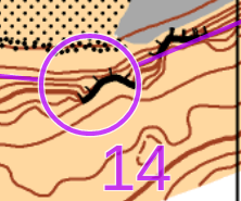
...where the previous "terrace" earlier in the course had been a flat bit above a cliff.
Old version - which of similar features is it on.
New version - no need to use it.
We had a hard line use of this new approach at the Scottish championships this year. Spot the "terrace"...
...where the previous "terrace" earlier in the course had been a flat bit above a cliff.
Jun 13, 2017 4:26 PM
#
rm:
Is it the one at the base of the cliff? (It is centered, so that's where my eye leads.)
Jun 13, 2017 4:28 PM
#
I don't see what the big deal is with these three changes. There are plenty of other symbols that many people wouldn't have a clue about if looking at for the first (or even second, third, fourth, etc) time.
-Forest corner
-Cave
-Termite mound
-Bare rock
-Open/semi open land/clearing
-Paved area
-Thicket
-Tree stump
-Shooting platform
and everyone's favourite
-Charcoal burning ground
...to name a few that have no correlation (or even exist) to their appearance on the map. They all get learned over time (if they're used).
Jun 13, 2017 4:41 PM
#
rm:
Well, sure, and we could have a third set of symbols for people to learn as well, if we wanted to. Even ten sets of symbols. Opportunities to simplify our sport seem worthwhile, though. It'd be fun if it were about navigating through terrain, and an eensy bit less about the complexity.
Jun 13, 2017 11:17 PM
#
Charcoal burning ground is a great control description symbol, since ISOM has yet to define what it's supposed to look like on the map.
Jun 14, 2017 12:11 AM
#
Just a question. We use for 418 Prominent bush or tree the Prominent tree symbol? Nothing for the bush?
Jun 14, 2017 5:06 AM
#
While I have been astonished trying to explain control descriptions to new orienteers:
"It's like an abstraction of the already abstracted map symbols, see?"
...I'm more astonished by these recommendations.
Loose descriptions for your clue sheet holder are *good*.
Monochromatic control descriptions are cheaper and easier for organizers.
It's not that big a deal. Literally no experienced orienteer is confused by the clues for knoll and boulder and boulder cluster.
The confusion caused by this change is unnecessary and, yes, embarrassing. It reinforces the stereotype of the definitely not pendantic nor OCD orienteer. (Orienteers created a game called Trail-O that rewards extremely specific knowledge of control descriptions.)
For those who say we don't need control descriptions, just think of the experience it takes to set courses acceptable to ordinary orienteers. Will not having control descriptions help or hurt meet quality? For course setters, what percentage of comments do you hear regarding the map versus the clue? What complaints do you usually *make* regarding the map versus the clue? I'm pretty confident it's at least evenly split or favoring the clues for me (more comments against clues than the map!).
And who decided a boulder should be round and not the knoll? So instead of the easily explained existing case, you create another arbitrary control description for knoll (that differs from the map symbol)?
I consider this reduced to absurdity.
Jun 14, 2017 7:48 AM
#
For those discussing the use of colour control descriptions, I recently ran a course where the planner used colour control descriptions (Chur in Switzerland). Just so happens that the planner also works for Ocad, so I'm pretty sure that this is currently supported or will be encouraged very soon.
Jun 14, 2017 8:07 AM
#
rm:
That's good news. People can experiment, as in Switzerland, and find out what works best.
Jun 15, 2017 3:37 PM
#
And to be clear, I'm open to adding things to the control descriptions specification. Just not arbitrary changes that offer marginal improvements at the expense of confusion.
Jun 15, 2017 10:42 PM
#
so, probably just stirring unnecessarily here, but... if a boulder is now going to be a circle because boulder clusters are mapped as a triangle, why is the 'rock pillar' control description still a triangle? I can see how this greatly simplifies the teaching process: "so if the control feature is a boulder, this will be shown in the descriptions the same way it is on the map. Unless the rock is significantly taller than it is wider, in which case it will be shown with an isoceles triangle, not to be confused with an equilateral triangle which is of course a group of rocks..."
Perhaps the 'pillar' symbol could be quietly retired. After all there is no way in the mapping specs to distinguish between 2 rocks with the same 'footprint' when one is 2m and the other is 10m high, and the description specs enable the height of the feature to be described...
Perhaps the 'pillar' symbol could be quietly retired. After all there is no way in the mapping specs to distinguish between 2 rocks with the same 'footprint' when one is 2m and the other is 10m high, and the description specs enable the height of the feature to be described...
Jun 16, 2017 2:16 AM
#
Having a symbol for retiring pillars is in the same league as charcoal burning platforms.
Jun 16, 2017 2:34 AM
#
You know orienteering has a demographics problem when even the map features are getting old and throwing in the towel.
Jun 16, 2017 10:53 AM
#
Getting rid of pillar is a fine idea, but even if it stays, it's simple enough to just not use it.
Jun 17, 2017 9:26 AM
#
GuyO:
Pillars are interestingly and rare, so, where they exist, they are attractive features.
Again, if it ain't broke...
Again, if it ain't broke...
Jun 17, 2017 9:57 AM
#
I pillar can just be called a boulder though, albeit a very large one.
Jun 17, 2017 10:34 AM
#
A pillar is not a freestanding boulder, it's a tall rocky knoll. Sometimes with a charcoal burning circle on the top (Exodus 13:21).
Jun 17, 2017 10:46 AM
#
The first control on our state middle champs last year was a rock pillar. It was the only one in the area (surrounded by boulders) and I had trouble identifying it, maybe because there was no shooting platform against it to help runners get to the top.
Jun 19, 2017 11:07 AM
#
Control description for "canopy" ( ISOM 2017 522, ISSOM 526.2)?
(withdrawn- I missed it on my first reading, not where I expected it.)
(withdrawn- I missed it on my first reading, not where I expected it.)
Jun 19, 2017 4:10 PM
#
Back in the days before symbolic control descriptions (1971 to be exact) I was on a course where one control had the description (48) The PULPIT. That confused me a bit because I was pretty sure there were no churches in those woods. However it turned out one man's pulpit was another man's pillar. With a wing and a prayer I found that control.
That rather unique rock formation is still there (Gatineau Park, Mt Bleu map) and it still looks like a pillar to me.
That rather unique rock formation is still there (Gatineau Park, Mt Bleu map) and it still looks like a pillar to me.
Jun 19, 2017 8:09 PM
#
Pulpit Rock is a famous rock climbing area in Yosemite, named after the obvious pillar (i.e. pulpit!):
http://www.rockclimbing.com/routes/North_America/U...
http://www.rockclimbing.com/routes/North_America/U...
Jun 20, 2017 7:21 AM
#
The number of Pulpit Rocks with rock climbs on them is beyond counting.
Jun 20, 2017 10:28 AM
#
Outdoor dunnies in Oz are sometimes referred to as the throne or the pulpit.
Jun 22, 2017 11:05 AM
#
For the colour control descriptions do you have coloured text as well????
Jun 22, 2017 2:07 PM
#
gruver, for club street maps I reserve the fodder rack symbol for small covered picnic tables and BBQ shelters in parks - with the BBQ shelters there is a connection with livestock, or at least the tasty bits. The symbol is more easily seen than a small grey canopy symbol, & even looks like the structure.
https://goo.gl/photos/TXhZRewYeuYY6XQK9
https://goo.gl/photos/TXhZRewYeuYY6XQK9
Jun 22, 2017 11:43 PM
#
rockman, glad to hear that others are taking this symbol seriously. Actually my thoughts were focussed by the views of a countryman of yours, who maintains that you can only use an "X" for one or two types of object, since they (under ISOM2000) need to be specified in a legend.
Around here, "X" mostly means "miscellaneous MM object", but it got me thinking that here was a specific symbol for at least some of them, commonly found in a park setting. Seats are too common to mark, but picnic tables and such are of the right frequency to be useful. There would seem to be no conflict between fodder racks for animals and fodder racks for humans.
PS sorry to hijack the thread, this is really a mapping rather than control description matter. Though I notice that it warrants a CD symbol too.
Jun 23, 2017 1:37 AM
#
This thread got hijacked a long time ago.
I like the idea of the fodder rack though. I have been using the canopy symbol for covered picnic tables (or even uncovered ones) but for ISOM drawn to scale at 1:10,000 it is far too small for many people to see.
I like the idea of the fodder rack though. I have been using the canopy symbol for covered picnic tables (or even uncovered ones) but for ISOM drawn to scale at 1:10,000 it is far too small for many people to see.
Jun 23, 2017 2:42 AM
#
Good thinking gruver - fodder rack would be especially appropriate for picnic tables in WA. Better still, we should use the refreshment symbol with some froth on top.
Actually though, why use symbols at all for street events? In WA we do need to use descriptions since we put controls on different features, and the actual marker is padlocked to something that may not be on the map. A typical description might be 'Road junction (light pole)' or 'Open land, N part (seat)'. So English is really the only option.
In Melbourne's street events they don't need descriptions at all since (usually) every control is chained to a light pole, and they put a dot on the map.
Regarding mapping of smaller objects, according to one sprint map expert seats, tables, and even some larger objects should not even be on 1:4000 maps, let alone 1:10000.
Jun 23, 2017 4:44 AM
#
Yes it depends on the scale, and the significance in context. For park mapping round here, I think seats are out and picnic tables are in. That's a judgement, not a requirement, I think. I can also think of an area where we have 1:10,000 mapping, and among a sea of sand-dunes, there is the occasional lookout, with a seat. I would map those. Probably an X.
tRicky - the new (more prescriptive) ISOM says the min canopy is 9X9m. No longer up to your judgement.
tRicky - the new (more prescriptive) ISOM says the min canopy is 9X9m. No longer up to your judgement.
Jun 23, 2017 5:48 AM
#
We use modified ISOM for our street events so I modify it to whatever I feel like.
Jun 26, 2017 6:24 PM
#
Given this discussion, I thought it was a little ironic that there were control description symbols used during last weekend's US Champs that became obsolete 13 years ago.
Specifically, the Sprint Champs on Friday used the pre-2004 symbol for single tree (a diagonally-oriented equilateral triangle with a small open circle inside).
Specifically, the Sprint Champs on Friday used the pre-2004 symbol for single tree (a diagonally-oriented equilateral triangle with a small open circle inside).
Jun 26, 2017 6:37 PM
#
Egad! What you are saying is that sometime in the last decade that the control description were edited. What the heck was wrong with using a triangle+circle to represent a tree -- we all knew what it meant. Of course someone new to the sport might think we are being a little obtuse (ha! triangle joke!) but they'll figure it out eventually, if they continue orienteering.
Jun 29, 2017 7:14 PM
#
Yeah but a newer (5 years) orienteer like me would be very thrown off to encounter that symbol for the first time in the call up boxes... glad not to have - it's safer over here in Iceland for descriptions ;p
Jun 29, 2017 7:57 PM
#
There were people asking about it during the call-up line for sure. Some people thought it was for charcoal burning ground, which has a similar symbol (it's a triangle inside of a circle, not the other way 'round).
Luckily for me, I started orienteering in 2003, when I took a bunch of those online description quizzes which had the correct-at-the-time tree symbol.
(For what it's worth, my sprint map from Boise State in 2009 had the correct description symbols for single trees.)
Luckily for me, I started orienteering in 2003, when I took a bunch of those online description quizzes which had the correct-at-the-time tree symbol.
(For what it's worth, my sprint map from Boise State in 2009 had the correct description symbols for single trees.)
Jun 29, 2017 9:08 PM
#
bmay:
Thankfully, the courses were a lot more about "map" reading than about "control description" reading. When the control circle is around a little green dot on the map, it doesn't really matter what symbol is on the control description.
Jul 3, 2017 1:28 PM
#
Just a point on newer orienteers...i caught up to a couple of I'm assuming new orienteers at melbusho on Sunday who couldn't find the control and the first thing they said was 'we don't understand the symbols' tbh knowing the description didn't really help in this case but definitely shows it's a bit off putting. I also think shows we might have a place for a long easy/ moderate at our races but that's another story.
This discussion thread is closed.