Discussion: Unknown Map Symbol
in: Orienteering; General
Jul 2, 2011 12:31 AM
#
What is represented by an exclamation point inside a triangle?
MTB Orienteering World Cup 2010, Veszprem, Hungary
http://orienteering.org/mtb-orienteering-world-cup...
http://orienteering.org/wp-content/uploads/2011/02...
North of Control 3
http://orienteering.org/wp-content/uploads/2011/02...
Northwest of Control 3
http://orienteering.org/wp-content/uploads/2011/02...
West of Control 4
Southeast of Control 9
http://orienteering.org/wp-content/uploads/2011/02...
West of Control 7
Northeast of Control 13
Jul 2, 2011 12:58 AM
#
A purple triangle denotes the start. In some computer programming languages, such as C, an exclamation point denotes "not" (a logical negation). So I would surmise that a purple triangle with an exclamation point inside is a place that is not the start.
(Actually, since this is MTBO, it looks like it might indicate a trail that is dangerously steep to ride down, with the exact spot being something that the competitor has to figure out, but at least he'll be alert when in that area.)
(Actually, since this is MTBO, it looks like it might indicate a trail that is dangerously steep to ride down, with the exact spot being something that the competitor has to figure out, but at least he'll be alert when in that area.)
Jul 2, 2011 4:11 AM
#
AZ:
Or perhaps, in the same train of thought, a particularly sketchy bit of the course - maybe dangerous two way traffic, scary intersection, etc? A good place not to be reading the map?
I imagine the interpretation would be given in the event notes? Or is it a well known (to other people) symbol
I imagine the interpretation would be given in the event notes? Or is it a well known (to other people) symbol
Jul 2, 2011 5:00 AM
#
It's not a map symbol. It's a road sign that is not common in North America, but is probably completely obvious to all Europeans.
Triangular signs mean "Warning", and the "!" triangular sign is for "Other danger". It is usually accompanied by a rectangular sign underneath it explaining the danger.
This pamphlet (that link opens a page---you have to click the web archive link) has at least two uses of that sign: See page 13 for "Hidden Dip" and page 142 for "Rising Bollards".
GuyO would know for sure, but I don't think this sign is used anywhere in North America, at least on the roads.
Jul 2, 2011 6:21 AM
#
The symbol is unofficially used in MTBO as a warning of the high likelihood of a puncture, with the dot representing the hole, the upright the sudden issue of air from the tire, and taken together the exclamation "oh sh....."! Course planners have been known to scatter tacks over an otherwise quite ridable section of track in order to provide the route choice challenges that are so vital!
Jul 2, 2011 6:53 AM
#
On the maps linked above, I believe it means 'If you are here, you are in the wrong place'.
Jul 2, 2011 6:59 AM
#
GuyO:
The Manual on Uniform Traffic Conrol Devices (MUTCD) is the US bible for road signage. Many states have their own versions, which have to be approved by the Federal Highway Administration.
On US (and Canadian) roadways, the diamond shaped sign with a yellow/gold background is the standard warning sign. They are often accompanied by an advisory speed panel. Actually, all signs with a yellow/gold background, regardless of shape, are supposed to be warning signs.
There are no triangular signs (pointing up), nor the use of a single exclamation point as text, in the US -- nor in Canada, as far as I know.
Jul 2, 2011 7:14 AM
#
GuyO:
Course planners have been known to scatter tacks over an otherwise quite ridable section of track in order to provide the route choice challenges that are so vital!
Wow! A deliberately imposed hazard that is not an intrinsic part of the sport (like ski moguls, motorcross jumps). In the event of a serious injury, I have to wonder if signed waivers, and/or the subject map symbol, would be sufficient to keep the lawyers at bay,
Wow! A deliberately imposed hazard that is not an intrinsic part of the sport (like ski moguls, motorcross jumps). In the event of a serious injury, I have to wonder if signed waivers, and/or the subject map symbol, would be sufficient to keep the lawyers at bay,
Jul 2, 2011 11:42 AM
#
There are no triangular signs,[...] in the US -- nor in Canada, as far as I know.
Except for

Except for
Jul 2, 2011 12:53 PM
#
Joe:
JJ, that is a delta. Don't ski areas use that symbol for avalanche prone areas?
Jul 2, 2011 1:32 PM
#
talking about the first example of the maps above:
there is a gate northeast of control 3 which is drawn by a pink line across the road. the triangle with the exclamation mark is there to get the competitors attention that there is a danger (the gate).
correct me if i am wrong :)
there is a gate northeast of control 3 which is drawn by a pink line across the road. the triangle with the exclamation mark is there to get the competitors attention that there is a danger (the gate).
correct me if i am wrong :)
Jul 2, 2011 2:29 PM
#
since many decades ago, all european roads have standardized signage that generally conforms to these patters:
triangular shape: danger ahead (rocks, slippery, RR crossing)
circular shape: restrictions (speed, parking, access)
rectangular shape: information (parking, hospital, services)
color plays a role:
red in restrictions means it is enforced
black or gray in restrictions means it is lifted (as in "the previously posted speed limit of 90 km/h ends here")
one curious observation: about 20 years ago, the octagonal shaped STOP sign started to appear in Europe. They had a stop sign before: it was a circular sign with a triangle drawn inside, but maybe they found the octagon to be more effective.
The prevalence of iconic (symbolic) vs textual signage spills over to other places, such as signage when entering a bus, a cafecteria, a train station, and public parks (can you see the sign for "playground use not allowed to children over 12" ? )
Jul 2, 2011 11:23 PM
#
GuyO:
@jjcote: Okay, you got me...
But I was only thinking about triangular signs that point up -- and edited my post accordingly.
But I was only thinking about triangular signs that point up -- and edited my post accordingly.
Jul 3, 2011 5:01 AM
#
Not too many people familiar with C programming eh JJ? Me, I gew up with machine language!
Jul 3, 2011 11:53 AM
#
is any of this serious?
it means "warning", generally for a particularly dangerous/highly technical section of trail
it means "warning", generally for a particularly dangerous/highly technical section of trail
Jul 3, 2011 6:26 PM
#
I stopped reading after your first line...
You also wrote "it looks like it might", well I can confirm that your guess was correct!
You also wrote "it looks like it might", well I can confirm that your guess was correct!
Jul 4, 2011 2:48 PM
#
It's a European road sign meaning "Warning". It looks like this:
http://commons.wikimedia.org/wiki/File:Zeichen_101...
It's a general warning without any specification.
http://commons.wikimedia.org/wiki/File:Zeichen_101...
It's a general warning without any specification.
Jul 5, 2011 4:38 PM
#
"one curious observation: about 20 years ago, the octagonal shaped STOP sign started to appear in Europe. They had a stop sign before: it was a circular sign with a triangle drawn inside, but maybe they found the octagon to be more effective."
Since we Americans (USA) are not very good at multi-lingual or multi-signs, perhaps Europeans realized that there was only one way to get us to stop at their intersections. :)
Since we Americans (USA) are not very good at multi-lingual or multi-signs, perhaps Europeans realized that there was only one way to get us to stop at their intersections. :)
Jul 5, 2011 7:50 PM
#
Around NY that red sign with "stop" written on it appears to mean, slow down, check there are no cops watching, keep on rollin'.
Jul 6, 2011 6:32 AM
#
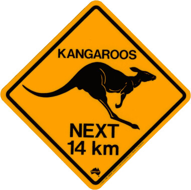
@BP Kangaroos may seem weird but have you seen them move through the bush? Man! I would love to move that fast and easy. 14km? That's about a dozen hops. :-)
Hey! Are Ricka and tRicky related???
Hey! Are Ricka and tRicky related???
This discussion thread is closed.