Discussion: Local Event Signage
in: Orienteering; General
Nov 18, 2010 12:04 AM
#
One of my upcoming projects is to improve our signage at our local events, as it was something mentioned several times on our member survey.
Currently, we have a haphazard collection of:
2' x 5' (or so) banner that has the club name, logo, and website
18" x 30" (or so) dry erase board with event fees
18" x 30" (or so) dry erase board with course lengths
We also have the standard directional signs and sandwich boards to direct folks to the event, but for now, I'm really asking about what's at the event, not what's pointing to it.
I'm wondering what other clubs do?
I'm thinking about getting one of those large, trade-show style displays, specifically one made for being outside. This display would be a one-stop shop. Club name, logo, and website up top, blank areas specifically allotted for:
- day-of-event course details
- entry fees
- distance and direction to the start from the sign
- upcoming event calendar
- and unfilled volunteer roles at the next event.
It would also be nice to include a brief definition of orienteering (for passersby), and map and description sheet symbols (for newbies). And other useful items?
Basically, I'm thinking about a cohesive and professional-looking plan for signage at our event. And if other clubs have already invented this wheel, I'd like to hear about it.
Nov 18, 2010 12:07 AM
#
I think using the Orienteering USA logo that someone came up with (who was that again? can't remember ...) as the most prominent graphic element would allow displays like this to be used across the US by any club, whether or not there was a separate (and smaller) space for the local club name and logo.
Nov 18, 2010 12:14 AM
#
Una:
You need a brochure / leaflet / flyer / postcard that people can take away. It should have your website and upcoming events listed on it. It might as well also have the current event's key details, if a brochure / leaflet / flyer / postcard is part of your ad campaign for the event.
Nov 18, 2010 12:20 AM
#
Una:
What I think would be really cool is large magnet club signage for course setters, vetters, and meet staff to put on their vehicles. Does your club have a cargo trailer for hauling the tables and tents and coolers and sandwich boards et cetera to the event? Does it have a big magnetic sign?
For SAR, I have 5x30 inch magnets that say SEARCH AND RESCUE in black on a hi-viz reflective white background. I haul a steel trailer, and the magnets live inside the trailer, stuck to the side wall. When on a SAR mission I slap them on the trailer and the truck.
For SAR, I have 5x30 inch magnets that say SEARCH AND RESCUE in black on a hi-viz reflective white background. I haul a steel trailer, and the magnets live inside the trailer, stuck to the side wall. When on a SAR mission I slap them on the trailer and the truck.
Nov 18, 2010 12:32 AM
#
For Directional Signage, Orienteering Cincinnati uses 2' x 2' signs made of 3/8 inch plywood. They are diagonally divided between orange and white, painted on both sides, so they are 100% reversable with arrow pointing right, left or ahead. They have a 1/4 inch bolt hole on 2 sides, allowing them to be bolted to standard sign posts (eg below a stop sign). We also have some timber bases with a 1/2" groove that allows the signs to be placed on the ground where no post is available. We've given several to neighboring clubs in Indianapolis and Columbus. In my opinion, they are some of the most visible signs anywhere.
That said, if some clubs (or a national federation) would like to go in on some lighter weight signs, I can arrange to make 18" x 24" signs similar to political signs. The price would be reasonable if we did 100 or so.
I'll post a picture or two shortly.
That said, if some clubs (or a national federation) would like to go in on some lighter weight signs, I can arrange to make 18" x 24" signs similar to political signs. The price would be reasonable if we did 100 or so.
I'll post a picture or two shortly.
Nov 18, 2010 1:44 AM
#
I think using the Orienteering USA logo as the most prominent graphic element would allow displays like this to be used across the US by any club, whether or not there was a separate (and smaller) space for the local club name and logo.
Since this is for our local events, I think it's more appropriate to focus on the club hosting the event. This is about our event, our calendar of events, our fees, and our needed volunteers, etc. People will be going to our website, not O-USA's.
An event banner in Seattle doesn't have to match one in Maryland or Cincinnati, just because all of the clubs are members of O-USA.
Including the O-USA is a good idea, though, as it'll make our club look more professional, as a member of a larger body. It's like buying a jersey for a football team. The jersey is for the the team, but there's an NFL logo on it, too.
You need a brochure / leaflet / flyer / postcard that people can take away. It should have your website and upcoming events listed on it.
The best place for this is on the back of the maps, I think. This strategy has two advantages over the separate flyer.
1) It's handy for everyone. Not every "regular" has the event calendar memorized, so it's useful for them, and it would add to the usual post-race chat. "I went around the hill from #13 to #14... hey, are you going to this event in a few weeks? I've never been there, have you?" For newbies, it serves both as an event souvenir and useful information for the future.
2) It's not a second piece of paper, so people won't forget to pick one up, (or pick one up and leave it somewhere). I keep all of my maps, but those fliers that routinely end up under my windshield wipers... I've never kept any of those.
Nov 18, 2010 2:03 AM
#
I *love* the idea of printing take-away info on the backs of the maps! I'm going to mention that at RMOC's annual meeting this weekend. Great suggestion.
Nov 18, 2010 5:59 AM
#
Una:
I *love* the idea of printing take-away info on the backs of the maps!
I love the idea too. I tried it once and found it requires a heavier, more opaque paper than we normally use, else the printing on the back shows through and interferes with reading the map.
I love the idea too. I tried it once and found it requires a heavier, more opaque paper than we normally use, else the printing on the back shows through and interferes with reading the map.
Nov 18, 2010 6:03 AM
#
Or lighter printing on the back -- some color other than full black, maybe.
Nov 18, 2010 6:27 AM
#
Before Cascade OC got the receipt printer for result splits, the splits came out on half sheets of paper, which included a quickie upcoming schedule. I guess that's probably possible with a receipt printer, too.
Nov 18, 2010 4:25 PM
#
Just a reminder that Orienteering USA has a large supply of the "Orienteering - Sport of a Lifetime" brochures available to clubs and individuals. They have room for you to insert your club logo and contact info (sticker label or stamp pad is easiest way). It does not have room for a schedule, though...
brochure images and ordering information
brochure images and ordering information
Nov 18, 2010 4:35 PM
#
Yup, we've got a bunch of those, too. I usually carry a bunch in my pocket when I do beginner instruction.
Nov 18, 2010 7:21 PM
#
I picked up one of those "Orienteering - Sport of a Lifetime" brochures recently, and my first thought was that Larry had pulled it out of some dark forgotten recess of his basement. Do we have anything more modern-looking, and with considerably less text? I find that much text to be a turnoff on a brochure. Even bullets would be better. If I worked on re-doing this brochure, would it A) get used and B) be appreciated? Or do most folks find the current one acceptable? (see mikeminium's link, above).
Nov 18, 2010 8:03 PM
#
I think something that follows the graphical feel of the new website/posters/logo would be very useful. Especially if it had lots of pictures. And short words. And room for a schedule. :-)
Nov 18, 2010 8:20 PM
#
be appreciated?
yes
I think something that follows the graphical feel of the new website/posters/logo would be very useful.
yes
Especially if it had lots of pictures.
yes
And short words.
yes
And room for a schedule.
yes
The O-USA folks may already be working with a graphic designer on this?
yes
I think something that follows the graphical feel of the new website/posters/logo would be very useful.
yes
Especially if it had lots of pictures.
yes
And short words.
yes
And room for a schedule.
yes
The O-USA folks may already be working with a graphic designer on this?
Nov 18, 2010 8:33 PM
#
We made one of those 5'x2' signs with mostly one word on it--Orienteering. We picked the largest font that would fit on the sign, so that people on the other side of the park could read the sign and come over to hopefully participate.
One side benefit of printing a schedule on the back of your maps is that when you are out doing control pickup, you can carry some of the leftovers with you. When you meet people walking in the park who are curious as to what the orange things are all over the park, you can explain and leave a copy with them.
One side benefit of printing a schedule on the back of your maps is that when you are out doing control pickup, you can carry some of the leftovers with you. When you meet people walking in the park who are curious as to what the orange things are all over the park, you can explain and leave a copy with them.
Nov 18, 2010 10:08 PM
#
Una:
I have handed "Orienteering - Sport of a Lifetime" brochures to people and watched them start reading with interest, and then their eyes glaze over with boredom. The entire front panel is wasted.
The new marketing materials on the OUSA website are much better. I downloaded a 2010 NOD poster PDF, post-processed it to add our club's event details, and made a new lean and eyepopping PDF that I e-mailed to everyone in the club to print and post or forward however they thought appropriate.
To see what juniors find exciting about orienteering, watch their videos on YouTube.
Nov 18, 2010 10:20 PM
#
Larry had some "Sport of a Lifetime" brochures on his table at the Hickory Run meet, which may well have come from his basement. They were an old version from many years ago. I probably should have grabbed all of them. Eva updated the brochure a couple years ago and the newer one includes an illustration and info about electronic punching. If you have an old one, look at the link above which has one with the new images.
New brochure / flyer / handout ideas are welcome.
New brochure / flyer / handout ideas are welcome.
Nov 19, 2010 12:22 AM
#
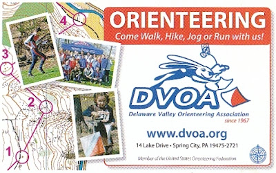
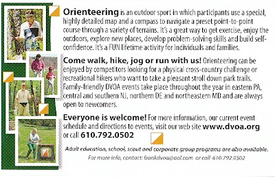
We (DVOA) have a slightly larger than business card size handout. It is very well done with photos of various aged runners and a map segment. I hand them out while running/hiking in local parks - much easier than explaining Orienteering.
Nov 19, 2010 12:25 AM
#
For the big events we pull out all the stops - tents, banners, flags, and the OUSA Blimp.
Nov 19, 2010 12:56 AM
#
acjospe, I agree with your assessment of the "Sport of a Lifetime" brochure... :-)
The "O.mov" video is looking pretty dated already, too.
OUSA should copy this Polish video frame-for-frame, or maybe just dub it into English: http://www.vimeo.com/11652305
The "O.mov" video is looking pretty dated already, too.
OUSA should copy this Polish video frame-for-frame, or maybe just dub it into English: http://www.vimeo.com/11652305
Nov 19, 2010 2:05 AM
#
Una:
Back to event signage. We (NMO) use some of those political campaign lawn signs. They're really flimsy and a PITA to handle. I'd like to upgrade to the stake type, like this.
Nov 19, 2010 3:14 AM
#
For the big events we pull out all the stops - tents, banners, flags.
What do they look like and what sort of information is shown?
What do they look like and what sort of information is shown?
Nov 19, 2010 3:43 AM
#
Una:
I am trying to picture this OUSA blimp. All that comes to mind is Dr. Evil.
Nov 19, 2010 4:07 AM
#
You can see the DVOA stuff here:
Tent
Tent with 'classic' banner
All Welcome banner
Registration banner
Instructions banner
(You get the idea, there are a few others with various wording)
Flag
Flag again
Tent
Tent with 'classic' banner
All Welcome banner
Registration banner
Instructions banner
(You get the idea, there are a few others with various wording)
Flag
Flag again
Nov 19, 2010 5:46 AM
#
This may not be exactly related to what you're asking about, Patrick, but DVOA also has these cool wallet cards. (I got this from someone at the Anza-Borrego meet in January.) There are so many times when I wish I had a card like this to give to a passer-by who's asking questions. It's like a glossy business card, but a bit larger than a standard business card (it's 4" x 2.5").
The print quality is much better than this scanned image, BTW.
The print quality is much better than this scanned image, BTW.
This discussion thread is closed.